
Good Shopify website design is functional first. It should make the offer, product categories, product differences, and next step easy to understand.
Hierarchy beats decoration. Use stronger headings, cleaner spacing, consistent product cards, and obvious calls to action before adding extra sections or animations.
Consistency makes a store feel easier to trust. Keep typography, colors, button styles, image ratios, section spacing, and product card details consistent across the homepage, collections, cart, and checkout entry.
Design mobile screens as the default experience. Menus, filters, product grids, sticky actions, and cart paths need to work on a real phone, not only in a desktop preview.
Use examples for patterns, not copying. The best Shopify website design examples are useful because they show clear navigation, product discovery, readable pages, and smooth buying flow in context.
What good Shopify website design actually means
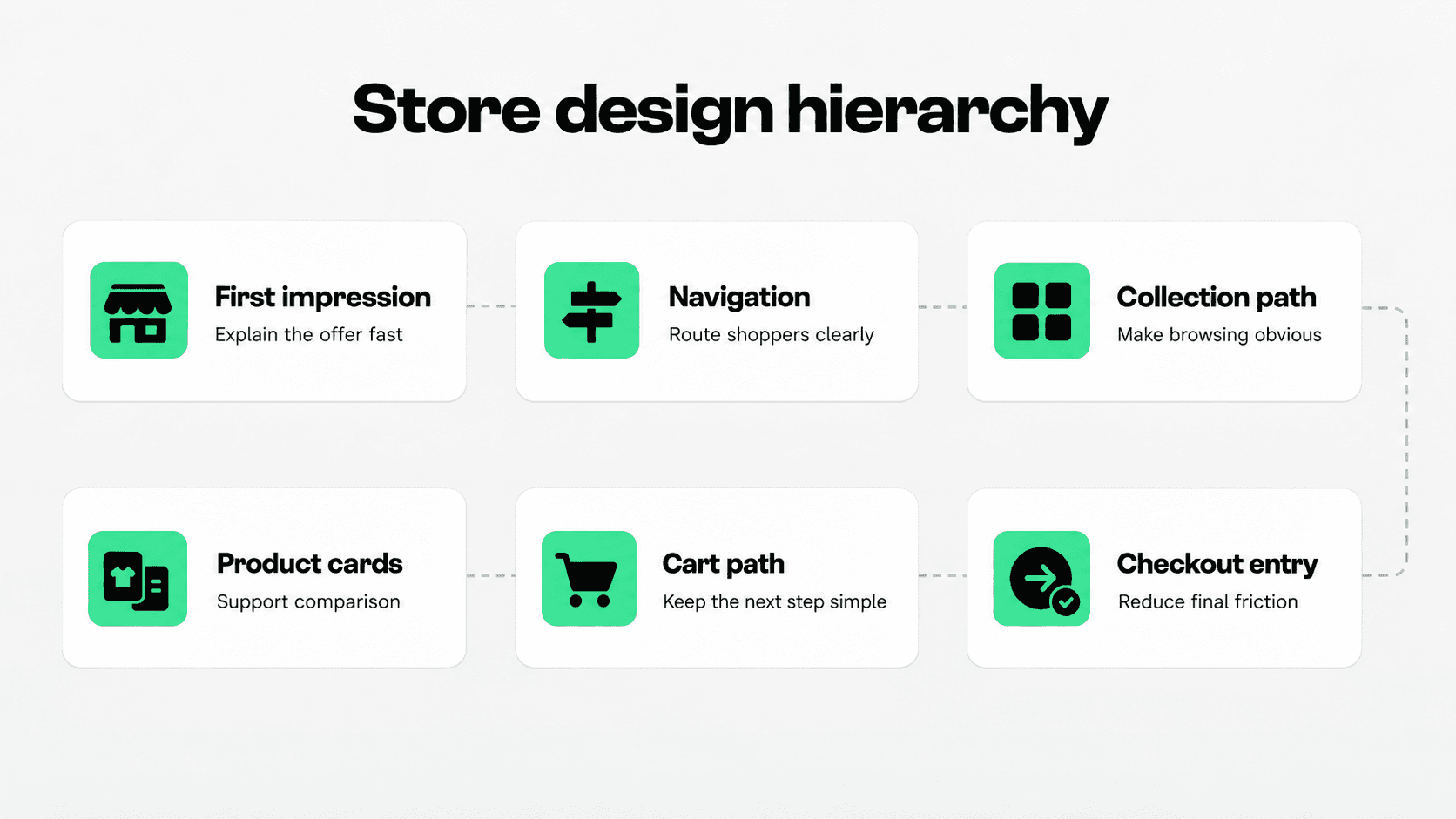
A polished Shopify store can still be hard to buy from. The homepage may look premium, but the navigation might hide important categories. Product images may be beautiful, but product cards may not show enough information to compare. A theme may feel modern on desktop, but the same layout may become crowded on mobile.
That is why Shopify website design should be judged by the full shopping path, not by a screenshot. The design has to help shoppers understand where they are, what the store sells, what makes the products different, how to narrow choices, and what to do next.
Shopify's ecommerce UX guidance makes the same distinction: UI is what a store looks like, while UX is how the store works for shoppers across navigation, product pages, cart, checkout, mobile, and speed. Source: Shopify ecommerce UX guide.
For merchants, the practical lesson is simple: do not start with visual taste alone. Start with the path shoppers need to take. Then use visual design to make that path easier to follow.
Create a clear visual hierarchy across the store
Visual hierarchy decides what shoppers notice first, second, and third. If every section has the same weight, shoppers have to work harder to understand the page. If the strongest visual element is a decorative banner, newsletter popup, or oversized image with vague copy, the store can feel impressive without being useful.
Strong hierarchy starts with the first screen. A shopper should quickly understand the product category, the main value proposition, the primary path to shop, and whether the brand feels relevant to them. This does not require a huge hero section. In many stores, a compact hero plus visible category entry points works better than a large image that pushes products below the fold.
Use headings to create clear levels. The H1 or main hero message should explain the offer. H2 sections should divide the page into meaningful shopping tasks, such as new arrivals, best sellers, bundles, gifts, or product categories. Product card names should be specific enough to compare without opening every product page.
Spacing matters too. White space is not empty space when it separates decisions. Give important sections room to breathe, but avoid padding that forces shoppers to scroll through branding before seeing products.
Use this table as a quick design audit before changing themes or adding more apps.
Design area | What to check | Better store outcome |
|---|---|---|
First screen | The offer, product category, and main shopping path are clear without scrolling. | Shoppers know where they are and what to do next. |
Typography | Headings, body text, prices, labels, and buttons have distinct sizes and weights. | Pages are easier to scan and read. |
Spacing | Sections are separated clearly, but product discovery is not pushed too far down. | The store feels organized instead of padded or cramped. |
Product cards | Cards show consistent images, names, prices, variant cues, and meaningful states. | Shoppers can compare products before opening detail pages. |
Calls to action | Primary buttons use consistent wording, styling, and placement. | The buying path feels predictable. |
Mobile layout | Important content remains readable, tappable, and close to the action on a phone. | Mobile shoppers can browse without zooming or re-tapping. |
Keep design consistent from homepage to checkout entry
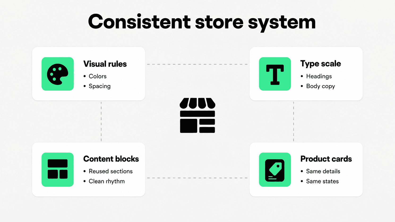
Consistency is one of the quietest Shopify store design improvements. When colors, type styles, buttons, product cards, section spacing, and icon treatment change from page to page, shoppers feel the friction even if they cannot name it.
Build a simple design system for the store. This does not need to be a formal brand book. At minimum, decide how headings work, how buttons look, how product images are cropped, how sale states appear, how icons are used, how much spacing sections need, and how page sections repeat across templates.
Consistency is especially important in Shopify because merchants often add theme sections, app blocks, metafield content, reviews, recommendation widgets, banners, and promotional tools over time. Each addition may look fine alone, but the store can slowly become a patchwork.
Keep reusable sections simple. If the homepage, collection page, product page, cart, and policy pages all use the same button logic, type scale, and spacing rhythm, shoppers spend less effort learning the interface and more effort evaluating the products.
If you want more inspiration for patterns that work in context, review Snapp's guide to Shopify website design examples. Use examples to borrow structure, not to copy another store's visual identity.
Make navigation and product discovery easy
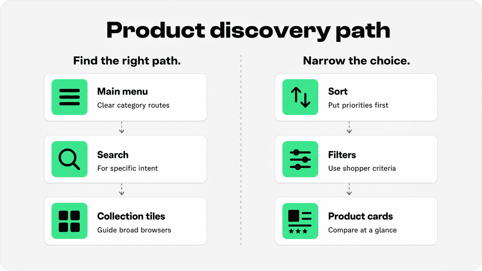
Navigation is where Shopify website design becomes information architecture. A beautiful header does not help if categories are vague, menus are too deep, or shoppers cannot find the product type they came for.
Shopify's menu documentation explains that online store menus control the links customers use to navigate the store, and Shopify's drop-down menu guide notes that menus can help customers find the type of products they are looking for. Source: Shopify menus documentation; Source: Shopify drop-down menu documentation.
Use customer language in the main menu. A shopper looking for skincare does not think in supplier codes, internal collection names, or admin tags. They think in product types, concerns, routines, ingredients, occasions, price ranges, and gift needs.
For small catalogs, keep the main navigation short and direct. For larger catalogs, use nested menus, collection tiles, search, filters, and sorting as a connected discovery system. Do not make one control do every job. Menus help shoppers choose a broad path. Collections help them browse a category. Filters help them narrow a large set. Search helps when they already know what they want.
Baymard's product list UX research focuses on how shoppers scan, evaluate, filter, and sort products in ecommerce product lists. That is the right lens for Shopify product discovery: every browsing page should make a large set of products feel easier to understand. Source: Baymard product lists UX research.
For a deeper follow-up, read Snapp's guide on Shopify navigation and the dedicated guide to Shopify product filters.
Design mobile screens before desktop polish
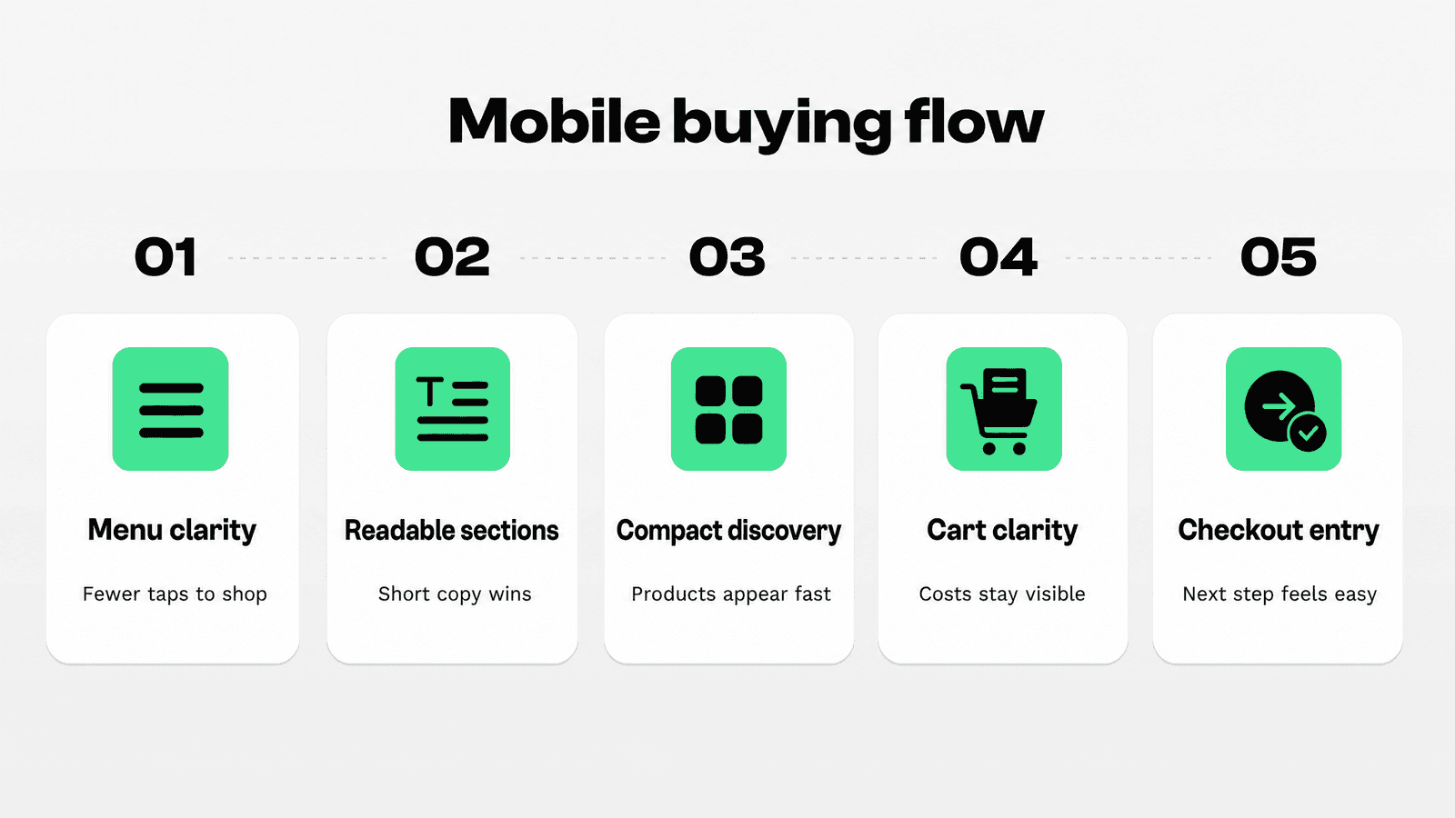
Mobile design exposes weak Shopify store design quickly. A desktop layout can hide long menus, oversized media, dense copy, small buttons, and awkward filters because there is more space. On a phone, those choices become immediate friction.
Start by testing the store on a real phone. Open the homepage, use the menu, browse to a collection, apply a filter if the catalog needs one, open a product, add it to cart, review cart details, enter a discount if relevant, and continue to checkout. Note every point where text feels small, controls are hard to tap, sticky elements block content, or shoppers have to backtrack.
Shopify's mobile website design guidance notes that responsive design is best practice for mobile sites and that Shopify Theme Store themes are responsive. Responsive foundations still need merchant-level decisions about section order, image size, grid density, menus, and mobile content. Source: Shopify mobile website design guide.
On mobile, prioritize the first useful action. A shopper should not have to scroll past a tall hero, a long brand story, three announcement strips, and a popup before seeing products or categories. Keep introductions short, show clear category paths, and make the buying action easy to reach when the shopper is ready.
For more mobile-specific detail, read Snapp's Shopify mobile optimization guide for tap targets, speed, sticky actions, collection browsing, and checkout usability.
Use collections, product cards, and search to shorten decisions
Many Shopify merchants treat collections as simple product shelves. Better Shopify website design treats collections as guided decision pages. The collection title, intro copy, subcollection links, product grid, sorting, filters, and product cards should all help shoppers choose what to inspect next.
Product cards deserve more attention than they usually get. A card that only shows an image, product name, and price may work for a very small catalog, but many stores need more comparison help. Depending on the category, useful card details can include available colors, size range, rating count, sale state, bundle status, material, compatibility, product type, or a short benefit cue.
Search should also be visible enough for shoppers who arrive with intent. If the store has many SKUs, compatibility needs, sizes, or technical terms, search is not a backup feature. It is a primary discovery path.
For a deeper collection-page workflow, read Snapp's Shopify collection page best practices guide. For merchandising strategy, read Shopify merchandising.
Smooth the buying flow without overloading pages
A good Shopify design does not ask every page to do every job. The homepage should orient shoppers. Navigation should route them. Collections should help them narrow and compare. Product pages should answer product-specific questions. Cart should confirm what is being purchased and what happens next. Checkout entry should feel expected, not sudden.
The main design risk is clutter. Merchants add banners, badges, popups, countdowns, payment icons, reviews, bundles, recommendations, shipping notes, return notes, chat widgets, and app blocks because each one can be useful in the right place. But when everything appears at once, important information becomes harder to see.
Use a simple rule: place information where the question naturally appears. If shoppers are comparing products, show comparison details on product cards and collections. If they are evaluating a product, show product-specific content on the product page. If they are reviewing the purchase, show delivery, returns, discounts, and payment reassurance in the cart and checkout-adjacent areas.
For storewide design, the important point is placement: trust cues should support the buying flow without turning the page into a badge wall.
If readers need simple Shopify tools for trust cues, product benefit icons, and sales-supporting page elements, Snapp offers Shopify apps to increase sales that can fit into a cleaner store design without custom code.
Shopify website design examples: what to borrow
Shopify website design examples are useful when you study the decision behind the layout. Do not copy another store's exact hero, colors, typography, or navigation labels. Instead, look for repeatable patterns.
A strong fashion store might use image-led category paths because style and fit are visual decisions. A supplements store might use benefit-led navigation because shoppers browse by goal. A home goods store might rely on room, material, color, and bundle collections because shoppers compare context. A technical accessories store might need search, compatibility filters, and clear product-card specs because mistakes are costly.
Shopify's own website design examples article highlights that strong Shopify website designs combine ecommerce functionality with thoughtful aesthetic choices. Source: Shopify website design examples. For merchants, that means design inspiration should always be translated back into the store's catalog, audience, and buying path.
When reviewing examples, ask four questions: What does the store make obvious first? How does it route different shopper intents? How does it make products easier to compare? Where does it reduce hesitation near the buying path?
Where Snapp fits
Snapp fits best after the core design structure is clear. A cleaner theme, stronger hierarchy, better navigation, and easier product discovery create the foundation. Then store elements such as trust badges, payment icons, product feature icons, promotional cues, and benefit blocks can support the buying path without becoming clutter.
The goal is not to decorate every page. The goal is to add the right cue in the right place, using styling that feels consistent with the rest of the store.
Conclusion
Better Shopify website design starts with clarity. Make the offer easy to understand, build navigation around how shoppers browse, keep pages readable, make product discovery faster, design mobile screens first, and keep the buying flow predictable.
Visual polish still matters, but it should support the shopping path. The best Shopify store design feels calm, consistent, and useful. Shoppers know what the store sells, where to go next, how to compare products, and how to buy when they are ready.