Strong Shopify store examples make the next step obvious. The best designs do not ask shoppers to decode the brand before they can shop.
Navigation is merchandising. Allbirds, Gymshark, Princess Polly, Leesa, Fable, Kotn, and BlenderBottle use top-level paths like best sellers, new arrivals, product types, use cases, rooms, bundles, or guides to shape demand.
Collections need a job. A collection should help shoppers compare, narrow, and decide, not simply display every product in a category.
Mobile clarity matters more than desktop polish. The best Shopify store designs keep menus, search, product cards, offers, and add-to-cart paths usable when only a few items fit on screen.
Use examples as patterns, not templates. Borrow the decision logic behind these stores, then adapt it to your own catalog size, price point, audience, and buying objections.
What makes a Shopify store example worth copying?
A good Shopify store example is not just a store with polished photography. It is a store where design choices support buying decisions. The header explains the catalog. Collections guide shoppers toward useful product groups. Product cards answer comparison questions. Product pages make the offer feel clear. Mobile layouts preserve the shopping path instead of hiding it behind cramped menus and oversized banners.
For this article, the examples were selected because they show repeatable ecommerce patterns across different categories: shoes, fitness apparel, trend fashion, mattresses, dinnerware, apparel/home goods, and shaker bottles. Several are identified by Shopify as Shopify or Shopify Plus merchants, including official Shopify case material for brands such as Gymshark and public Shopify example/case resources. The store observations below are based on live storefront review as of September 2026, so use the lessons as patterns rather than assuming every detail will remain unchanged.
If you are improving a store from scratch, connect this article with Snapp's guides on Shopify navigation, Shopify merchandising, and Shopify mobile optimization. Together, those pieces cover the system behind the examples: how shoppers move, how products are grouped, and how confidence is built before checkout.
The repeatable pattern behind the best Shopify store designs
Before looking at individual stores, it helps to name the pattern most strong Shopify store design examples share: they reduce the number of vague choices between arrival and product decision.
That does not mean every homepage needs to be minimal. Gymshark has a broad catalog. Princess Polly moves fast with trend and sale merchandising. Leesa sells high-consideration mattresses. Ruggable-style home categories need room, size, style, and material decisions. Different catalogs need different interfaces. But the strongest stores still organize the path around shopper intent.
Navigation: Top categories, best sellers, sale, new arrivals, bundles, rooms, use cases, or guides are visible without forcing shoppers through generic "Shop" labels.
Collections: Product grids expose meaningful filters, useful sorting, clear product names, consistent images, and enough product-card detail to support comparison.
Merchandising: The store tells shoppers where to start: best sellers, starter sets, seasonal edits, quiz paths, bundles, or complete-the-look modules.
Visual hierarchy: The page gives weight to the product, offer, category, or buying decision instead of spreading attention evenly across everything.
Mobile buying clarity: The same path works on a phone: open menu, pick a category, scan products, compare options, add to cart, and recover if the first path is wrong.
Shopify store examples at a glance
Use this table as the quick pattern map. The detailed sections below explain how each store translates that pattern into navigation, collections, merchandising, hierarchy, mobile experience, and buying clarity.
Store example | What it gets right | Repeatable pattern | Best for merchants who need to improve |
|---|---|---|---|
Allbirds | Simple category paths plus material and comfort storytelling | Use product taxonomy and brand proof together | Navigation, product-card clarity, sustainability or material claims |
Gymshark | Deep apparel taxonomy that still starts with recognizable shopper paths | Turn a large catalog into clear segments | Mega menus, collection grouping, mobile category discovery |
Princess Polly | Fast trend merchandising with sale, newness, and quick buying cues | Expose commercial paths for shoppers who browse by moment | New arrivals, sale strategy, product-card speed |
Leesa | High-consideration buying support through comparison, quiz paths, bundles, and proof | Guide shoppers when the product decision is hard | Product education, bundles, comparison, trust cues |
Fable | Lifestyle-led dinnerware merchandising with bundles and social proof | Sell sets and occasions, not only individual SKUs | Bundles, visual hierarchy, gifting and home categories |
Kotn | Minimal navigation that keeps ethics and product quality close to commerce | Let the brand story support, not interrupt, shopping | Premium basics, mission-led brands, restrained hierarchy |
BlenderBottle | Product-type navigation, best sellers, quiz entry, reviews, and quick add | Help shoppers choose variants without slowing the path | Accessories, variants, quick add, product discovery |
1. Allbirds: simple navigation with product and material clarity
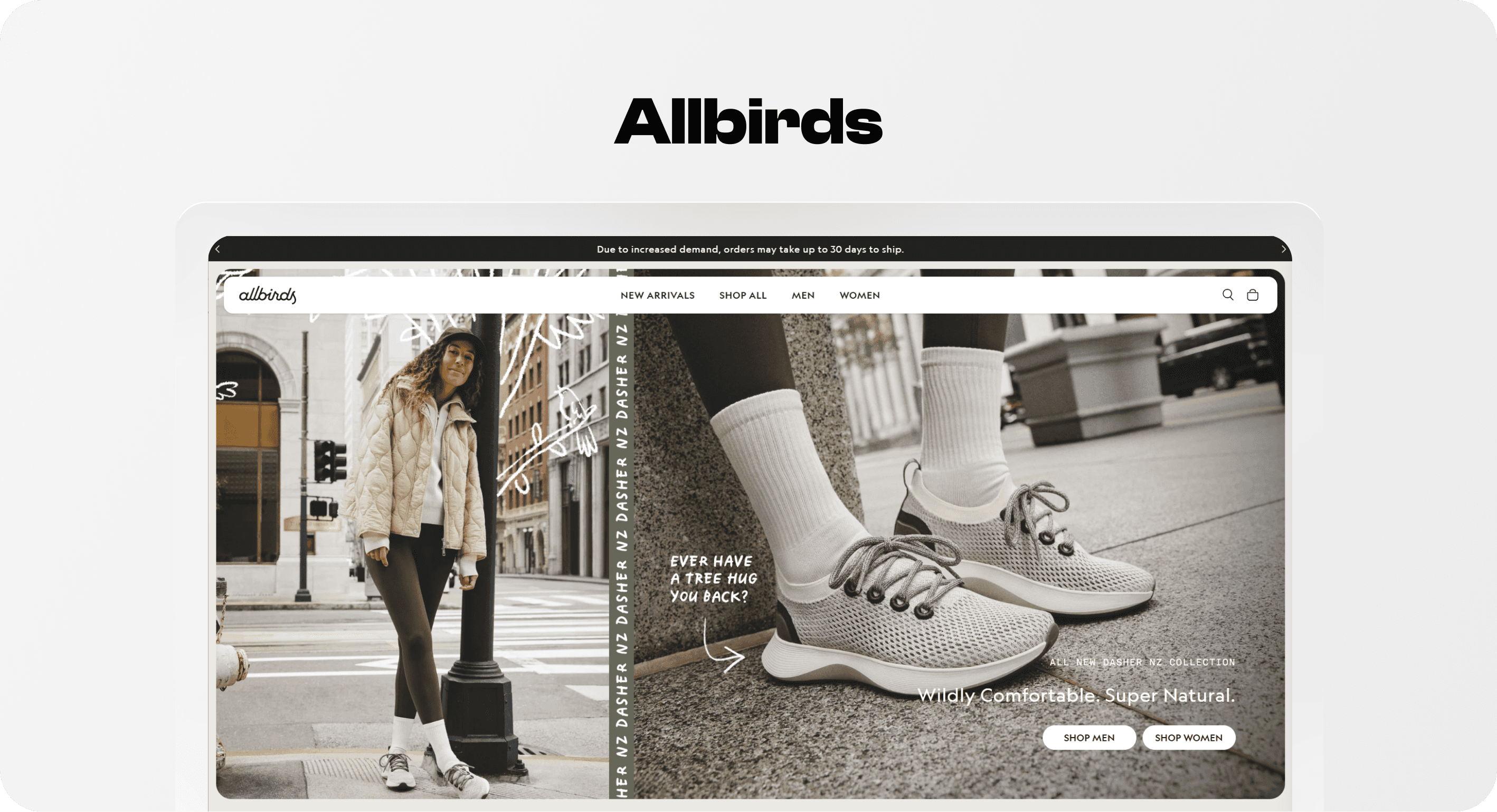
Allbirds is a useful Shopify website example because it keeps the main shopping choices recognizable: men, women, shoes, apparel, bestsellers, new arrivals, and product families. That sounds basic, but basic is often what helps shoppers move. A visitor can enter through gender, category, popularity, or a specific product line without first learning internal brand language.
What Allbirds gets right is the combination of clean taxonomy and brand proof. The store sells comfort and sustainability, but it does not make shoppers choose between brand story and product discovery. Category paths lead to products, while material and benefit messaging supports the decision once the shopper is already oriented.
The repeatable pattern: use the header to answer "what can I buy here?" before using the rest of the page to answer "why should I buy it from this brand?" This is especially important for Shopify stores with strong values or proprietary materials. If the story appears before the catalog is understandable, shoppers can appreciate the brand and still leave unsure where to click.
Navigation lesson: Use common category labels first, then layer branded product names underneath.
Collection lesson: Make bestsellers and product families easy to reach for shoppers who do not yet know the exact item.
Buying clarity lesson: Support product decisions with benefits such as comfort, material, sustainability, shipping, and returns near the point of comparison.
2. Gymshark: large-catalog navigation that still feels shoppable
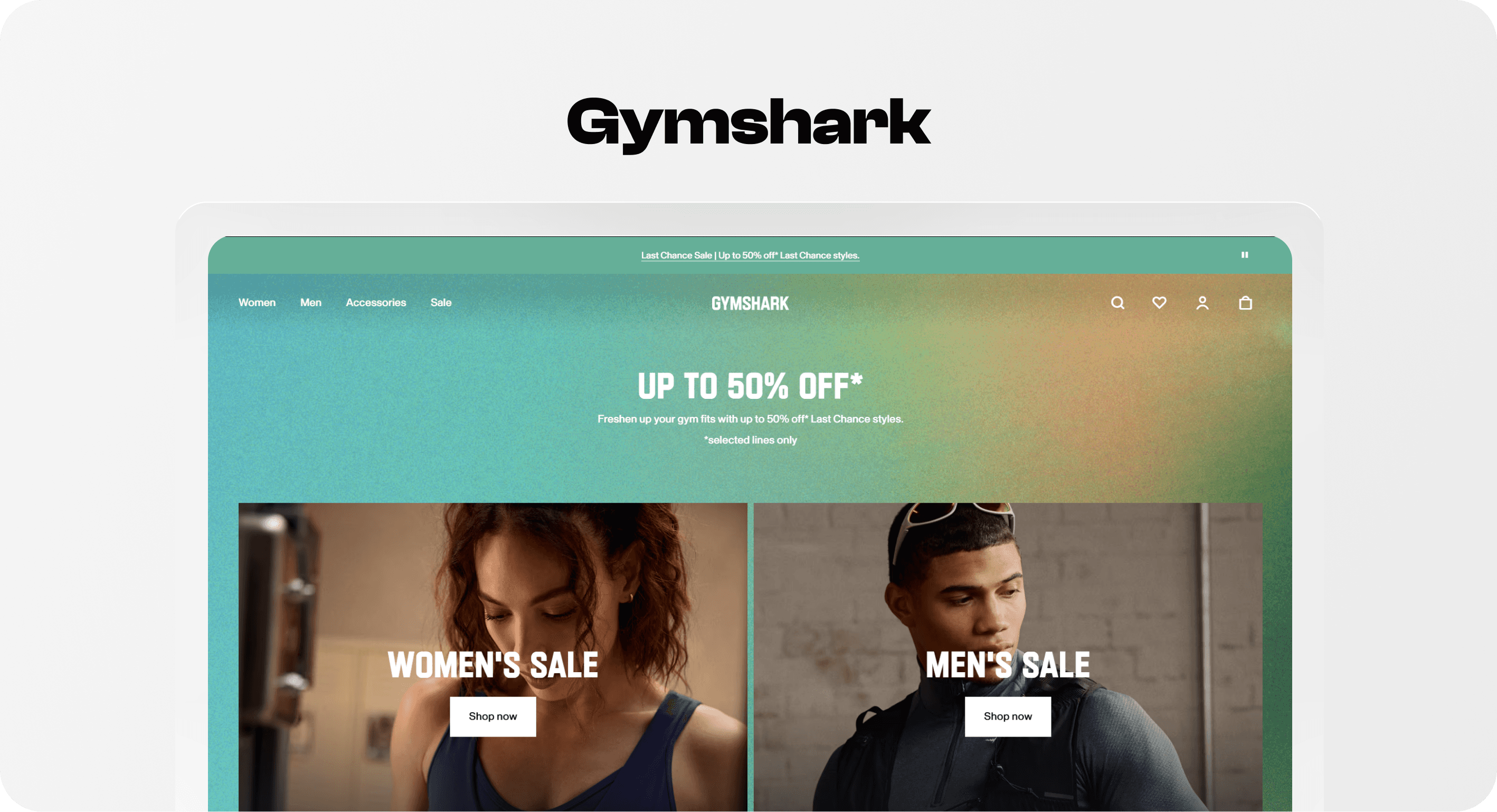
Gymshark is one of the clearest Shopify store design examples for broad apparel navigation. Shopify's Gymshark case study describes the brand replatforming to Shopify Plus after outgrowing Adobe Commerce and needing a platform that could scale with major traffic and international growth. That scale shows in the storefront: the catalog is broad, but the menu is organized around how fitness shoppers browse.
The header separates women and men, then exposes product types, trending edits, training use cases, collections, accessories, and sale paths. Instead of relying on one long "apparel" category, Gymshark gives shoppers multiple natural entry points: leggings, sports bras, matching sets, lifting, running, rest day, best sellers, back in stock, and last chance.
The repeatable pattern is not "make a huge menu." It is "make the catalog easier to recognize." A mega menu helps only when it groups choices into meaningful clusters. Gymshark works because the menu mirrors real shopping language: garment type, activity, collection, color or trend, and deal intent.
Navigation lesson: For larger catalogs, top-level categories should open into grouped shopper intents, not an undifferentiated link dump.
Collection lesson: Create collection paths for product type, use case, popularity, launch status, and sale intent when those represent real customer decisions.
Mobile lesson: Large menus need careful mobile testing. The first tap should reveal useful categories quickly, with search and back paths easy to use.
3. Princess Polly: trend merchandising with a fast path to product
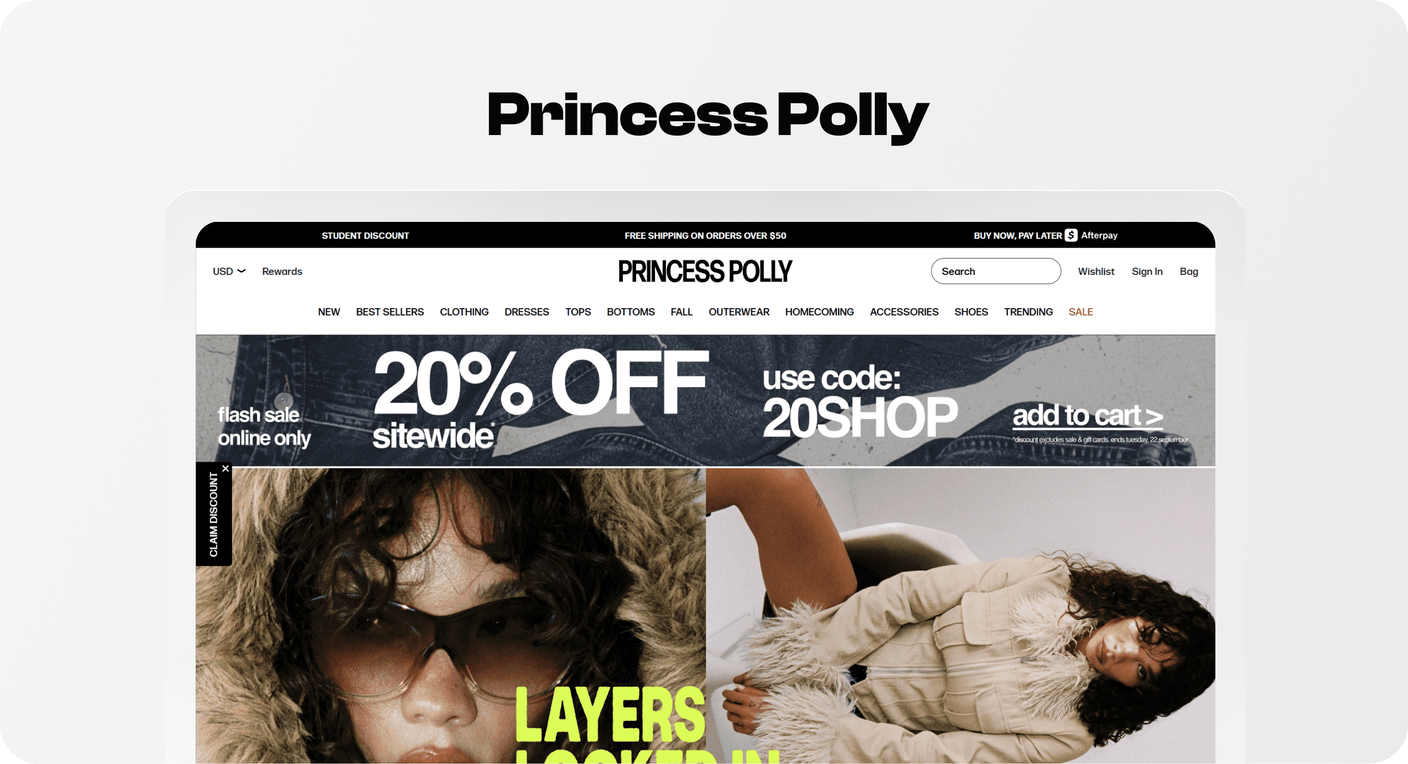
Princess Polly is a strong example for fashion merchants because its storefront is built around pace. The store has to support browsing by trend, newness, sale, category, and occasion while still keeping the path to product quick. That is a different job from a minimalist basics brand or a high-consideration mattress store.
The useful lesson is how commercial paths are made visible. Sale offers, quick product access, reviews, category links, and fast-moving edits all support shoppers who arrive ready to browse rather than research. Trend-driven stores need the product grid to do more work: product imagery, price, sale state, variant availability, and quick-add behavior matter because the shopper may be comparing many items quickly.
The repeatable pattern: when shoppers browse by mood or moment, merchandising should feel current and easy to scan. New arrivals, back-in-stock, occasion edits, sale pages, and bestsellers deserve deliberate placement because they match how fashion shoppers often decide.
Navigation lesson: Use newness, sale, category, and occasion as distinct paths when your audience shops by trend or event.
Merchandising lesson: Keep the first rows fresh. Trend stores feel neglected when old products, weak images, or sold-out items dominate key collections.
Buying clarity lesson: Quick-add and visible sale cues can help, but only when size and variant states are clear enough to prevent mistakes.
4. Leesa: guided buying for a high-consideration product
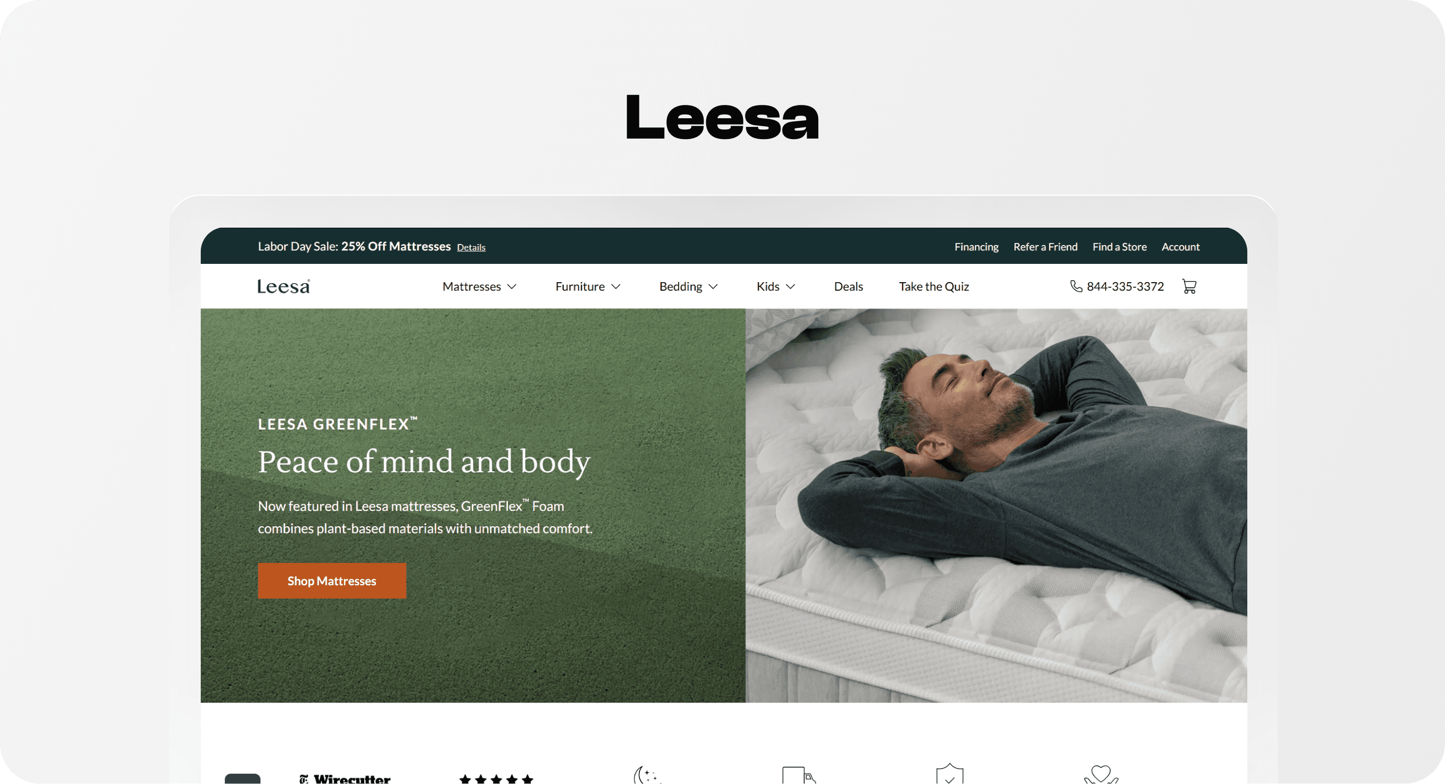
Leesa shows a different kind of Shopify store example: the shopper may not know which product is right. Mattresses require more education than a t-shirt or shaker bottle. Leesa's navigation and shopping paths reflect that with mattress comparison, quiz prompts, bundles, financing, store-finder support, product families, and sale messaging.
This is where buying clarity becomes more important than visual novelty. A high-consideration product page or collection has to answer: Which model is right for me? What is the difference between foam, hybrid, cooling, natural, kids, plus, or pet options? What does the price include? Can I finance it? What happens if it does not work?
The repeatable pattern: if shoppers need help choosing, build assisted paths into the store rather than hiding them in a blog post or FAQ. Comparison pages, quizzes, bundles, product cards with meaningful differentiators, and trust cues should all help the shopper reduce uncertainty.
Navigation lesson: Include decision aids such as compare, quiz, bundles, financing, and store locations when they directly support buying.
Collection lesson: Do not make high-consideration products look interchangeable. Product cards should surface the differences that matter.
Trust lesson: Shipping, returns, warranties, financing, reviews, and trial information should appear before the shopper has to hunt for them.
5. Fable: lifestyle merchandising that sells complete sets
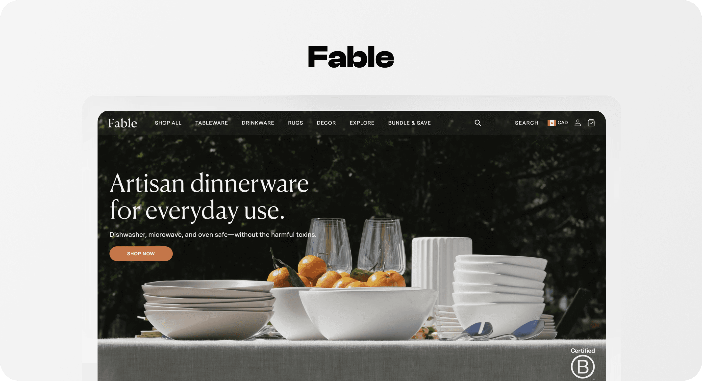
Fable is a useful example for home and dinnerware stores because the buying decision often happens at the set, occasion, or room level, not only at the individual SKU level. The storefront leans into lifestyle presentation, product bundles, reviews, and collection paths that help shoppers imagine the products together.
The store's repeatable lesson is that merchandising can make product architecture feel simpler. A dinner plate, bowl, glass, mug, and flatware product set can become a confusing list of SKUs, or it can become a complete table setting. Bundles and coordinated collections help shoppers buy with less assembly work.
This matters for Shopify stores that sell products meant to work together: skincare routines, bedding sets, cookware systems, office setups, pet starter kits, coffee gear, fitness bundles, or gift boxes. The store should not make the shopper assemble the logic alone.
Merchandising lesson: Use bundles, starter sets, and "complete the set" modules when products are naturally bought together.
Visual hierarchy lesson: Lifestyle imagery should clarify use and scale, not just create atmosphere.
Buying clarity lesson: Show what is included, what can be customized, and why the set is better than buying items separately.
6. Kotn: restrained design with brand trust built into the path
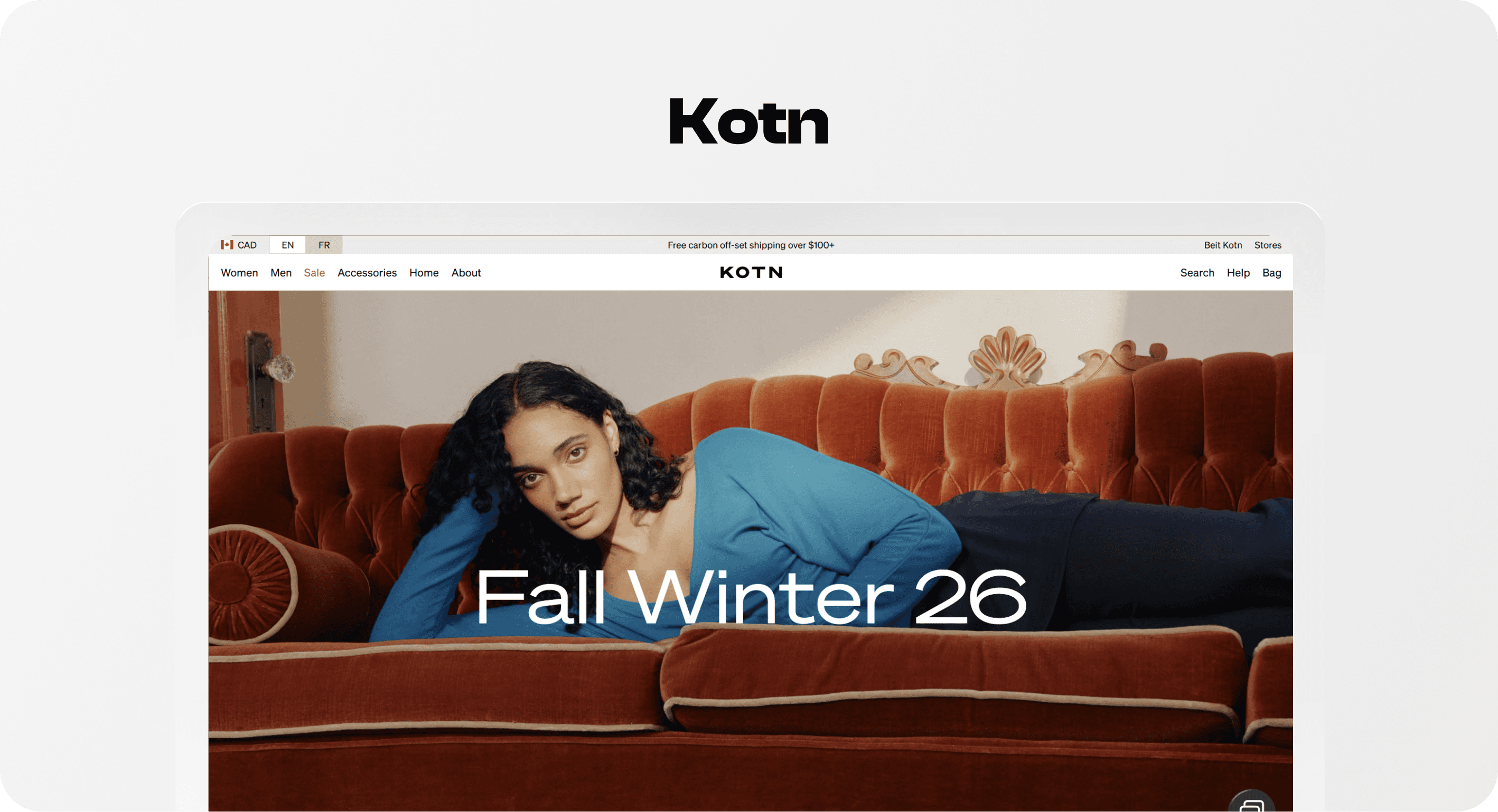
Kotn is a strong Shopify store design example for merchants who want a quieter, premium experience. The navigation is restrained: women, men, sale, accessories, home, about, stores, search, help, and bag. The store does not need to shout because the product line, materials, ethics, and brand restraint are part of the value proposition.
The lesson is not that every store should be minimal. The lesson is that minimal design only works when the remaining choices are clear. Kotn can keep the interface calm because the categories are familiar and the brand story reinforces why the products deserve attention. The design gives breathing room to quality, comfort, ethics, and editorial product presentation.
The repeatable pattern: if your brand relies on trust, craft, sourcing, ethics, or premium basics, keep the shopping path calm but not vague. Make the catalog easy to enter, then use content and product detail to support credibility.
Navigation lesson: A short menu can work when category labels are plain and the catalog is not too complex.
Brand lesson: Mission content should support commerce with proof, not interrupt product discovery with broad claims.
Mobile lesson: Minimal mobile design still needs obvious search, cart, category paths, help, and returns access.
7. BlenderBottle: product-type discovery with quick comparison cues
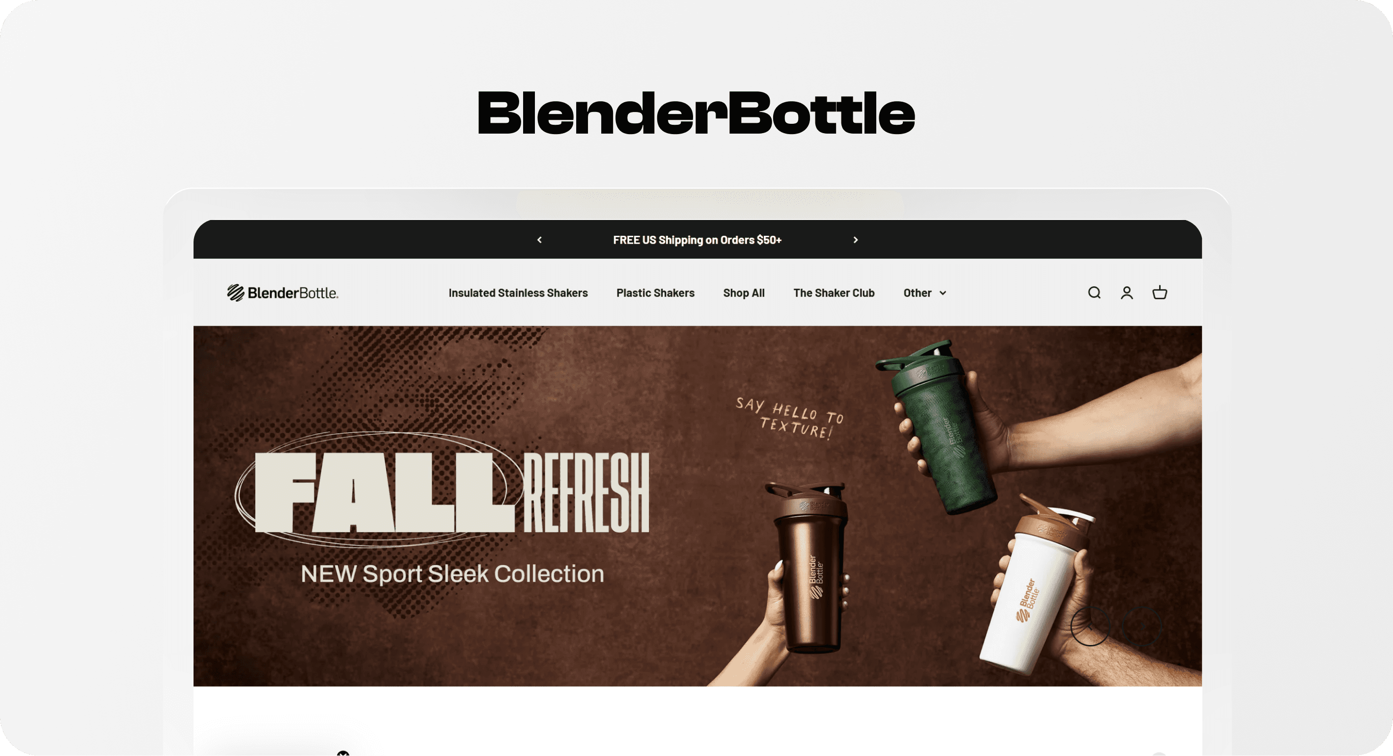
BlenderBottle is a practical Shopify website example for stores with many variants, product families, and accessories. The header exposes insulated stainless shakers, plastic shakers, shop all, new releases, best sellers, accessories, sale, and a product quiz. The page also uses reviews, fan favorites, and quick-add cues to shorten the path from browsing to product selection.
The useful pattern is product-type discovery. Shoppers may not know the product name, but they usually know the use case: insulated, plastic, tumbler, accessory, gym bottle, protein shaker, or gift. A quiz can help when product differences are real but hard to compare at a glance.
This is a good model for Shopify stores with functional variants: water bottles, supplements, coffee equipment, tools, pet supplies, tech accessories, skincare formulas, or food products. The storefront should help shoppers choose by use case, material, size, feature, and popularity.
Navigation lesson: Expose product types and best sellers before asking shoppers to know exact product names.
Collection lesson: Product cards should show the comparison details that matter: material, size, rating, color, feature, or bundle value.
Buying clarity lesson: Quick-add is useful when variants are simple; for complex variants, make selection states impossible to miss.
How to apply these Shopify store examples to your own store
The wrong way to use Shopify store examples is to copy the surface design: the same hero layout, the same menu size, the same product-card styling, or the same homepage section order. That usually creates a store that looks inspired but does not solve the merchant's actual buying path.
The better approach is to copy the decision logic. Ask what the example is helping shoppers do, then decide whether your store has the same problem.
If shoppers do not know where to start, copy Allbirds' and BlenderBottle's emphasis on familiar product paths and bestsellers.
If the catalog is broad, copy Gymshark's grouped navigation logic, not the exact number of menu links.
If products move quickly, copy Princess Polly's focus on newness, sale, trends, and quick product movement.
If the product is expensive or complex, copy Leesa's decision support with compare, quiz, bundles, financing, and trust cues.
If products work together, copy Fable's set-based merchandising and lifestyle context.
If brand trust is a major reason to buy, copy Kotn's restraint and proof-led story placement.
For Shopify merchants comparing Shopify apps to increase sales, this order matters: fix the shopping path first, then add tools that clarify decisions. Badges, icons, reviews, recommendations, search, filters, and bundles work best when the underlying navigation and merchandising already make sense.
Common mistakes to avoid when copying Shopify website examples
Copying the homepage but not the catalog logic. A homepage section only works if the linked collection or product page continues the promise.
Using branded names too early. Product-line names are useful after shoppers understand the category. Use plain labels first.
Making every collection a "best seller" page. Best sellers, new arrivals, sale, bundles, gift guides, and category pages each need a different job.
Treating mobile as a smaller desktop. Menus, filters, product cards, popups, sticky bars, and quick-add controls need a real mobile pass.
Adding trust badges as decoration. Trust cues should answer real questions: payment safety, delivery, returns, material quality, reviews, guarantees, or support.
Letting visual style outrank buying clarity. A beautiful Shopify design still fails if shoppers cannot compare products or understand the next step.
Where Snapp fits
Snapp should not be positioned as a replacement for strong navigation, product photography, collection structure, or merchandising. Its role is the confidence layer: clean trust badges, payment icons, product benefit icons, and reassurance cues that help shoppers understand why it is safe and sensible to keep moving.
For stores inspired by these examples, use Snapp where trust and clarity belong: near the add-to-cart area, beside shipping and returns information, around product benefit blocks, close to payment reassurance, or inside simple product-page icon rows. The goal is to support buying decisions without creating clutter. For deeper implementation ideas, connect this article to Snapp's guides on Shopify product page optimization and Shopify product page icons.
Final recommendation
The best Shopify store examples are useful because they reveal patterns, not because they are perfect templates. Allbirds shows how simple category paths can support a strong brand story. Gymshark shows how a large catalog can stay navigable. Princess Polly shows how trend merchandising can move fast. Leesa shows how high-consideration products need guided buying. Fable shows how sets and lifestyle context can simplify product decisions. Kotn shows how restraint can build premium trust. BlenderBottle shows how product-type navigation and quick comparison cues help shoppers choose.
If you want to improve a Shopify store, start with the shopper's next decision. What are they trying to find? What do they need to compare? What doubt blocks the add-to-cart click? What information is hidden too late? Once those answers are clear, design becomes less about inspiration and more about helping people buy with confidence.