TL;DR
A strong Shopify collection page has a job. It should help shoppers browse, compare, and choose, not simply display every product in a category.
Start with collection hierarchy. Build collections around shopper intent, product type, use case, season, price, or problem instead of internal catalog logic.
Product cards carry the comparison work. Use consistent imagery, clear names, prices, variants, ratings, and short trust cues so shoppers can decide what deserves a click.
Mobile collection design needs tighter choices. Keep the collection intro short, make sort easy to access, avoid oversized cards, and test the full browse path on real phones.
Filters matter, but they are not the whole page. Use them briefly and intentionally here; the deeper filter strategy deserves its own dedicated article.
What a Shopify collection page needs to do
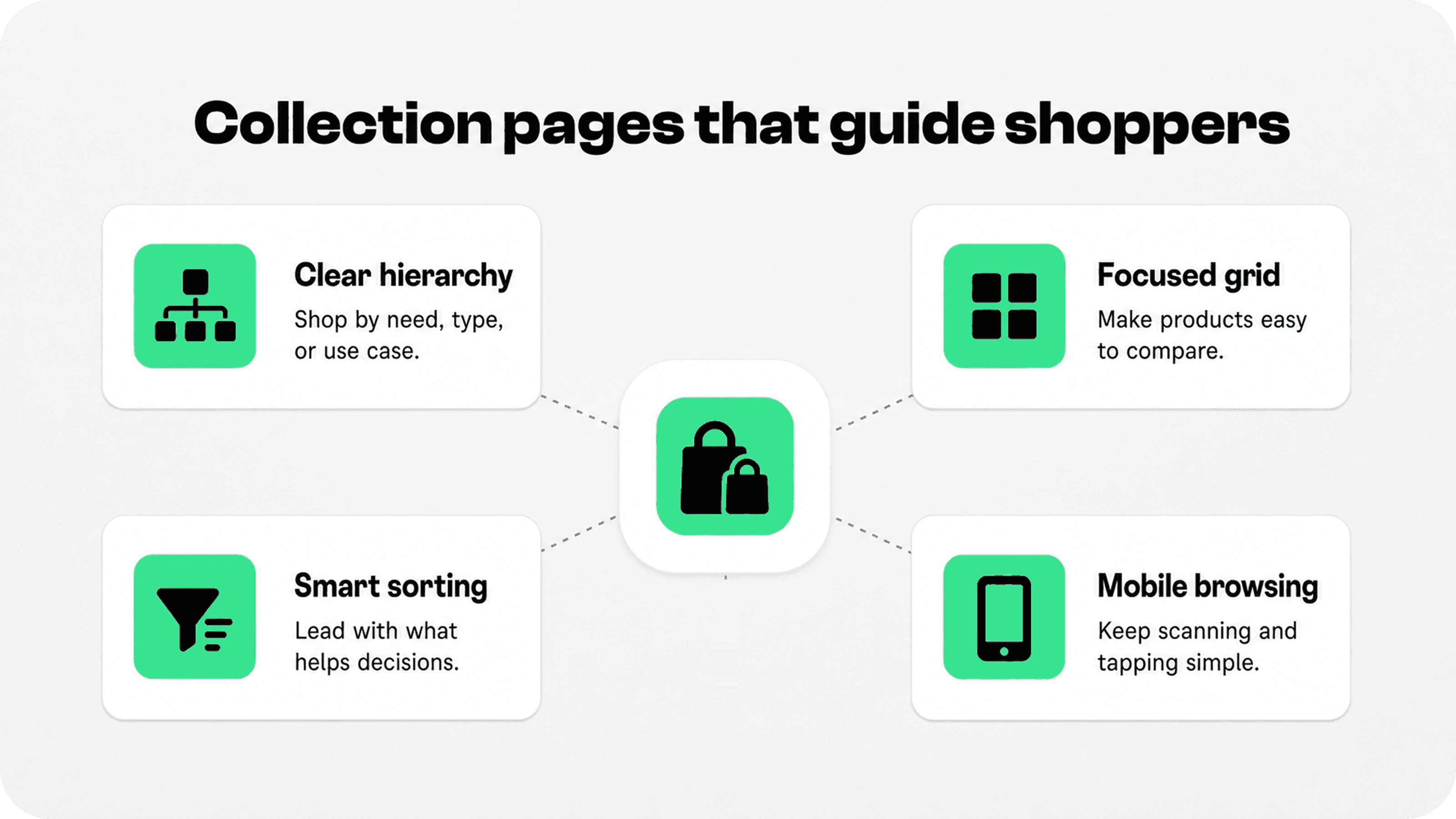
A Shopify collection page is a product discovery page. It sits between the store navigation and the product detail page, which means it has to translate broad interest into a smaller set of useful choices.
That sounds simple, but many Shopify stores treat collection pages as static shelves: a title, a long grid, maybe a filter sidebar, and little else. Shoppers then have to work out which products matter, how the category is organized, whether the products are comparable, and what to click first.
Shopify’s Help Center explains that collections group products into categories and that the exact layout and appearance of collection pages depends on the theme and template a store uses. Shopify also lets merchants choose different default sorting options for individual collection pages. Source: Shopify collections documentation.
The practical takeaway is that collection page optimization is partly admin structure and partly storefront design. The collection has to contain the right products, but the page also has to explain why those products belong together and make the next comparison easy.
For most stores, a good shopify collection page should answer five questions quickly: Where am I? What kinds of products are here? Which products should I look at first? How can I narrow the list? What makes one product different from another?
Build collection hierarchy around shopper intent
Collection hierarchy is the foundation of Shopify collection page optimization. If the collections are too broad, shoppers get dumped into a generic product wall. If they are too narrow, navigation becomes fragmented and hard to maintain.
Start by mapping how customers actually shop. Some shoppers browse by product type: dresses, lamps, coffee grinders, skincare sets. Others shop by use case: gifts under $50, office essentials, outdoor entertaining, sensitive skin, beginner kits. Strong collection architecture usually includes both.
Use top-level collections for the categories shoppers expect, then use subcollections, navigation links, collection tiles, or featured blocks to route people into more specific paths. A clothing store might start with Women, Men, Accessories, and Sale, but the collection page can guide shoppers into New Arrivals, Workwear, Wedding Guest, Linen, Best Sellers, or Under $100.
Shopify supports manual collections and automated collection rules, and its smart collection documentation notes that automated collections use conditions and sort order to add matching products. Source: Shopify smart collection documentation. Use automated rules when the product set changes often, and use manual control when editorial merchandising matters more than rule-based inclusion.
The goal is not to create every possible collection. The goal is to create the paths that help shoppers make progress. If a collection does not match a real browsing intent, drive meaningful search traffic, or support a merchandising plan, it may be adding clutter.
Design product grids for scanning and comparison
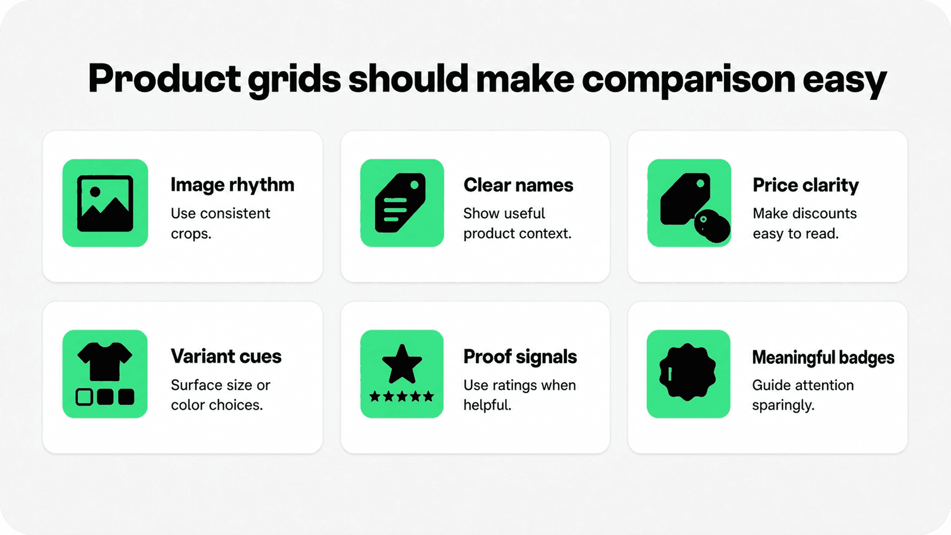
Shopify collection page design usually rises or falls with the product grid. The grid is where shoppers scan, compare, pause, and decide whether a product page is worth opening.
Use a grid density that matches the product type. Visual categories such as apparel, home decor, jewelry, beauty, and food often need larger images because shoppers compare color, texture, shape, packaging, or style. More technical categories may need denser cards with specs, compatibility, dimensions, or model differences.
Keep image ratios consistent. A collection page with mixed square, portrait, and landscape product images feels harder to scan because every card has a different rhythm. Consistent image cropping, background treatment, and product scale let shoppers compare products instead of comparing photography quality.
Product card copy should be short but useful. A card can often include the product name, price, sale price if relevant, rating count, color or size availability, one distinguishing attribute, and a small product badge for meaningful states such as New, Best seller, Low stock, Bundle, or Final sale.
Baymard’s product list UX research focuses on how users scan, evaluate, filter, and sort products in product listing pages. Its 2025 benchmark summary reports that many ecommerce sites still underperform on product list UX, especially on mobile. Source: Baymard product list UX research.
That is the useful lens for Shopify merchants: the grid should reduce comparison effort. If shoppers need to open every product page just to learn price, variant availability, size range, or key differences, the collection page is not doing enough discovery work.
Use one clear best-practice checklist
Use this table as a practical audit before redesigning a collection page. It keeps the work focused on product discovery rather than purely visual changes.
Collection page area | Best practice | Why it helps discovery | Avoid |
|---|---|---|---|
Collection title and intro | Use a clear H1 and one short intro that explains the category or use case. | Confirms the shopper is in the right place without pushing products too far down. | Long SEO blocks above the grid. |
Collection hierarchy | Link to useful subcollections, use-case groups, seasonal edits, or best-seller paths. | Lets shoppers choose a smaller path before scanning dozens of items. | Internal catalog names shoppers do not understand. |
Product grid | Use consistent image ratios, predictable spacing, and enough columns for comparison. | Creates a steady rhythm so products are easy to scan side by side. | Mixed image crops, uneven card heights, and oversized gaps. |
Product cards | Show price, sale state, rating, variant cue, and one meaningful badge when useful. | Lets shoppers compare without opening every product page. | Decorative badges or hidden prices. |
Sorting | Default the collection to the most helpful order for that collection’s goal. | Puts the most relevant products in the first screen instead of relying on shoppers to sort. | One default order across every collection. |
Mobile layout | Shorten intro copy, keep sort visible, and use compact cards with tappable controls. | Protects the mobile browse flow where space and attention are limited. | Huge banners, tiny tap targets, and badge rows that wrap badly. |
Choose sorting that matches the collection goal
Sorting is one of the quietest but most important Shopify collection page optimization levers. Default sort order decides what shoppers see first, especially on mobile where only a few products are visible in the first scroll.
Do not use the same default sort for every collection by habit. A New Arrivals page should usually lead with newest products. A Best Sellers page should reinforce popularity. A Sale page might sort by featured products, discount depth, inventory priority, or price depending on the campaign. A gift guide might lead with the strongest editorial picks.
Shopify’s collection layout documentation explains that merchants can change a collection’s default sort order from the collection’s items section and can choose manual sorting when they want to rearrange products directly. Source: Shopify collection layout documentation.
Manual sorting is useful when merchandising matters: launch products, margin priorities, seasonal inventory, campaign products, bundles, or items that photograph well together. Automated sorting is useful when the point of the collection is objective: newest, best selling, price, or title.
The best rule is simple: choose the default order that helps the shopper make the best first click. Then keep alternate sort controls available for people who want cheapest, newest, most popular, or alphabetic views.
Write collection copy that helps, not hides the grid
Collection copy has two jobs: orient the shopper and support search. It should not become a wall of text that pushes the product grid below the decision area.
Put the most useful copy above the grid: one or two sentences that explain what the collection contains, who it is for, and how to choose. If the collection needs more SEO content, move the longer buying guide, FAQs, or educational copy below the first product set.
For example, a collection page Shopify merchants use for “linen bedding” might open with: “Breathable linen bedding for warm sleepers, layered beds, and relaxed everyday texture. Compare sheet sets, duvet covers, pillowcases, and bundles by color, size, and fabric weight.” That copy helps shoppers browse. It is not filler.
Use collection copy to explain differences that product cards cannot fully show: fit, material, compatibility, bundle value, sizing, care, seasonality, or gift suitability. Then let the grid take over.
Make product imagery consistent and decision-friendly
Imagery is one of the fastest ways to improve Shopify collection page examples because shoppers compare visually before they compare details. The product photos do not need to be identical, but they do need to feel consistent enough that the category is easy to scan.
Use consistent primary images inside a collection. Apparel might use model shots for the first image and detail shots on hover. Beauty might use clean pack shots with texture or shade cues. Home decor might need scale context. Technical products might benefit from the product at the same angle so differences are obvious.
The first image should answer the most important visual question. If shoppers buy based on color, show color clearly. If they buy based on shape, show shape. If they buy based on scale, show scale. Hover images and secondary media can add context, but the first grid image carries the scan.
Avoid using lifestyle-only images as every primary grid image. Lifestyle photos can make a brand feel richer, but they often make comparison harder when products are small, cropped, hidden, or lit differently. Use them where they clarify use, not where they obscure the product.
Design product cards for the comparison shoppers actually make
A product card is not just a thumbnail. It is a compact decision unit. The right card information depends on the catalog, but the principle is the same: show what shoppers need before clicking.
For apparel: show price, sale state, color count, size availability, model or fit cue, and rating when available.
For beauty: show shade count, skin type, product size, rating, and bundle or refill status.
For home goods: show dimensions, material, color, delivery cue, and whether variants are available.
For electronics or accessories: show compatibility, key spec, warranty or return cue, and stock status.
For gifts: show price band, personalization, shipping deadline, review proof, and best-seller status.
Keep card badges meaningful. A single “Best seller” or “New” badge can guide attention. Five competing badges make the card harder to read. If every product has the same badge, it is no longer helping shoppers choose.
When a card needs light reassurance, use specific trust cues instead of generic decoration. Snapp’s guide to Shopify product page icons is useful for deciding which icons belong near product decisions, and Snapp Trust Badges & Icons can help merchants add clean, on-brand benefit and trust blocks without editing theme code.
Optimize mobile collection pages first
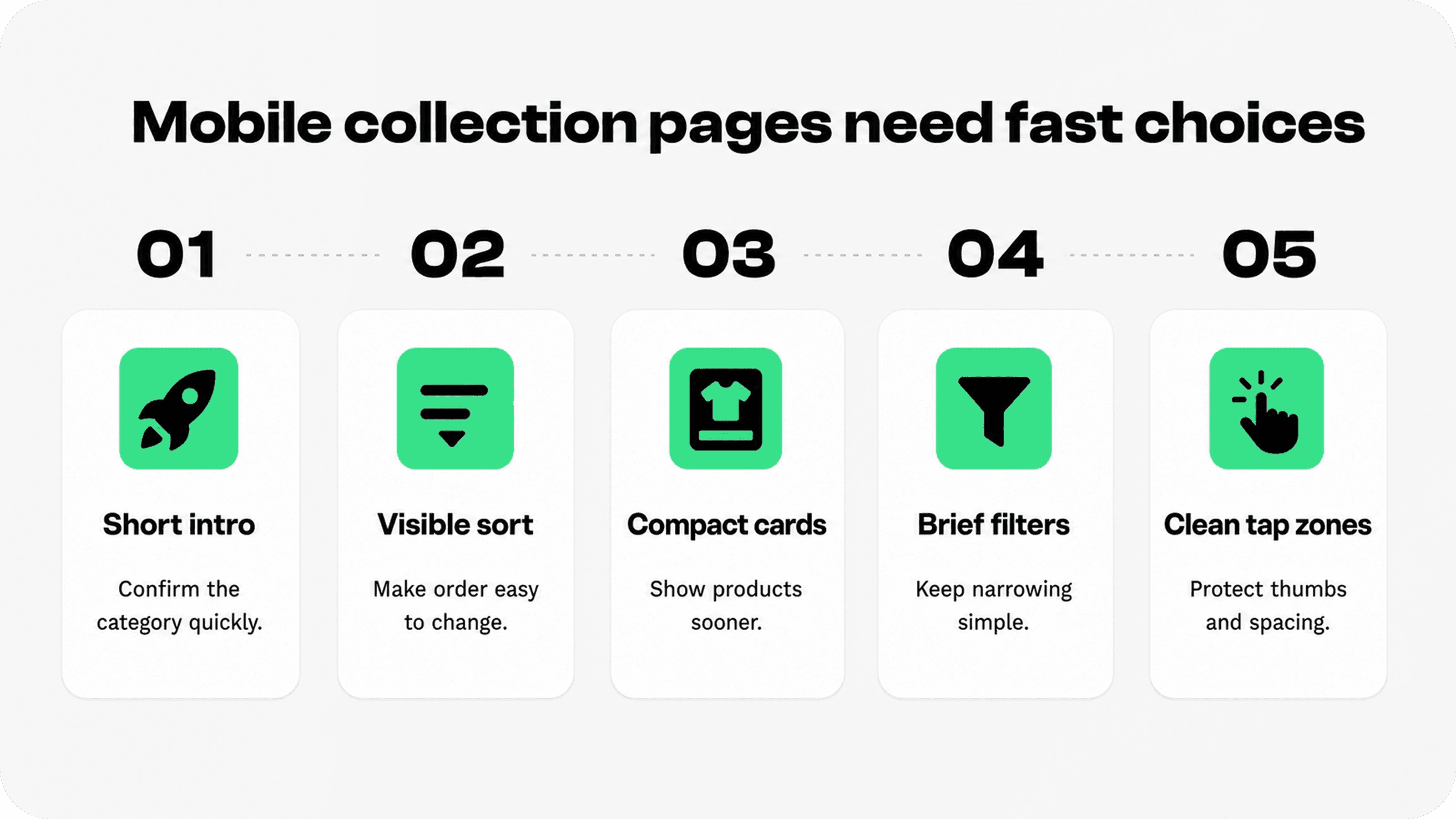
Mobile is where weak collection pages become obvious. A desktop grid can hide clutter with space. A mobile collection page has to prioritize ruthlessly because shoppers see fewer products, tap with less precision, and abandon faster when the page feels heavy.
Start with the first mobile screen. The H1 should be clear, the intro should be short, and products should appear quickly. If a hero banner or SEO paragraph pushes the product grid too far down, shorten it or move deeper content below the grid.
Keep sort accessible. Sorting is often more important than filters for small and medium catalogs because shoppers may simply want newest, lowest price, highest price, or best selling. The control should be easy to find and tap, not buried at the bottom of a drawer.
Use product cards that survive narrow screens. Product names should wrap cleanly. Prices should not collide with ratings. Variant swatches should not create a second messy row unless they genuinely help. Quick-add can help repeat purchases, but it should not hide variant decisions that need context.
For a deeper mobile pass, connect this article to Snapp’s guide on Shopify mobile optimization, which covers navigation, tap targets, speed, content order, and collection browsing across the full mobile buying path.
Use filters briefly, then keep the page broader
Filters are important for larger catalogs, but they should not carry the whole collection page. A filter drawer cannot fix weak hierarchy, unclear product cards, poor sorting, or inconsistent product images.
Shopify’s Search & Discovery app is the native starting point for customizing storefront search, filters, and product recommendations, and Shopify’s storefront filtering documentation points merchants to that app for filter customization. Source: Shopify Search & Discovery app.
For this article, the useful filter guidance is intentionally short: choose filters that match real buying criteria. Size, color, price, material, availability, compatibility, product type, rating, and use case are common examples, but the right set depends on the category.
Also keep filter labels clean. If product tags or metafields are messy in the admin, shoppers see that mess on the storefront. Standardize product data before relying on filters to improve collection page Shopify discovery.
Merchandise collections like guided shelves
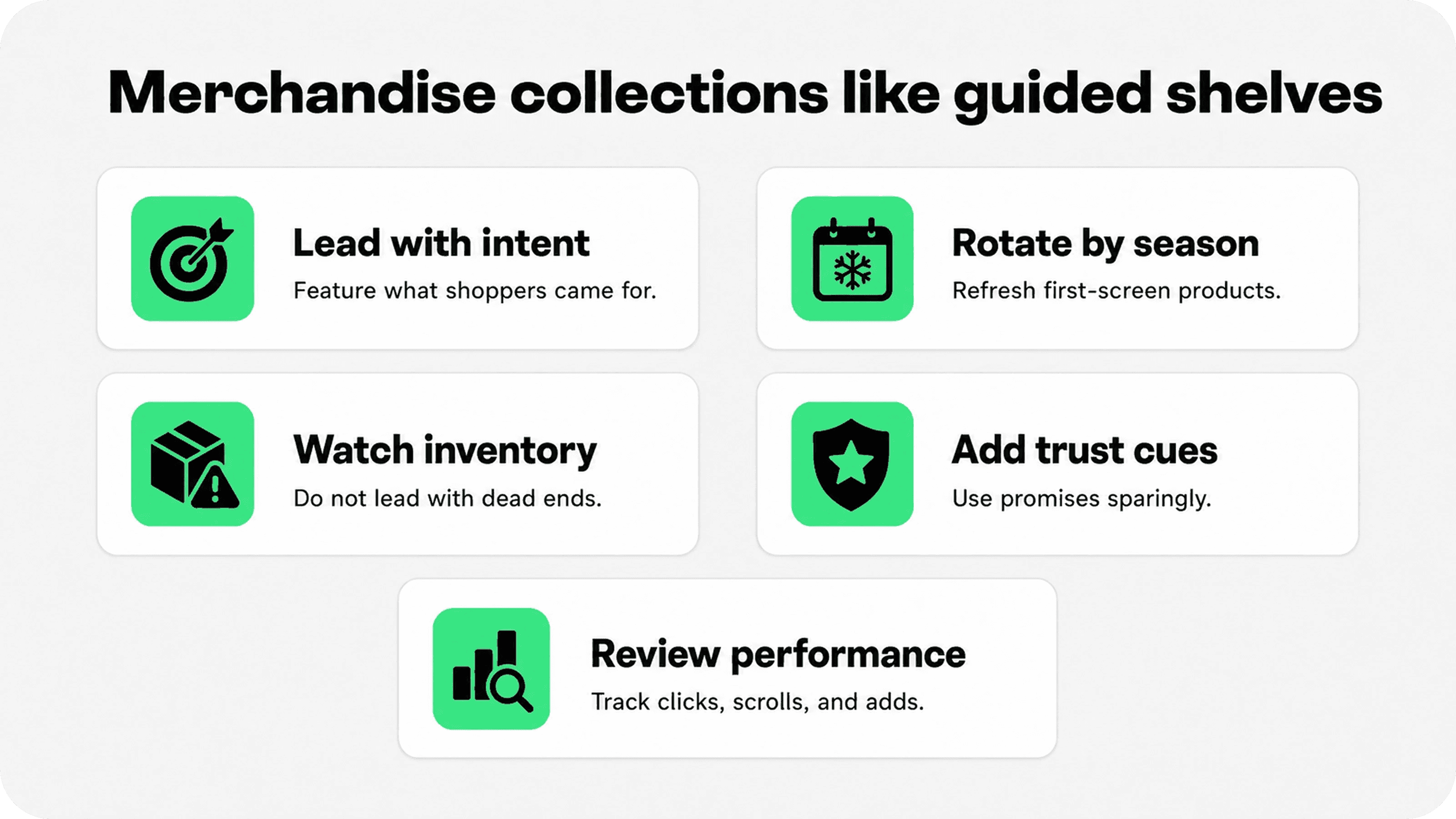
Merchandising is where Shopify collection page design becomes more than layout. It is the choice of what to feature first, what to group together, what to promote, and what to hide when it no longer helps the shopper.
Use collection merchandising to support the store’s current goal. A new-season collection might feature fresh arrivals and editorial color stories. A sale collection might prioritize high-stock, high-margin, or high-discount products. A gift collection might group by recipient, price, shipping deadline, or best-seller status.
Watch inventory. A collection that leads with sold-out products teaches shoppers to stop trusting the page. If sold-out products stay visible for SEO or restock demand, push them lower, mark them clearly, or use back-in-stock capture where appropriate.
For the broader merchandising system, link readers to Snapp’s guide on Shopify merchandising. This article should stay focused on the collection page itself, while the merchandising guide can cover broader product ordering, campaign planning, and cross-sell logic.
Collection merchandising should be reviewed regularly. What belongs at the top in April may not belong there in July. Build a simple monthly or seasonal review: top clicked products, top added products, low-performing first-screen products, sold-out products, search terms, filter usage, and mobile scroll depth.
Use internal links to move shoppers forward
Collection pages are also useful internal-link hubs. They can point shoppers to related collections, buying guides, product education, size guides, shipping information, returns, and trust content without forcing every answer onto the product card.
For example, a merchant could link from a collection intro or lower-page buying guide to related Snapp resources such as No Sales on Shopify? Why Your Store Gets Traffic but No Orders when diagnosing product discovery issues, or Shopify Product Page Optimization: Trust Elements That Help Customers Buy when the collection page is sending clicks but product pages are not converting.
For merchants comparing Shopify apps to increase sales, the best approach is still to fix the discovery path first: collection hierarchy, grid clarity, product cards, mobile flow, and then the tools that support those jobs.
Internal links should feel like helpful next steps, not SEO footnotes. Put them where the shopper is deciding what to do next.
Measure whether collection page optimization worked
A collection page can look better without performing better. Measure the changes that show whether product discovery actually improved.
Collection click-through rate: how often visitors click from the collection page to product pages.
Product-card engagement: clicks on badges, quick-add, swatches, ratings, or hover states if tracked.
Sort and filter usage: whether shoppers use controls and whether those users convert better.
Mobile scroll depth: whether shoppers reach enough of the grid to find options.
Add-to-cart rate from collection traffic: whether better browsing leads to stronger product intent.
No-result or low-result paths: collections or filters that create dead ends.
Use the data to improve the page in order. If shoppers do not click products, fix hierarchy, imagery, product cards, and first-screen sorting. If they click products but do not buy, the problem may sit on the product page, price, trust layer, offer, or checkout.
Final recommendation
The best Shopify collection page is not the most decorated one. It is the page that helps a shopper go from “I’m interested” to “this product is worth opening” with the least confusion.
Start with shopper-focused collection hierarchy, then improve the grid, product cards, sorting, imagery, mobile layout, and merchandising. Use filters as support, not as a substitute for page clarity. When each part of the collection page has a job, product discovery becomes faster, cleaner, and more likely to lead to the right product page.