TL;DR
Shopify mobile optimization is bigger than responsive design. It covers speed, navigation, product discovery, tap comfort, content order, cart clarity, and checkout flow.
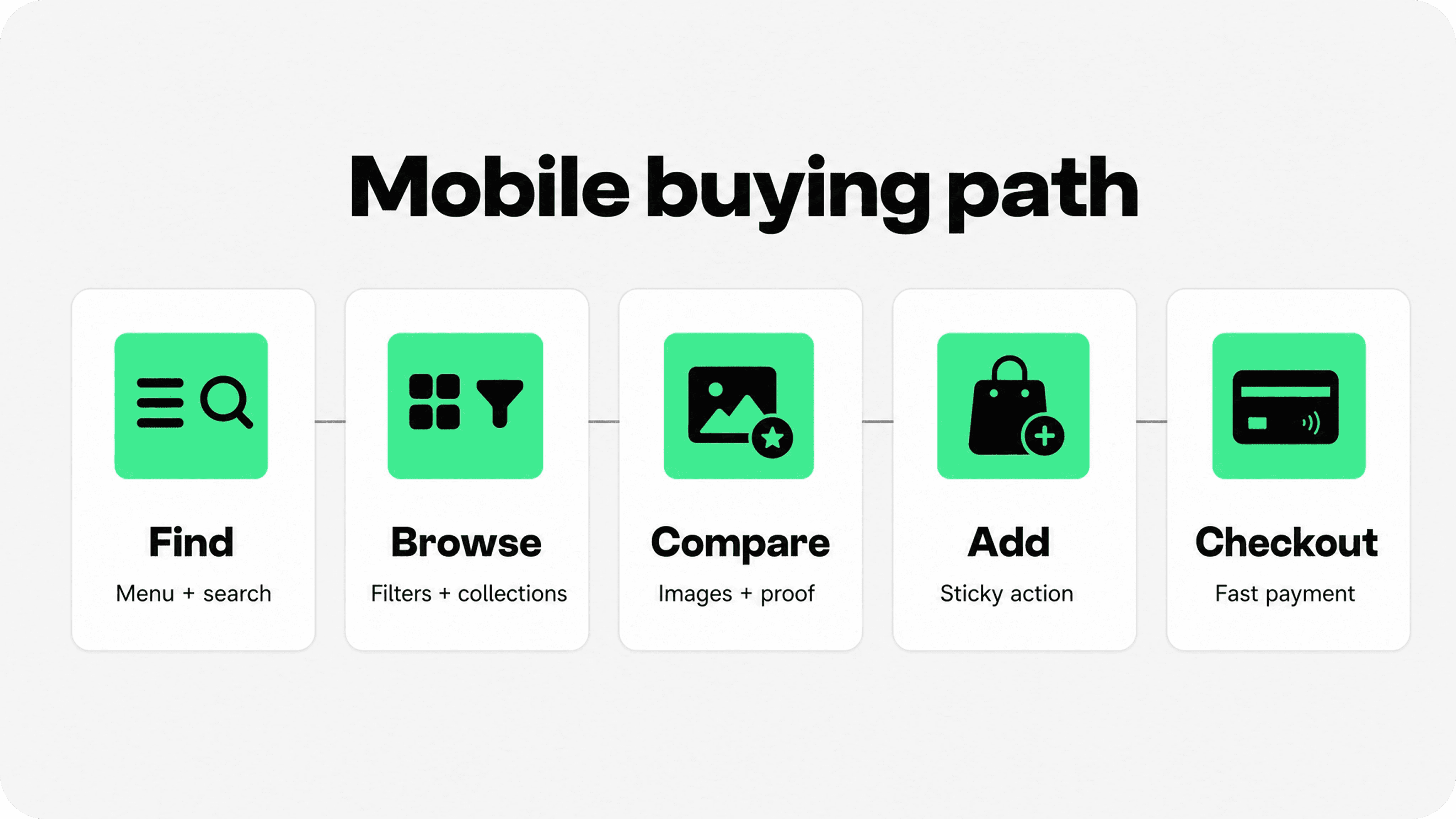
Start with the full mobile buying path: find a product, browse collections, compare options, add to cart, and complete checkout.
Keep mobile pages focused. Put the product, price, variant choices, key proof, delivery/returns cues, and add-to-cart action ahead of secondary content.
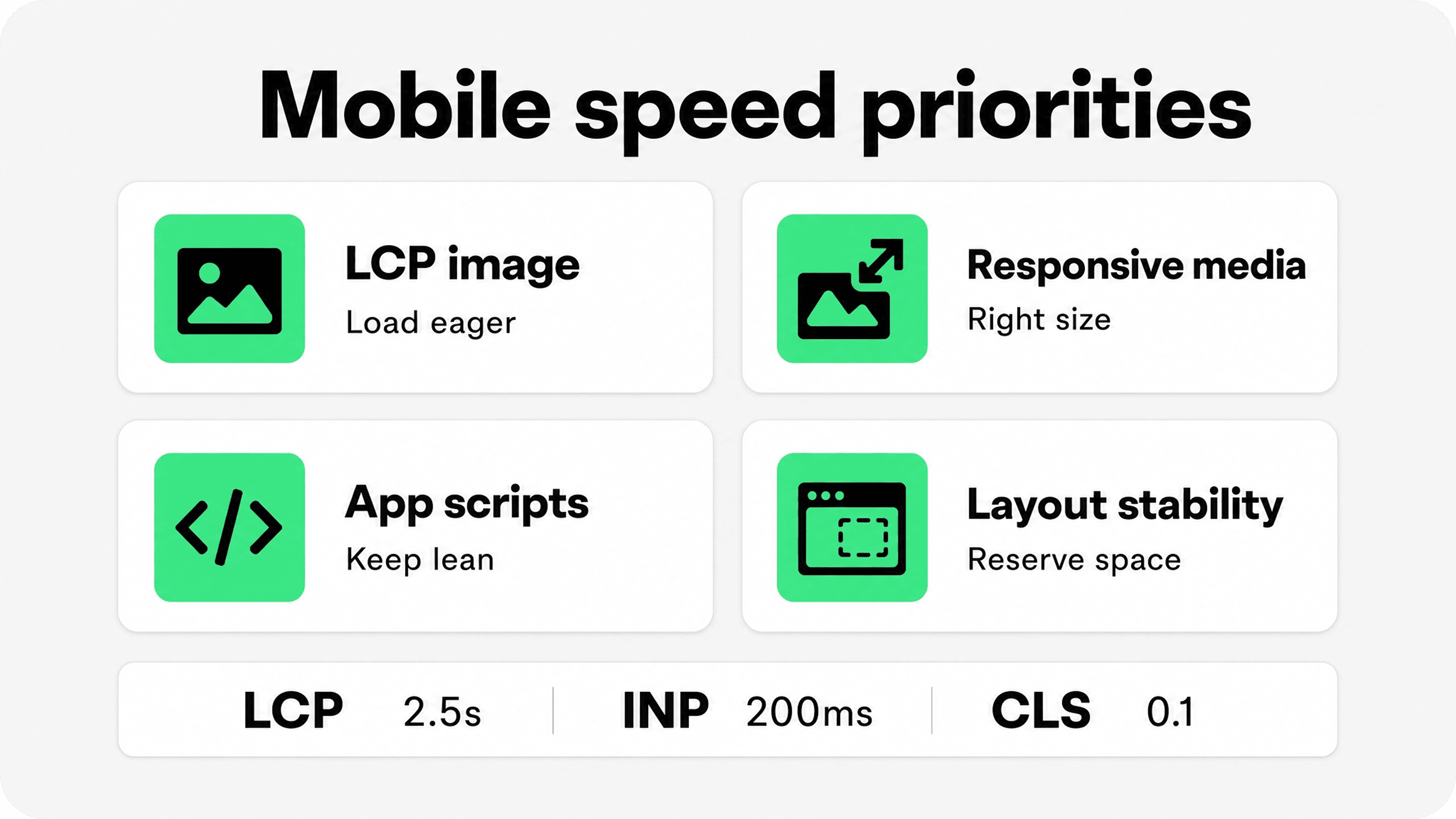
For speed, prioritize Core Web Vitals: LCP under 2.5 seconds, INP under 200 milliseconds, and CLS under 0.1.
Snapp can support the mobile trust layer with clean badges, payment icons, and product benefit icons that stay close to buying decisions without cluttering the page.
What Shopify mobile optimization really means
To optimize Shopify for mobile, start with the shopper, not the theme setting. A mobile shopper is usually scrolling with one hand, comparing products quickly, waiting on a smaller network connection, and deciding whether the next tap is worth it. If the page is slow, crowded, hard to navigate, or vague about checkout, the store feels harder to trust.
A mobile-optimized Shopify store makes each step of the buying path feel obvious: the shopper can find the right category, scan product cards, open a useful product page, choose variants without errors, add to cart, review costs, and pay with minimal friction.
That is why the best mobile ecommerce best practices combine UX and performance. Google defines Core Web Vitals around loading, responsiveness, and visual stability, with good thresholds of LCP within 2.5 seconds, INP under 200 milliseconds, and CLS below 0.1. Source: Google Search Central Core Web Vitals.
For merchants, those metrics are not abstract SEO jargon. LCP often reflects how quickly the main hero, collection image, or product image appears. INP reflects how responsive menus, filters, variant buttons, search, and cart drawers feel. CLS reflects whether content jumps while a shopper is trying to tap.
Simplify mobile navigation before redesigning pages
Mobile navigation should help shoppers move, not make them decode the store structure. Keep the header compact, make search easy to reach, and make the menu labels plain enough that a first-time visitor can choose a path without guessing.
For small catalogs, a short menu with top categories, best sellers, new arrivals, sale, and support links may be enough. For larger catalogs, add search, filters, and clear collection grouping so shoppers do not have to scroll through a long menu tree.
Use plain category labels instead of internal brand language.
Keep search visible in the header or one tap away.
Put important support links in the menu, but do not let policy links crowd product discovery.
Make menus easy to close and return from. A trapped menu feels broken on mobile.
Check navigation on a real phone, not only inside the Shopify theme editor preview.
If a store has a broad catalog, connect mobile navigation work to merchandising. Snapp's Shopify merchandising guide is a useful companion because collection structure, filters, product-card details, and featured products all affect mobile product discovery.
Make tap targets comfortable
Small tap targets create accidental taps, especially around menus, filters, variant options, quantity controls, carousel arrows, swatches, and checkout buttons. A store can look clean in a desktop screenshot and still feel frustrating when someone tries to buy with a thumb.
A practical target is to design important mobile controls around 44 to 48 CSS pixels where possible. Google web.dev recommends tap targets around 48 device-independent pixels, while WCAG 2.2 sets a minimum target-size requirement of 24 by 24 CSS pixels with exceptions. Source: web.dev accessible tap targets; Source: WCAG 2.2 target size minimum.
Do not solve this by making everything visually huge. Use padding, spacing, full-width buttons, larger variant hit areas, and clear focus/active states. The visible icon can stay small if the actual tappable area is large enough.
Control mobile content density
Mobile ecommerce UX usually fails when a page asks shoppers to read too much before they can act. The first screen should answer the shopper's immediate questions, not recreate the whole desktop product page in a narrower column.
On product pages, keep the title, price, rating or proof, media, variants, delivery/return cues, and add-to-cart action easy to reach. Move long descriptions, ingredient details, size charts, comparison content, reviews, and FAQs into scannable sections or accordions, but avoid hiding critical buying information.
On collection pages, product cards should expose the comparison details shoppers need before they open a product page. Depending on the category, that might mean price, sale status, material, color count, size range, rating, shipping cue, stock status, compatibility, or product badge.
Prioritize mobile page speed
Page speed is one of the highest-impact Shopify mobile optimization tips because it affects every step of the buying path. A slow home page blocks discovery. A slow collection page makes browsing feel heavy. A slow product page can make the add-to-cart button feel unresponsive. A slow cart drawer can make shoppers wonder whether their tap worked.
Shopify's theme performance documentation says images are often the Largest Contentful Paint element, and that eager or lazy loading, fetchpriority, and responsive sizing directly affect LCP. Shopify also recommends using its image_url and image_tag filter chain so responsive srcset, width, height, CDN delivery, and format handling are generated correctly. Source: Shopify theme performance best practices.
For a typical Shopify theme, the mobile speed audit should start with four areas: the LCP image, responsive media, third-party scripts, and layout stability. Do not lazy-load the main above-the-fold product or hero image. Do use lazy loading for below-the-fold images. Do make collection and product images request mobile-appropriate sizes instead of desktop-sized assets.
Shopify's responsive image guidance is especially useful for mobile collections because oversized product-grid images waste bandwidth when a desktop grid collapses into fewer mobile columns. Source: Shopify responsive image guidance.
Apps and tags also matter. A mobile store can be visually simple but still slow if it loads unused widgets, duplicate analytics scripts, heavy review modules, popups, chat tools, or personalization code on every page. Keep apps that earn their place, remove or disable the rest, and test the pages that actually drive revenue.
Use this mobile Shopify audit table
This table is the practical checklist for the article. Use it to decide what to fix first when the store already has a responsive theme but still feels hard to shop on a phone.
Mobile area | What to check | Best fix | Metric or signal to watch |
|---|---|---|---|
Navigation | Can shoppers reach search, top categories, cart, and support without guessing? | Use clear menu labels, visible search, and short paths to top collections. | Menu taps, search usage, collection entrances |
Tap targets | Are buttons, filters, swatches, quantity controls, and links easy to tap? | Expand hit areas, add spacing, and make primary actions full-width where useful. | Rage taps, mis-taps, mobile add-to-cart rate |
Content density | Does the first product screen answer price, fit, proof, delivery, and next step? | Move secondary content into scannable sections while keeping buying details visible. | Scroll depth, variant errors, product-page conversion |
Images and media | Are mobile users downloading desktop-sized images or waiting on hidden media? | Use responsive images, correct sizes, and lazy-load offscreen media only. | LCP, page weight, product-image engagement |
Collections | Can shoppers filter, sort, and compare product cards quickly? | Expose useful card details and make filters easy to open, apply, and clear. | Filter usage, product clicks, collection conversion |
Sticky actions | Does the add-to-cart or checkout action stay reachable without covering content? | Use a restrained sticky bar with price, selected variant state, and one primary CTA. | Add-to-cart taps, cart opens, blocked content reports |
Cart and checkout | Are total cost, shipping, returns, payment options, and checkout buttons clear? | Show concise reassurance near checkout and support express payment where appropriate. | Cart-to-checkout rate, checkout completion, abandonment reasons |
Improve mobile collections and product browsing

Mobile collections are where many shoppers decide whether the store is worth exploring. Product discovery should feel fast and confident: category, sort, filter, product cards, and search should work together instead of fighting for space.
Filters should be easy to open, understand, apply, and clear. Do not bury active filters below the fold. If a shopper filters by size, color, material, compatibility, price, or availability, show the selected state clearly and make removal obvious.
Product cards need enough information to support comparison without becoming tiny product pages. For fashion, show price, variant availability, colors, sale status, rating, and image consistency. For technical products, show compatibility, size, specs, or use case. For consumables, show quantity, subscription options, ingredients, or shipping cues.
Mobile collection pages should also avoid endless content blocks above products. Editorial copy can help SEO and buying confidence, but it should not push the product grid so far down that shoppers cannot begin browsing.
Make product pages easier to buy from
A mobile product page should help the shopper answer one question quickly: is this the right product to buy now? The page needs strong media, clear pricing, easy variant selection, helpful proof, and an obvious add-to-cart action.
Keep image galleries swipeable, fast, and easy to zoom when product detail matters.
Use variant labels that do not rely only on color dots or tiny swatches.
Show selected variant state clearly before add to cart.
Place sizing, delivery, returns, guarantee, reviews, and payment reassurance near the buying decision.
Avoid pushing the add-to-cart button below too many badges, accordions, or upsell blocks.
For stores improving the product-page confidence layer, link mobile work to Snapp's Shopify product page optimization guide. It explains how delivery, returns, payment safety, product proof, support, and offer clarity should sit near the moment of hesitation.
Use sticky actions carefully
Sticky add-to-cart and sticky checkout bars can help mobile shoppers because the primary action stays reachable after they scroll. They can also hurt mobile ecommerce UX if they cover content, duplicate too many controls, or appear before the shopper has enough information.
A good sticky product bar is restrained. It usually includes the product price or selected variant, one clear add-to-cart button, and perhaps a compact trust cue. It should not become a second product page footer filled with badges, urgency timers, cross-sells, and subscription selectors.
On cart pages or cart drawers, a sticky checkout button can be useful when the order summary is long. Keep it honest by making total cost, shipping thresholds, returns, payment options, and discount state easy to review nearby.
Remove checkout friction on mobile
Checkout is where small mobile issues become expensive. Baymard's cart and checkout research reports an average documented cart abandonment rate around 70% and highlights practical friction around cost clarity, delivery, payment trust, account creation, form complexity, returns, and payment options. Source: Baymard cart and checkout usability research.
Shopify merchants cannot and should not rebuild every part of checkout, but they can improve what surrounds it. Make the cart or checkout-entry point clear, show accepted payment methods honestly, keep returns and delivery expectations visible, and support express checkout where it fits.
Shopify explains that accelerated checkout methods can save customer payment and shipping information so returning customers can complete payment faster, and that hiding accelerated checkout buttons may negatively affect conversion rates. Source: Shopify accelerated checkouts.
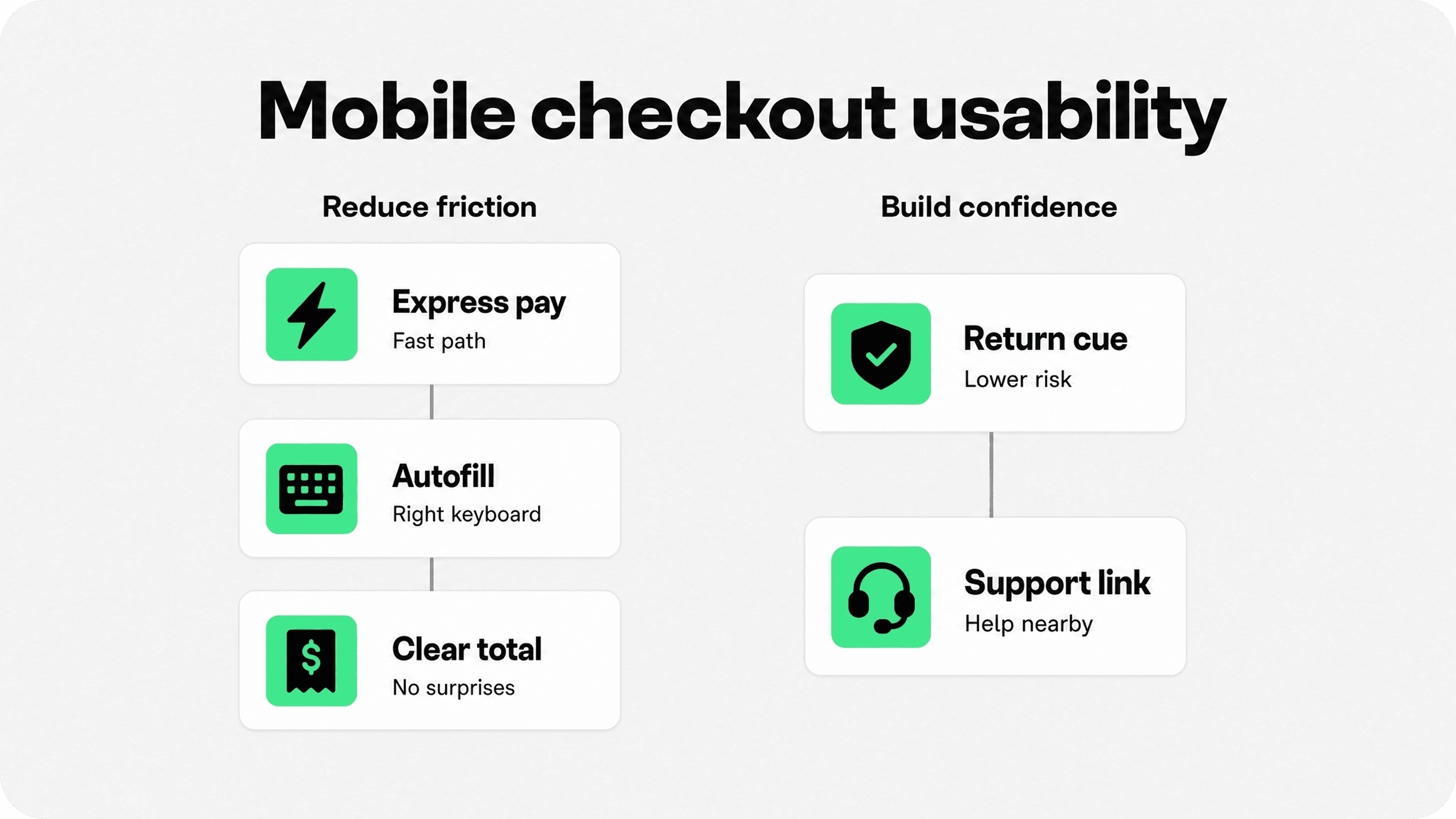
Mobile checkout usability also depends on form comfort: correct keyboard types, clear error messages, visible field labels, autofill support, a clear total, and no surprise costs after the shopper commits to checkout. If a field fails, the error should explain exactly what to fix without making the shopper scroll back and forth.
Where Snapp fits
Snapp should not be positioned as a speed plugin or a full mobile theme redesign tool. Its role is the mobile trust and clarity layer: badges, payment icons, product benefit icons, and simple reassurance blocks that help shoppers understand the offer without custom code.
That makes Snapp useful when a merchant wants mobile confidence cues near product decisions, cart buttons, shipping information, returns, and payment reassurance. For a broader starting point, merchants can explore Shopify apps to increase sales and choose the trust tools that fit their current bottleneck.
The key is restraint. Mobile trust badges, payment icons, and benefit blocks should make the page easier to scan. If they create wrapping issues, push the CTA too far down, or repeat claims that are already clear, they are adding noise instead of confidence.
Final recommendation
The best way to optimize a Shopify store for mobile is to audit the buying path in order: navigation, search, collections, product pages, add-to-cart behavior, cart clarity, and checkout entry. Fix the points where shoppers wait, mis-tap, get confused, or hesitate.
Start with speed and clarity. Make the LCP image load correctly, keep app scripts lean, reserve layout space, expose the right product details, make tap targets comfortable, and keep the primary action visible without crowding the screen. Then add trust cues only where they answer a real mobile shopper doubt.