TL;DR
Shopify merchandising turns a catalog into a guided shopping path. Collections, filters, product order, product cards, recommendations, and visual cues all help shoppers move from browsing to buying.
Start with shopper intent. A strong collection structure answers how people shop: by category, use case, audience, season, price, problem, occasion, or popularity.
Do not sort every collection the same way. Best sellers, new arrivals, manual curation, seasonal picks, and high-margin products each make sense on different pages.
Visual merchandising matters online too. Consistent imagery, clear product cards, useful badges, benefit icons, and trust cues make comparison easier.
Recommendations should feel like help, not noise. Use related products, complementary products, recently viewed items, and featured products where they make the next decision easier.
What Shopify merchandising means
Shopify merchandising is the work of deciding how products appear across your online store: which products sit in each collection, how they are ordered, what gets featured, which product attributes appear on cards, and what recommendations support the next click. It is ecommerce merchandising applied to the structure of a Shopify storefront.
The goal is not to show every product equally. The goal is to help shoppers understand what you sell, narrow the catalog, compare good options, and reach a product page or cart with fewer doubts. A store with strong merchandising feels easier to shop because the catalog is doing some of the selling before the shopper even opens a product page.
Shopify describes ecommerce merchandising as the strategic presentation and promotion of products through categorization, visual display, personalized recommendations, and promotional tactics. Shopify also gives merchants practical merchandising levers: collections, collection sort order, storefront filters, search customization, and product recommendations. In other words, merchandising is not just a design idea. It is a store operating habit.
Start with shopper-friendly collections
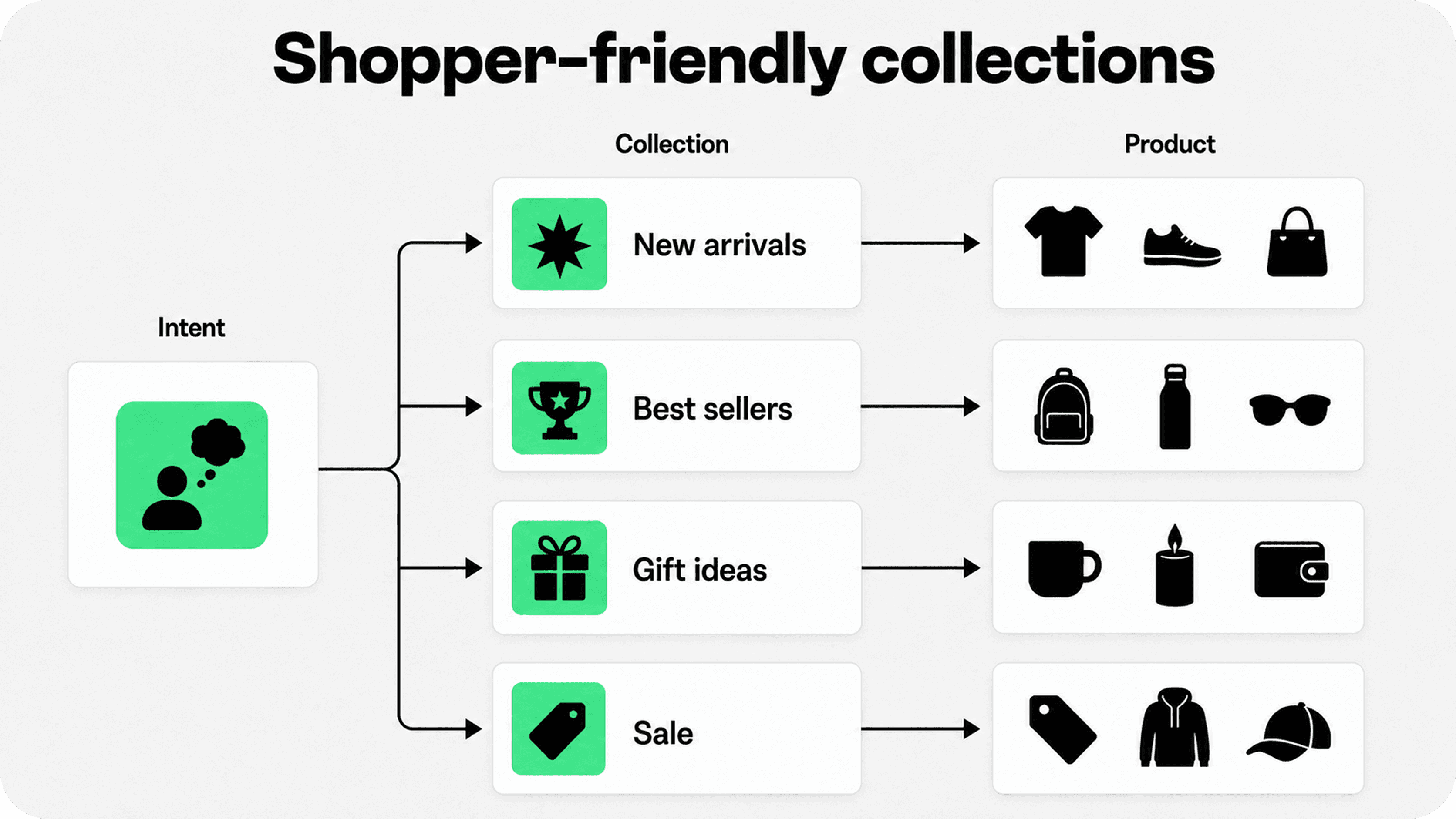
Collections are the backbone of Shopify merchandising. They are the pages shoppers use when they know the type of product they want but have not chosen the exact item yet. That makes collection structure one of the highest-leverage parts of an online merchandising ecommerce plan.
A weak collection structure mirrors the merchant’s internal catalog. A strong collection structure mirrors how shoppers think. For a clothing store, that might mean collections by product type, occasion, season, fit, material, color, best sellers, sale, new arrivals, and gifting. For a home goods store, it might mean room, style, size, budget, material, use case, and seasonal edits.
Manual collections are useful when the merchant wants hands-on control, such as a founder’s edit, holiday gift guide, sale page, or landing-page collection. Automated collections are useful when products can be grouped by rules such as tag, vendor, product type, price, inventory, or other conditions. Shopify’s help docs also note that merchants can apply sort order and conditions to automated collections, while manual collections allow direct product selection and ordering.
For most growing stores, the best structure uses both. Use automated collections for stable taxonomy and operational consistency. Use manual or curated collections for campaigns, homepage features, seasonal edits, influencer picks, and buying moments where taste matters as much as catalog logic.
A simple internal rule helps: every important product should have more than one reasonable discovery path. A shopper might find the same candle through “Home fragrance,” “Gifts under $50,” “Best sellers,” “Fall edit,” or “Self-care gifts.” That is not duplication for its own sake. It is merchandising that meets different shopper intents.
Choose product ordering by page goal
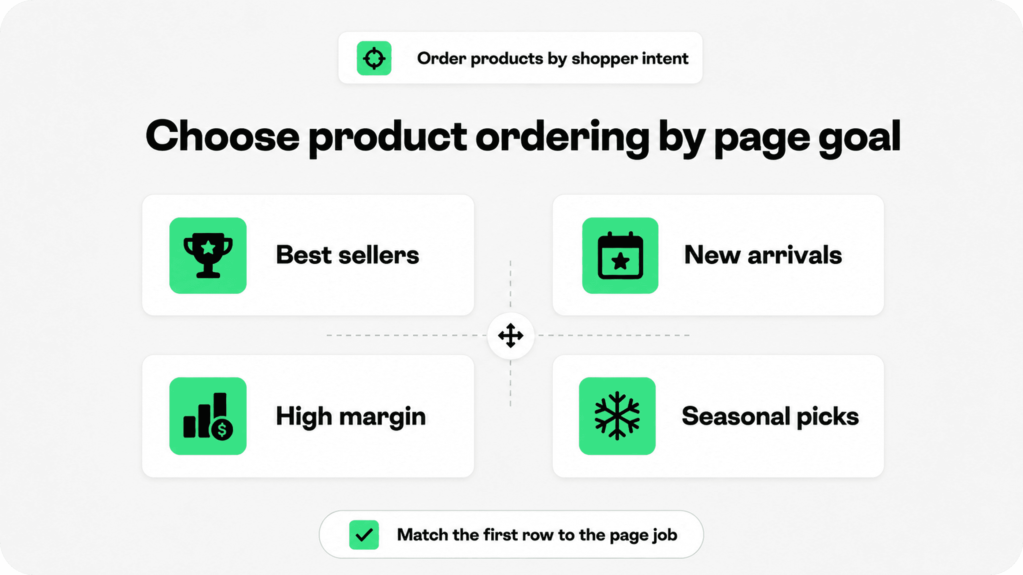
Product order is merchandising. The first row of a collection page sets the shopper’s first impression, especially on mobile where only a few products are visible at once. If the first products are unavailable, visually inconsistent, expensive without context, or unrelated to the page title, the collection feels weaker even when the catalog is good.
There is no universal best sort order. The right choice depends on the job of the page.
Collection type | Best merchandising approach | Why it helps shoppers |
|---|---|---|
Best sellers | Sort by proven demand, then manually adjust for stock, season, and product-card quality. | Shoppers see popular products first without landing on out-of-stock or weakly presented items. |
New arrivals | Sort newest first, but pin the strongest launch items or complete outfits near the top. | Returning shoppers can quickly see what changed while new shoppers still get a curated first row. |
Sale or clearance | Lead with compelling discounts, good inventory, and easy size/color availability. | Deal-seeking shoppers can find real value without digging through broken leftovers. |
Gift guide | Manually curate by recipient, price, occasion, or personality rather than default chronology. | Gift shoppers often need confidence and shortcuts more than they need the full catalog. |
Seasonal campaign | Pin seasonal hero products, bundles, and accessories before general inventory. | The page supports the campaign promise and makes the featured edit feel intentional. |
Large category | Use a balanced first row: best sellers, representative subcategories, clear price range, and strong imagery. | New visitors understand the category faster and can compare options without getting lost. |
This is also where merchants should make peace with manual work. Automated rules save time, but merchandising is partly editorial. If a hero collection matters to revenue, review the first row manually before major traffic arrives.
Collections also need filtering and sorting that match the catalog. Shopify’s Search & Discovery app can help merchants customize filters, search, and product recommendations. For large catalogs, filters should reflect the attributes shoppers actually use to decide: size, color, price, material, compatibility, style, ingredient, rating, availability, or use case. Baymard’s product-finding research repeatedly points to product lists, filtering, sorting, and category navigation as core parts of how ecommerce shoppers move from a broad catalog to a specific product.
Feature the products shoppers should notice first
Featured products are not just homepage decoration. They are merchandising signals. A featured product tells shoppers, “start here.” That signal should be earned.
Good candidates for featured placements include best sellers, new launches, products with strong reviews, high-margin items that still represent real customer value, seasonal products, complete bundles, starter kits, limited-time offers, and products that explain the brand quickly. Weak candidates include products with poor images, confusing variants, low stock, unclear pricing, or missing product-page content.
Featured product sections work best when the surrounding context is specific. “Best sellers” is clearer than “Featured.” “Gifts under $50” is more useful than “You may like.” “Complete the routine” is stronger than “Recommended products” when the products truly support the main item.
If a featured placement relies on a product card, the card has to carry enough information to support a click. Use a clear image, readable title, visible price, sale or new badge when relevant, review signal if available, color or variant hints when useful, and one short benefit cue where the theme supports it. For more on product-card cues, Snapp’s guide to Shopify product badges explains how badges can help shoppers compare products when they are placed on product cards or images instead of buried after the click.
Plan seasonal merchandising before demand peaks
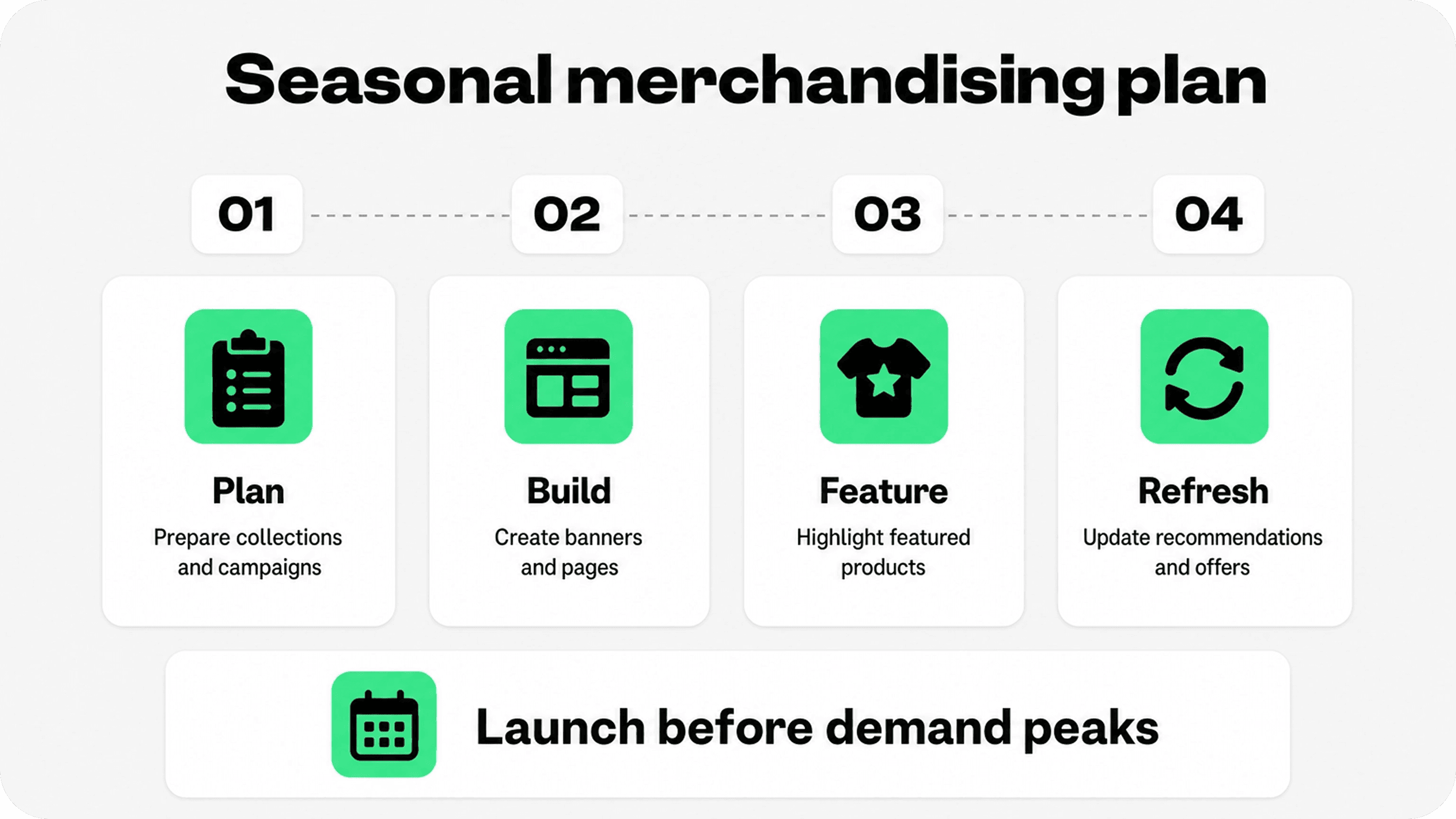
Seasonal merchandising is where many Shopify stores lose easy revenue. The campaign goes live, but the collection page still sorts by old defaults, product cards do not mention the seasonal use case, sold-out items stay near the top, and recommendations still point to products from the previous campaign.
A stronger seasonal workflow starts before demand peaks. Build the collection, decide the first row, prepare the homepage or navigation placement, update product-card badges, check inventory, add gift or seasonal copy where it helps, and refresh recommendations so the campaign feels connected across the store.
Seasonal merchandising does not only mean big holidays. It can support weather changes, back-to-school, summer travel, wedding season, festival season, gifting moments, new product drops, clearance cycles, influencer campaigns, regional events, and category-specific buying windows.
The important thing is to remove dead ends. If a seasonal banner sends shoppers to a collection, the collection should open with products that match the promise. If a product is part of the campaign, the product page should show related accessories, shipping clarity, return reassurance, and any seasonal urgency honestly. If the product sells out, the page should route shoppers toward substitutes instead of letting the campaign leak attention.
Merchants comparing Shopify apps to increase sales should treat seasonal merchandising tools as support for a plan, not a substitute for one. Apps can help with badges, recommendations, bundles, search, filters, trust cues, and conversion prompts, but the merchant still has to decide which products deserve attention and why.
Make recommendations feel useful
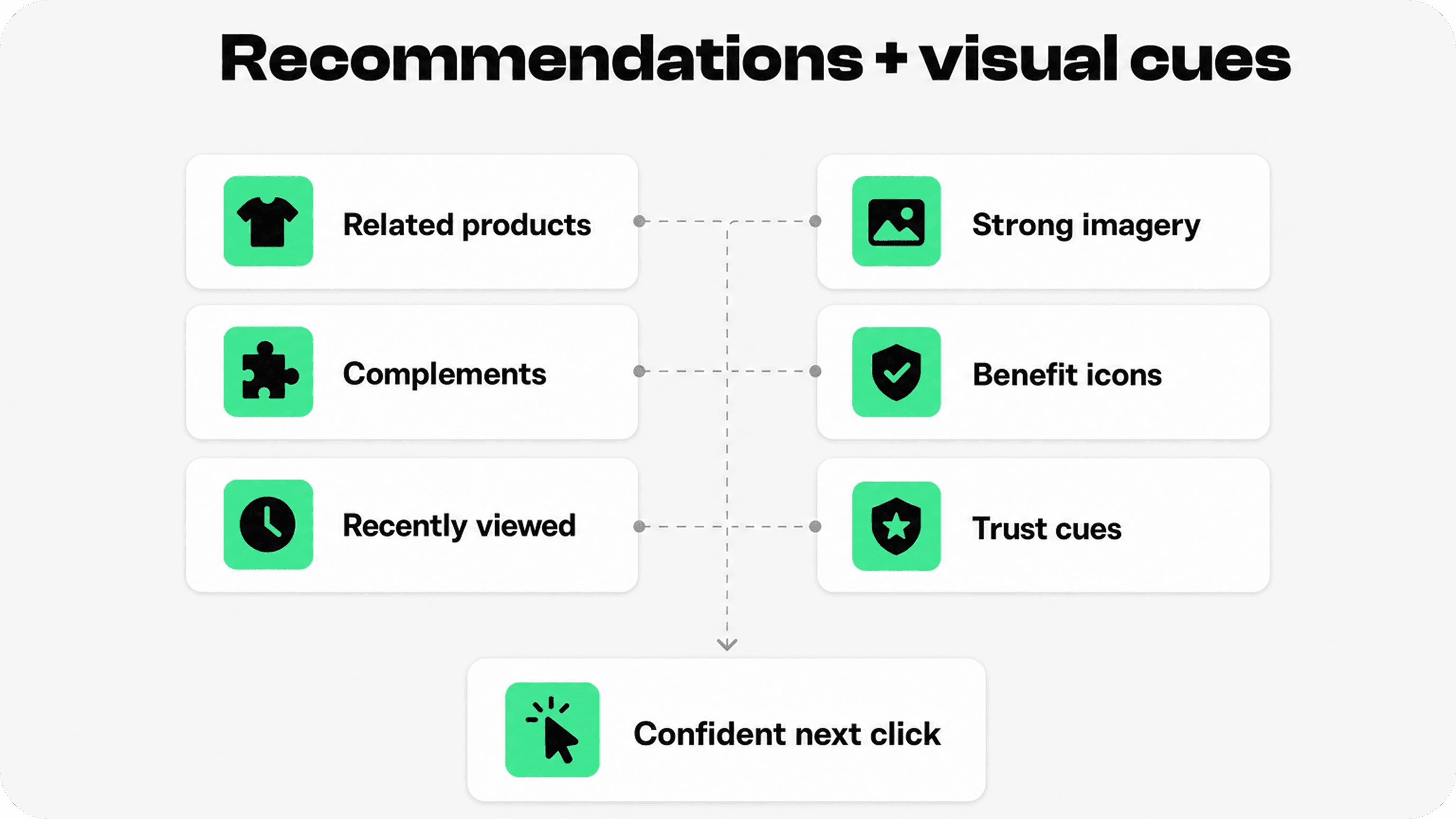
Product recommendations are one of the simplest ways to turn merchandising into guided discovery. They can help shoppers compare alternatives, complete a set, add a compatible accessory, return to recently viewed products, or recover from a dead end when a product is unavailable.
Shopify’s product recommendation docs distinguish between related recommendations and complementary recommendations. Related recommendations can be generated by Shopify, while complementary products need manual setup and can be configured through Shopify Search & Discovery. That distinction matters for merchandising. Related products help shoppers compare similar options. Complementary products help shoppers build a fuller order.
Use related products when the shopper might still be choosing: similar styles, adjacent colors, alternate sizes, different price points, or substitutes. Use complementary products when the shopper has likely chosen the main product: refill packs, accessories, matching pieces, care products, installation items, bundles, or “complete the look” products.
Recently viewed products can be useful for stores where comparison takes time. They are especially helpful on mobile, where shoppers may move back and forth between product pages and lose track of what they considered. Just keep the module quiet. It should help shoppers return to an item, not compete with the add-to-cart area.
Recommendations should also respect buying intent. A shopper on a product page needs relevant next steps. A shopper in the cart needs reassurance or useful add-ons, not an overwhelming product carousel. Snapp’s Shopify cart page optimization guide is a useful companion for deciding which trust signals belong near checkout intent and which merchandising prompts can wait.
Use visual merchandising to make comparison easier
Visual merchandising in ecommerce is the online version of product presentation in a physical store. It uses imagery, layout, spacing, badges, icons, copy, and hierarchy to make products easier to understand and compare.
The strongest visual merchandising choices are practical. Keep product image ratios consistent inside the same collection. Use the first product image to show the product clearly. Show scale, texture, color, packaging, included items, and real-world use where those details affect purchase confidence. Avoid mixing studio shots, lifestyle crops, and inconsistent backgrounds so heavily that the collection page feels uneven.
Product cards should answer the shopper’s first comparison questions. In some categories, that means size, material, color, sale status, stock status, rating, bundle value, or “new” status. In others, it means compatibility, ingredient, use case, age range, fit, or delivery promise. The point is not to cram every detail into the card. The point is to expose the details shoppers need before they decide which product page is worth opening.
This is where trust and merchandising overlap. Benefit icons, product badges, delivery cues, return promises, and payment reassurance can all support product discovery when they are specific and restrained. Snapp’s Shopify product page optimization guide shows how trust elements work best when they reduce hesitation at the point of decision rather than turning the page into a badge wall.
Build an ecommerce merchandising strategy you can maintain
A good ecommerce merchandising strategy is not a one-time redesign. It is a repeatable operating rhythm. Merchants need a way to decide what gets featured, when collections change, which products deserve pinning, how seasonal pages are retired, and how underperforming discovery paths are fixed.
Start with a monthly merchandising review. Look at collection traffic, search terms, zero-result searches, product views, add-to-cart rate, conversion rate, stockouts, returns, reviews, and customer support questions. Then make small changes with a clear reason: move better products up, improve weak product cards, add missing filters, rename confusing collections, feature high-demand items sooner, or retire seasonal pages that no longer help.
The best strategy also includes constraints. Decide how many products can be pinned manually, which badges are allowed, what qualifies as a best seller, how often seasonal collections are refreshed, how recommendations are reviewed, and who owns merchandising updates. Without constraints, online merchandising ecommerce work becomes reactive and inconsistent.
For Shopify merchants, the practical stack is usually simple: clean product data, useful collections, Search & Discovery setup, consistent product-card design, strong product pages, honest trust cues, and regular review. More advanced tools can help once the basics are working, but they cannot fix a catalog that is hard to understand.
Common Shopify merchandising mistakes
Creating too many collections with no clear difference. If shoppers cannot tell why two collections exist, search engines and customers may both receive a weaker signal.
Letting default sort order control important pages. High-traffic collections need a curated first row, not whatever the catalog happens to produce.
Featuring products that are not ready to sell. A homepage feature should not point to a weak product page, low-stock item, confusing variant setup, or poor product image.
Using badges and labels as decoration. Badges should answer comparison questions, not make every product shout at once.
Ignoring mobile merchandising. Collection sorting, filters, product-card text, and recommendation modules need to work when the shopper only sees a small slice of the page.
Forgetting to clean up seasonal campaigns. Outdated banners, expired offers, and old seasonal collections make the store feel neglected.
Final recommendation
Shopify merchandising works best when it starts with the shopper’s path, not the merchant’s catalog spreadsheet. Build collections around real buying intent. Order products according to the goal of each page. Feature products that are ready to sell. Refresh seasonal campaigns before demand peaks. Use recommendations to help shoppers compare, complete, or return to products. Keep visual cues clear enough to support the decision without crowding the page.
A well-merchandised Shopify store does not make shoppers work harder. It quietly explains where to go next, what to compare, and why the next click is worth it.