
TL;DR
Shopify product filters should reflect shopper decisions. Use filters for criteria people actually compare, such as size, color, price, availability, material, fit, compatibility, and product type.
Clean product data matters more than adding more filters. If color names, sizes, tags, metafields, or product types are inconsistent, storefront filters become confusing.
Keep filter naming plain. Use customer language like Size, Color, Price, In stock, Material, Fit, and Brand instead of internal catalog labels.
Mobile filtering needs a clear drawer flow. Make filters easy to open, apply, clear, and review without forcing shoppers through a crowded sidebar.
Avoid unnecessary complexity. A small set of useful filters beats a long list of low-value facets that create dead ends, duplicate choices, and no-result states.
Why Shopify product filters matter
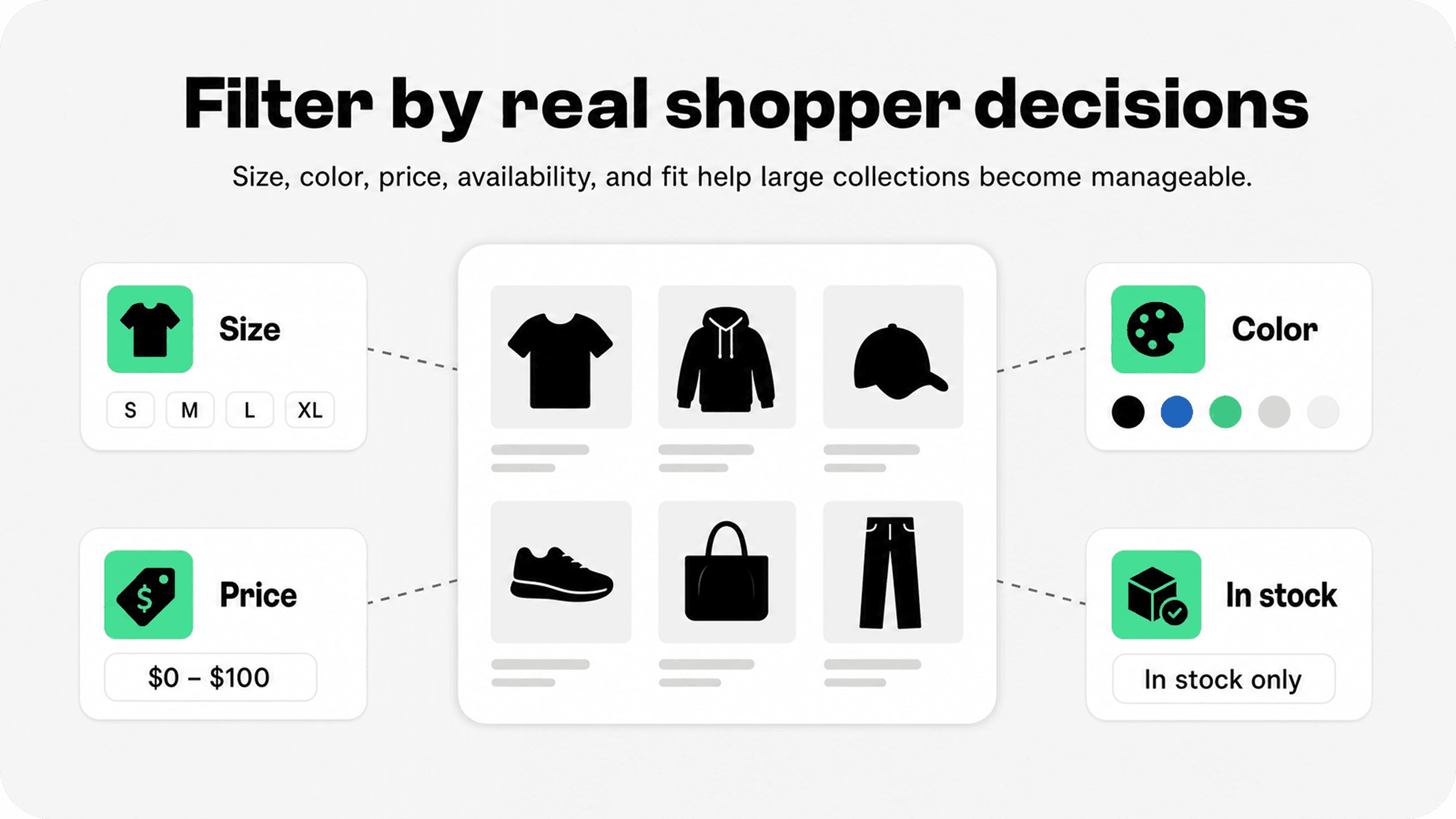
A large collection can feel exciting for a merchant and exhausting for a shopper. More products create more choice, but they also create more work: scanning, comparing, remembering what looked good, checking stock, opening product pages, and going back to the grid.
Shopify product filters reduce that work. They let shoppers turn a broad collection into a smaller product set based on the criteria that matter to them. A customer looking for black size M jackets under $150 should not have to inspect every jacket in the store. They should be able to narrow the list quickly, see what is available, and compare the remaining options.
Shopify's storefront filtering documentation says filters can be based on availability, category, price, product tags, product type, vendor, variant options, and metafields. It also explains that filters are applied with AND logic across filters and OR logic within values from the same filter. Source: Shopify storefront filtering documentation.
That technical foundation matters, but the merchant decision is more practical: which filters make the collection easier to shop? The answer depends on the catalog. Apparel shoppers often need size, color, fit, price, and availability. Beauty shoppers may need skin type, shade, concern, ingredients, product size, and price. Home shoppers may need material, dimensions, color, room, delivery, and price.
For broader collection-page context, pair this article with Snapp's Shopify collection page best practices guide. Collection hierarchy, product cards, sorting, and filters should work together instead of competing for attention.
Start with clean product data
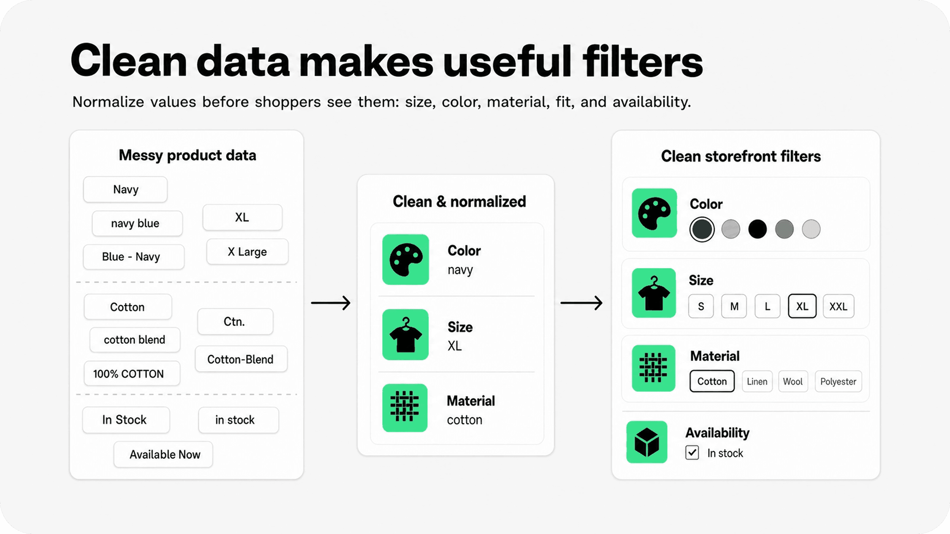
Before adding Shopify collection filters, audit the product data that will power them. Filters are only as useful as the values behind them. If one product uses Navy, another uses navy blue, and another uses Blue - Navy, shoppers may see duplicate or fragmented color choices.
The same problem shows up with sizes, materials, product types, brands, tags, and custom metafields. A filter drawer full of near-duplicates looks like a UX problem, but the cause is often catalog hygiene.
Shopify's category metafields help merchants add product attributes tied to Shopify's Standard Product Taxonomy, and Shopify notes that those attributes can improve discoverability on the storefront, marketplaces, and search engines. Source: Shopify category metafields documentation.
Use product options for variant choices shoppers expect to select on a product page, such as size or color. Use metafields for structured attributes that help people narrow a collection, such as material, fabric, room, skin concern, compatibility, pack size, scent family, or water resistance. Use tags carefully; they are flexible, but that flexibility can create messy storefront filters if the team uses tags inconsistently.
Standardize values before exposing them as filters.
Merge duplicate or near-duplicate labels, such as Grey and Gray, or XL and X Large.
Avoid internal tags that shoppers should never see, such as campaign notes, margin labels, supplier codes, or workflow states.
Use consistent capitalization and naming across every product in the collection.
Review filters after imports, bulk edits, seasonal launches, and app migrations.
Choose filter types based on how shoppers narrow choices
The best Shopify product filtering system starts with customer questions. Do not begin by asking, "What data do we have?" Begin by asking, "What would a shopper need to remove from this collection to feel closer to the right product?"
Most larger Shopify collections need a few common filters, but the order and labels should change by category. A footwear collection should not use the same filter strategy as a coffee collection, and a technical accessories collection should not copy a fashion sidebar without considering compatibility and specs.
Use this table as the main audit checklist when deciding which filters deserve space in a collection.
Filter type | When it helps | Best practice | Avoid |
|---|---|---|---|
Availability | Collections with frequent sellouts or many variants. | Offer a clear In stock or Available filter and show active stock states plainly. | Making shoppers choose a sold-out size or color before discovering it is unavailable. |
Price | Categories where budget strongly shapes the buying decision. | Use a simple range or clean price bands that match how shoppers compare. | Too many narrow bands that split the collection without helping choice. |
Size | Apparel, footwear, accessories, furniture, packaging, and fit-sensitive products. | Normalize size values and put size high in the filter order when it is a hard constraint. | Mixing US, EU, alpha, numeric, and one-off size labels without explanation. |
Color | Visual categories where shoppers start with style, shade, or palette. | Group similar values where useful and keep color names consistent with swatches. | Exposing dozens of nearly identical shade names as separate choices. |
Material or ingredient | Products where fabric, finish, formula, or ingredient affects suitability. | Use structured metafields and plain labels such as Cotton, Leather, Vegan, or Fragrance-free. | Internal supplier terms that shoppers do not recognize. |
Brand or vendor | Multi-brand stores, marketplaces, retailers, and curated shops. | Use when shoppers recognize brands and actively compare them. | Showing vendor names when they are only internal suppliers. |
Product type or category | Broad collections that mix product families. | Let shoppers narrow from all products into meaningful subgroups. | Using product types that duplicate navigation or create confusing overlaps. |
Use case or compatibility | Technical, hobby, home, pet, supplement, or gift collections. | Create filters around real purchase constraints, such as device model, room, skin concern, or recipient. | Creating clever lifestyle filters that sound nice but few shoppers understand. |
For custom storefronts, Shopify's ProductFilter input includes fields such as available, category, price, product metafield, product type, product vendor, tag, taxonomy metafield, variant metafield, and variant option. By default, the available and price filters are enabled, while filter customization is handled through Shopify Search & Discovery. Source: Shopify ProductFilter Storefront API reference.
Name filters in shopper language
Filter names should be boring in the best way. A shopper should know what a filter means before opening it. Use Size instead of Variant option, Color instead of Shade taxonomy, Brand instead of Vendor when the store sells recognizable consumer brands, and In stock instead of Availability if that is clearer in the theme.
Avoid brand-internal labels unless customers already use them. A merchant may organize products around capsule names, supplier ranges, collection codes, or fulfillment classes, but those are not always useful storefront filters. If a label needs explanation, it may belong in navigation, collection copy, or a buying guide instead of the filter drawer.
Naming also affects trust. If filters feel messy, shoppers assume the catalog is messy. Clean names make the store feel easier to buy from, especially when the collection is large.
Put the most useful filters first
Filter order should match the shopper's decision order. Hard constraints usually belong near the top because they immediately remove irrelevant products. For fashion, that often means availability, size, color, price, fit, and material. For furniture, it might be product type, room, dimensions, color, material, delivery, and price. For technical accessories, compatibility can matter more than color.
Do not bury the filter that decides whether a product can be purchased. If size is the main constraint, show it early. If shoppers often buy by budget, make price easy to reach. If the catalog sells out quickly, do not make availability feel like an afterthought.
Filter order is also a mobile decision. A desktop sidebar can show many controls at once, but a mobile drawer forces sequencing. Put the highest-value filters above lower-value ones so shoppers do not scroll through noise before finding the control they need.
Shopify Search & Discovery is the native app Shopify provides for customizing storefront search, filtering, and product recommendations, including filters that let shoppers refine results by multiple categories. Source: Shopify Search & Discovery app listing.
Design mobile filters around speed and recovery
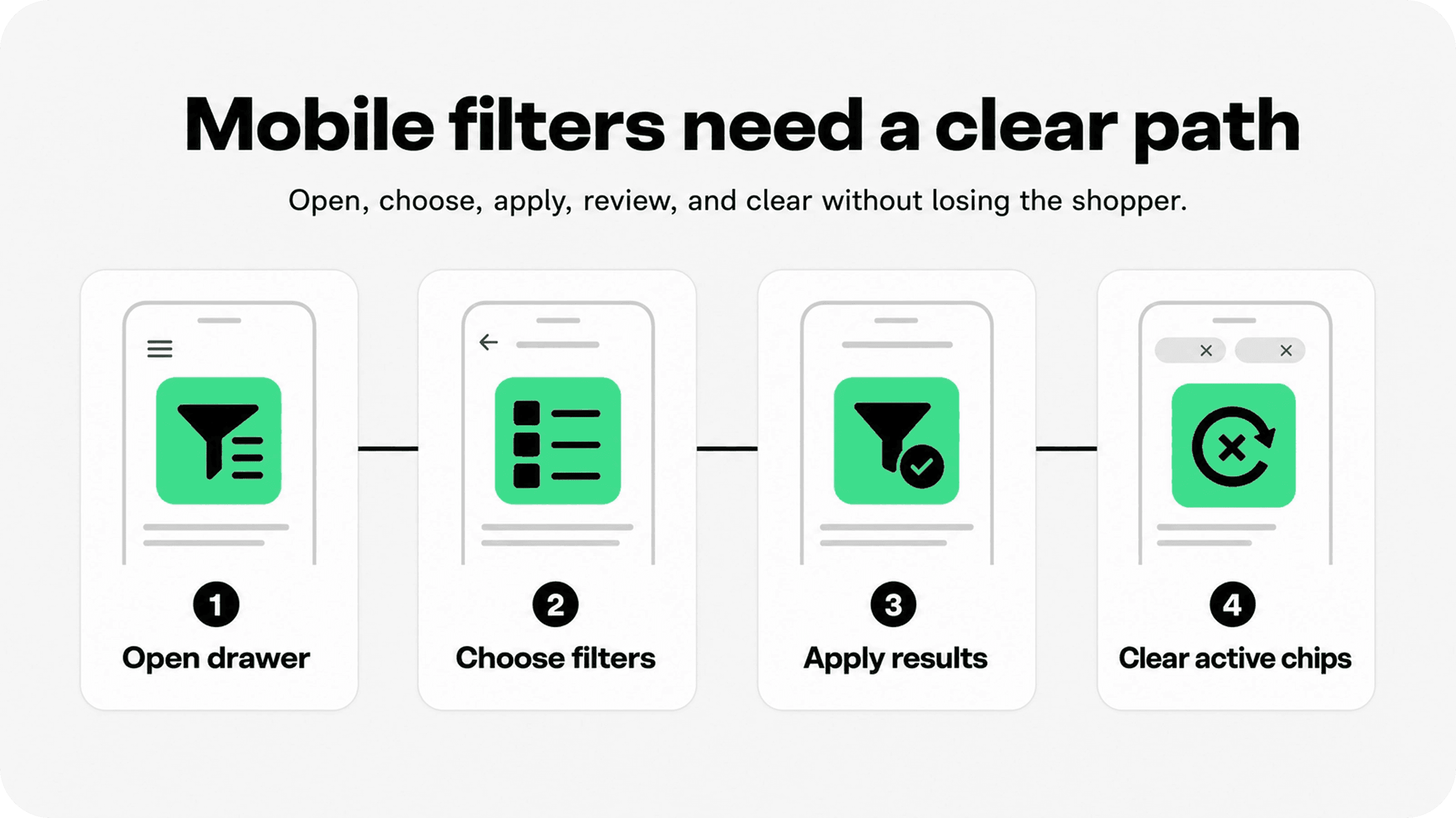
Mobile filtering should feel quick to open, easy to apply, and easy to undo. Shoppers should not have to guess whether a filter was applied, where the active filters went, or how to return to the full collection.
A good mobile filter drawer usually needs a visible Filter button near sorting, a clear count of selected filters, a sticky Apply button, a simple Clear all action, and active filter chips above the product grid after the drawer closes. The drawer should not trap the shopper or hide the result count until the very end.
For the wider mobile browsing path, Snapp's Shopify mobile optimization guide covers navigation, tap targets, content density, speed, collection browsing, and checkout usability.
Keep the Filter and Sort controls close together near the collection grid.
Show active filters as removable chips after filters are applied.
Make the Apply button easy to reach without covering filter options.
Avoid tiny checkbox targets, cramped swatches, and labels that wrap awkwardly.
Test no-result states, back-button behavior, and filter clearing on real phones.
Use price, size, color, and availability carefully
Price, size, color, and availability are common Shopify collection filters because they are close to how people shop. They are also easy to get wrong.
Price should help shoppers find a realistic budget range. If the collection spans $8 to $800, a simple slider or useful bands can help. If most products sit between $42 and $58, price may not deserve a top position. Keep the range aligned with the store currency and avoid creating price cuts that feel arbitrary.
Size is often a hard constraint. If a shopper wears size M or needs a 10-inch case, products outside that range are not alternatives. That makes size one of the most important filters in apparel, footwear, accessories, packaging, furniture, and technical products. Keep size systems consistent and consider how variant availability affects the experience.
Color is useful when shoppers shop visually, but color values need discipline. Decide whether Slate, Charcoal, and Black should be separate values or grouped under a broader black/gray family. The answer depends on how shoppers compare the category. Swatches can help, but only if labels remain accessible and the selected state is clear.
Availability should reduce frustration, not hide merchandising problems. Many shoppers simply want products they can buy today. If out-of-stock products remain visible, label them clearly, move them lower when appropriate, or use back-in-stock capture instead of making shoppers click into dead ends.
Avoid filter complexity that does not improve discovery
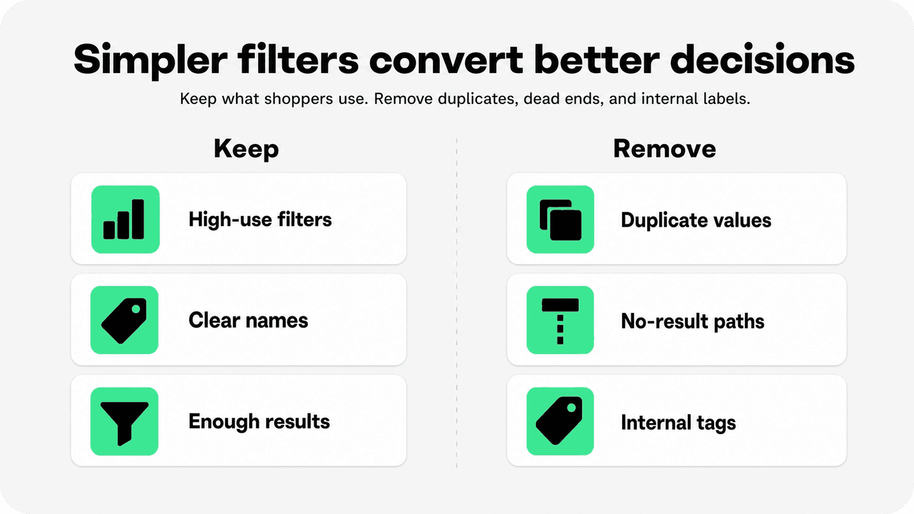
It is tempting to turn every product attribute into a filter. Resist that. More filters do not automatically create better Shopify product filtering. They can make the collection feel harder to use, especially when filters overlap, contain too many values, create empty result sets, or repeat navigation.
A useful filter removes real uncertainty. A weak filter exposes data because it exists. If a filter is rarely used, creates very small groups, duplicates another control, or uses language shoppers do not understand, remove it or move that information somewhere else.
Shopify's storefront filtering documentation notes that users can create up to 25 filters. Treat that as a ceiling, not a target. Most stores should use far fewer on a single collection page.
Remove filters that are not used or that produce mostly no-result states.
Merge overlapping attributes, such as Style, Occasion, and Use case, when shoppers cannot tell the difference.
Do not expose internal tags, hidden merchandising labels, or operational fields.
Use collection links or subcollections when a choice is really navigation, not filtering.
Keep SEO content and filter UX separate; do not create filter values just to chase keywords.
Connect filters to sorting, product cards, and merchandising
Filters work best when the rest of the collection page supports the narrowed result. If a shopper filters by size and color, product cards should still show price, image clarity, availability, sale state, and other comparison details. If the filtered result is full of weak product cards, the filter only made the problem smaller.
Sorting matters too. A shopper who filters by size may still want best selling, newest, lowest price, or featured products. Keep sorting accessible after filters are applied, and make sure default sorting does not push relevant in-stock products below less useful choices.
For merchandising context, connect filter work to Snapp's Shopify merchandising guide. Merchandising decides what gets priority; filters help shoppers narrow what remains.
For merchants comparing Shopify apps to increase sales, the strongest filter improvements usually come from catalog clarity first, then apps that support trust, product discovery, and buying confidence.
Measure whether filters are helping
A filter set can look sensible in a theme preview and still fail in real shopping sessions. Measure whether shoppers use filters, whether filtered sessions move to product pages, and whether those sessions add products to cart.
Baymard's ecommerce UX research is a useful reference point for auditing product lists, filtering, mobile web, and broader product discovery patterns. Source: Baymard ecommerce UX research.
Filter open rate: how often shoppers open filters on collection pages.
Filter apply rate: which filters and values shoppers actually select.
Filtered product click-through rate: whether narrowed results lead to product-page visits.
No-result rate: how often filter combinations lead to empty or tiny result sets.
Clear-all rate: whether shoppers frequently need to undo the filter set.
Mobile filter usage: whether mobile shoppers can apply and clear filters without friction.
Use those signals to simplify. If shoppers never touch a filter, it may not belong. If they use a filter but abandon after no results, the data may need cleanup. If filtered visitors click more products but do not buy, the issue may sit on product pages, pricing, trust cues, returns, or checkout.
For the post-click confidence layer, Snapp's Shopify product page optimization guide is a useful next step because filters can get shoppers to the right product page, but the product page still has to earn the order.
Final recommendation
The best Shopify product filters make a large collection feel smaller, clearer, and easier to compare. They do not show every attribute in the catalog. They expose the handful of criteria shoppers actually use to decide what is worth opening.
Start with clean product data, choose filters around real shopper decisions, name them plainly, put the most useful filters first, and make mobile filtering easy to apply and undo. Then remove anything that adds complexity without helping discovery. A focused filter set will usually beat a crowded one.