TL;DR
Ecommerce UX best practices start with clarity. A shopper should quickly understand what the store sells, where to go next, and why one product fits their need better than another.
Shopify user experience is a full-path problem. Navigation, search, filters, product cards, product pages, cart, checkout, and mobile behavior all shape whether shoppers keep moving.
Focus on usability before visual styling. Better labels, cleaner product information, useful comparison cues, clear policies, and fewer interruptions often help more than a new aesthetic.
Use collection pages for browsing and product pages for decisions. Collections should narrow choice; product pages should answer practical buying questions about fit, price, delivery, returns, proof, and payment.
Measure friction, not opinions. Track search usage, filter behavior, add-to-cart rate, checkout starts, checkout completion, mobile drop-off, and support questions before making broad changes.
What ecommerce UX means for a Shopify store
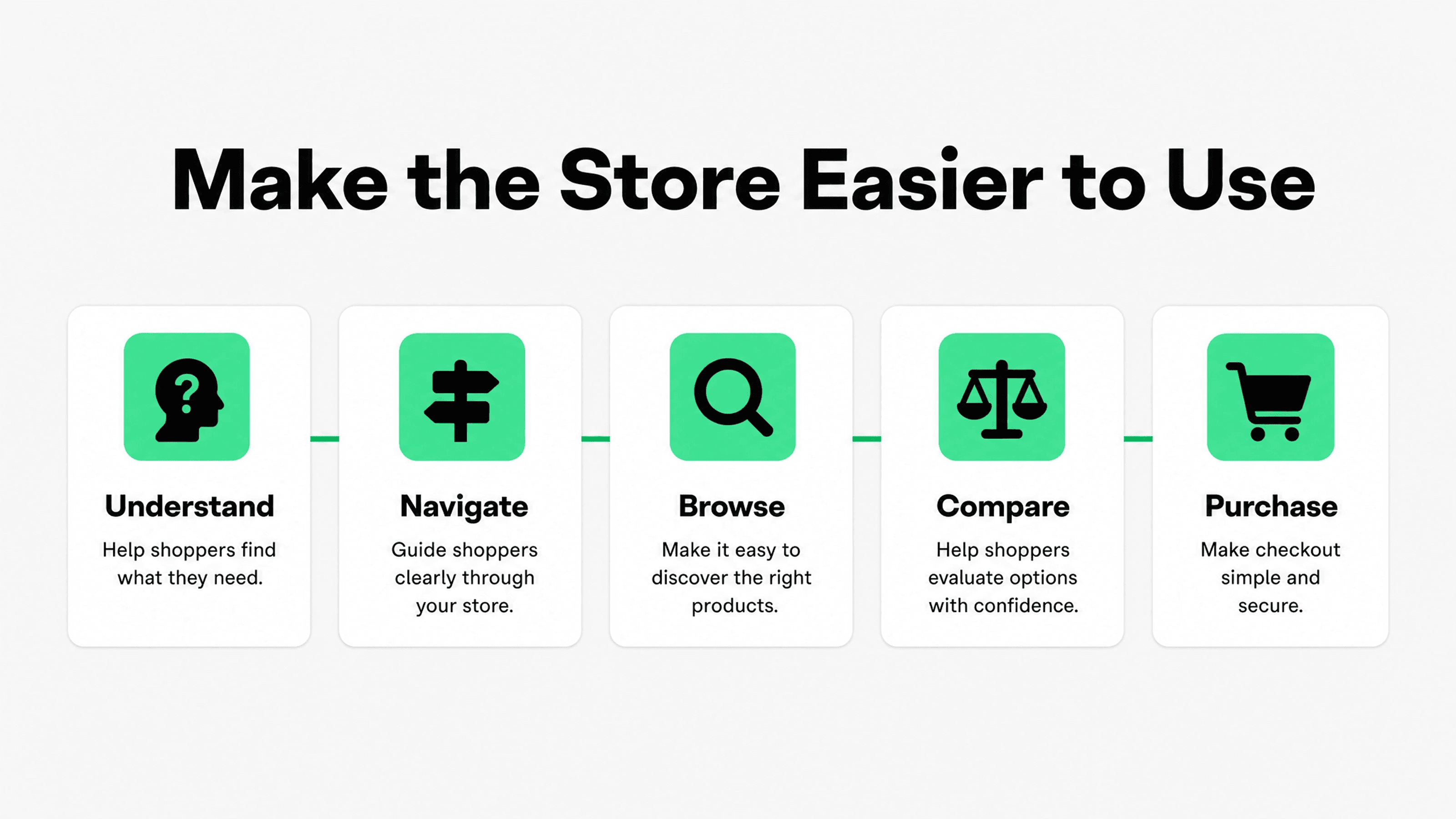
Ecommerce UX is the experience a shopper has while trying to find, understand, choose, and buy a product from an online store. For Shopify merchants, that experience is shaped by theme structure, navigation, collection setup, product data, apps, page speed, mobile layout, policies, checkout settings, and the small trust cues that appear near decisions.
That is why ecommerce UX best practices should not be treated as a design checklist. A store can look polished and still be hard to use. Shoppers may not know which collection to open, which size is available, why one product costs more, when it will arrive, whether returns are easy, or which payment methods are accepted.
Shopify's website usability guidance describes usability improvements such as mobile optimization, avoiding disruptive overlays, readable text, clear navigation, search functionality, simple forms, consistent design, accessibility, and fast loading. Source: Shopify website usability guide. Those ideas are useful, but this article applies them specifically to the buying path inside a Shopify store.
A simple way to evaluate Shopify UX is to ask whether the store lowers the shopper's effort at each step. The homepage should orient. Navigation should route. Search should recover intent. Collections should help browsing. Product pages should answer doubts. Cart and checkout should make the final step feel obvious and safe.
Start with plain-language store structure
Many UX problems begin before a shopper reaches a product page. If store navigation uses internal labels, vague categories, or too many competing paths, shoppers have to decode the store instead of shopping.
Use customer language in the main menu. A beauty store should prefer labels like Skin Care, Makeup, Body, Gifts, and Sale over internal terms such as Collections, Rituals, Essentials, or Systems unless those terms are already widely understood by the audience. A home goods store should make rooms, product types, materials, or use cases obvious.
Keep the top navigation limited to the most useful paths. A Shopify store with many product types may need dropdowns or mega menus, but each menu should still have a clear hierarchy. Put the most common shopper paths first, then support secondary paths with collection tiles, search, footer links, or in-page cross-links.
This is also where internal linking helps both shoppers and crawlerability. For example, if a merchant is improving product discovery, Snapp's Shopify collection page best practices article is a useful next read because collection hierarchy is where browsing starts to become easier or harder.
The practical test is simple: give a new visitor a task such as "find a waterproof backpack under $100" or "find a fragrance-free moisturizer for sensitive skin." If they hesitate at the menu, open irrelevant categories, or rely on search immediately, the structure needs clearer labels or better routing.
Make navigation and search work together
Navigation and search solve different problems. Navigation helps shoppers understand the store's structure. Search helps shoppers express a specific intent. Strong Shopify UX uses both instead of treating search as a backup for weak menus.
Make the search bar easy to find, especially on mobile. Then check whether common searches produce useful results. If shoppers search for "wide leg jeans," "birthday gift," "USB-C," or "vegan leather," those terms should map to products, collections, tags, metafields, descriptions, or synonyms that help results feel relevant.
Search result pages should not become dead ends. Show the query, the number of results, sorting controls, relevant filters, and useful product cards. If there are no results, help the shopper recover with corrected spelling, popular categories, best sellers, or a prompt to contact support.
Baymard frames ecommerce UX around evidence-based guidelines, benchmarks, case studies, and thousands of ecommerce examples, which is a good reminder that findability is not a decorative issue. Source: Baymard ecommerce UX research. If shoppers cannot find a product or a category, the rest of the conversion path never gets a chance.
Improve collection pages for browsing
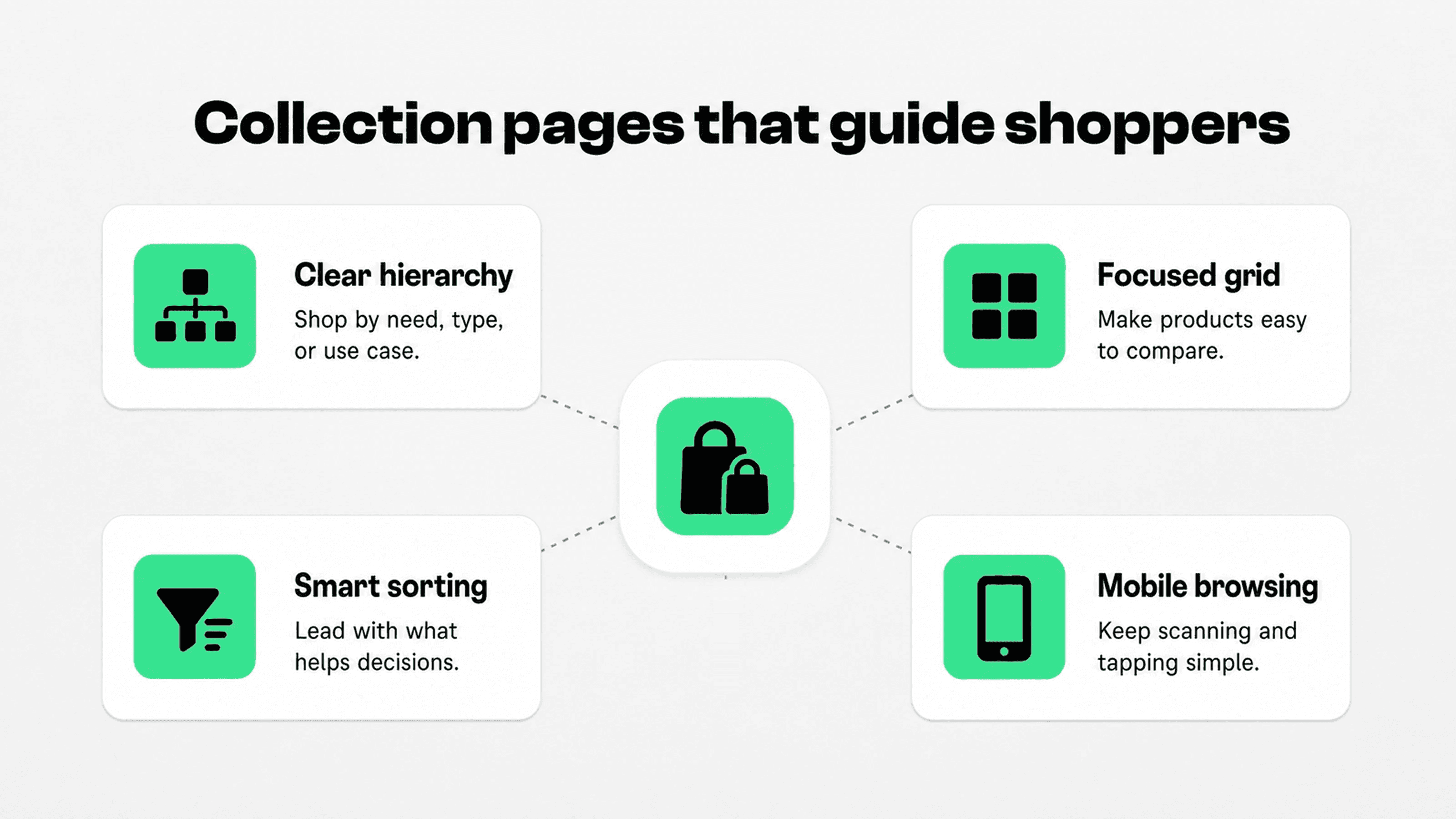
Collection pages are where shoppers turn broad interest into a shortlist. A weak collection page makes every product look equally important. A strong one helps shoppers understand the category, scan the product set, narrow options, and decide which product page deserves attention.
Keep collection introductions short and useful. One or two sentences are usually enough to explain the category, key differences, buying criteria, or use case. Long SEO blocks above the grid can push products down and make the page feel like an article instead of a shopping path.
Product cards should support quick comparison. At minimum, shoppers need a clear product name, consistent image angle, visible price, sale price clarity, review summary when available, variant or color cues, and availability signals when stock matters. If product cards are too minimal, shoppers must open too many pages just to compare basics.
Filters should reflect real shopper decisions, not every piece of product data. Snapp's Shopify product filters best practices guide goes deeper on choosing, naming, ordering, and simplifying filters for Shopify collections.
Sorting should also be easy to understand. Best selling, newest, price, rating, and relevance can all be useful, but the defaults should match the collection. A new arrivals collection may default to newest. A sale collection may need better price sorting. A high-consideration category may benefit from merchandising the best-reviewed or most complete products first.
Help shoppers compare products without opening every page
Comparison is one of the most overlooked parts of Shopify user experience. Shoppers rarely evaluate one product in isolation. They compare size, color, ingredients, specs, bundles, compatibility, price, reviews, delivery, warranty, and returns across multiple items.
The easier you make comparison, the less memory work shoppers have to do. For simple catalogs, product cards can carry most of that work. For complex catalogs, add comparison tables, buying guides, quiz paths, collection groupings, or product badges that highlight meaningful differences.
UX area | Shopper question | Usability improvement | Where to check in Shopify |
|---|---|---|---|
Store structure | Where should I go first? | Use plain category labels, fewer top-level choices, and collection links based on product type, use case, or buyer goal. | Main menu, footer menu, collection templates, homepage sections |
Product discovery | How do I narrow this list? | Use useful filters, clear sorting, short collection copy, consistent product cards, and no-result recovery paths. | Search & Discovery app, product tags, metafields, collection pages |
Product comparison | Which option is right for me? | Show comparable names, prices, variants, specs, reviews, badges, and product benefits before forcing a product-page click. | Product cards, collection sections, comparison blocks, product recommendations |
Product decision | Can I buy this confidently? | Answer fit, materials, sizing, delivery, returns, support, reviews, payment, and guarantee questions near the buying decision. | Product template, collapsible rows, app blocks, trust elements, product media |
Cart and checkout | What will happen if I continue? | Make totals, shipping, payment options, returns, discounts, and checkout actions obvious before the shopper reaches the final step. | Cart page, cart drawer, checkout settings, payment settings, policy links |
Mobile shopping | Can I do this comfortably on my phone? | Use readable text, thumb-friendly controls, compact cards, clear sticky actions, simple drawers, fast pages, and fewer interruptions. | Theme editor, mobile previews, app embeds, analytics by device |
Use the table as a usability audit, not a redesign brief. If one area is causing confusion, fix the smallest useful part first. A better filter label, clearer product card detail, or visible return note can solve more than another full-width image section.
Make product pages easier to understand
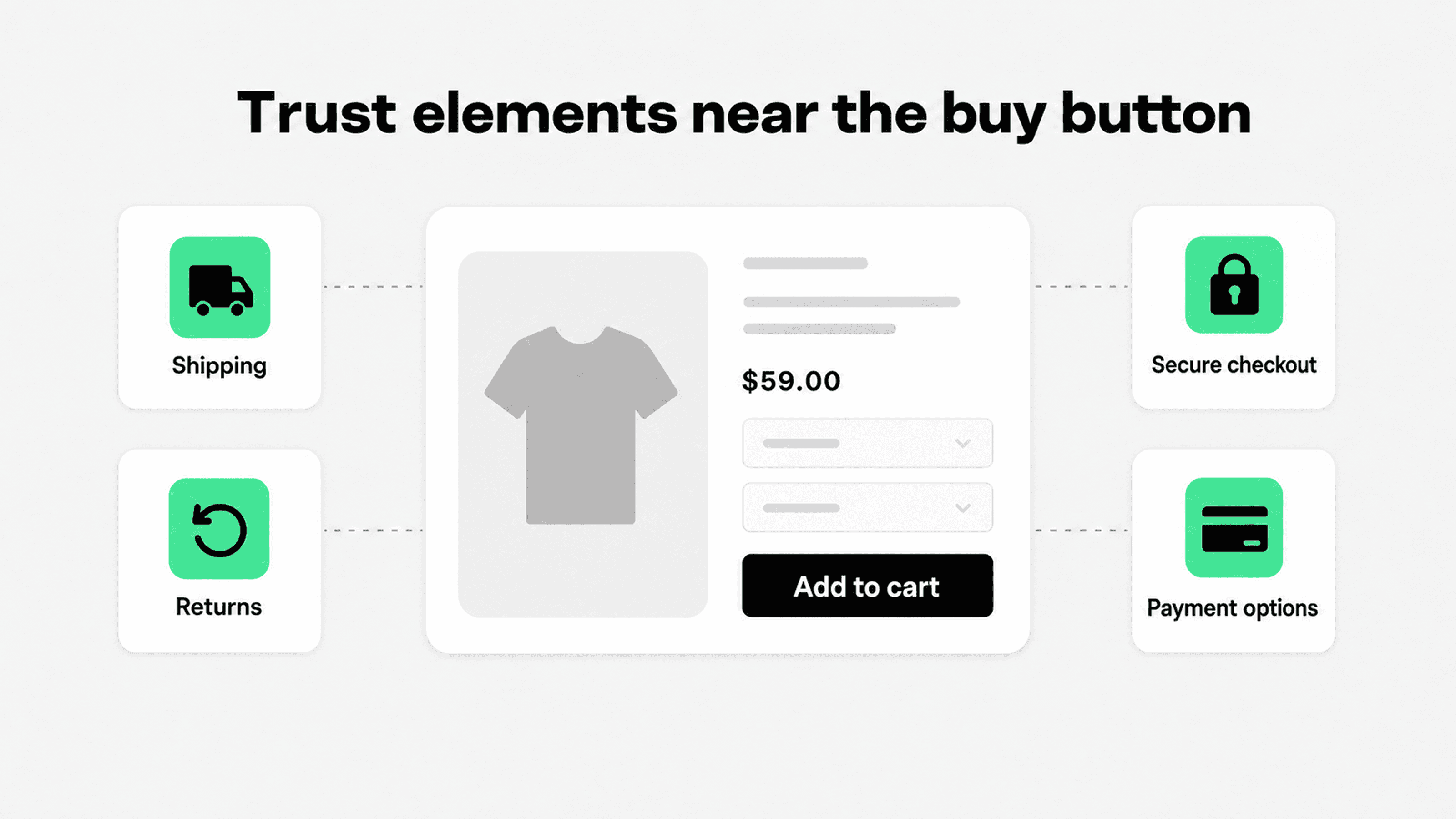
Product pages are where ecommerce UX becomes concrete. The shopper is no longer asking "what do you sell?" They are asking whether this exact product is right for them and whether buying it from this store feels low risk.
Shopify's product page optimization guide recommends improving essentials such as CTA visibility, product imagery, descriptions, reviews, related products, buying options, mobile usability, and trust signals. Source: Shopify product page optimization guide. For Shopify merchants, the UX priority is to make those essentials easier to scan and act on.
Start near the buy section. The product title should be understandable. The price should be clear. Sale pricing should explain the current offer without looking misleading. Variant selectors should show unavailable options honestly. The add-to-cart button should be visible, specific, and separated from secondary actions.
Then answer the practical doubts that stop shoppers from buying: Will this fit? What is it made of? What comes in the box? When will it arrive? What happens if I return it? Can I pay with my preferred method? Is the store trustworthy? Use accordions, short bullets, reviews, size charts, delivery notes, product benefit icons, and policy summaries where they reduce effort.
For a deeper trust-specific layer, link this article to Snapp's Shopify product page optimization trust elements guide. The useful distinction is that UX clarifies the whole decision, while trust elements answer the specific doubts that make shoppers hesitate.
Avoid hiding essential information in long copy below the fold. If a shopper needs sizing, compatibility, delivery, or return details to make the decision, put a clear summary close to the product form and link to deeper details where needed.
Reduce friction in cart and checkout-adjacent pages
A good Shopify UX does not wait until checkout to reduce checkout friction. Many purchase-stopping doubts appear in the product page, cart drawer, cart page, and checkout-adjacent reassurance areas before the shopper enters payment details.
Baymard's cart abandonment research lists common purchase-stopping reasons such as extra costs, slow delivery, lack of payment trust, account creation, long checkout flows, unsatisfactory returns, missing total cost, and limited payment methods. Source: Baymard cart abandonment research. Some of those issues are business constraints, but many can be eased through clearer UX before and during checkout.
Make the cart easy to understand. Show item names, images, selected variants, quantities, discounts, subtotal, shipping threshold, estimated delivery or shipping notes, returns summary, and the primary checkout button. If the cart drawer hides totals or makes quantity updates awkward, shoppers may use checkout just to inspect costs, then abandon when something surprises them.
Do not overuse popups, urgency widgets, cross-sells, or app blocks in the final steps. Cart and checkout UX should feel calmer than the rest of the store. Relevant recommendations can help, but they should not interrupt quantity editing, discount entry, shipping clarity, or the checkout button.
Payment reassurance should also be honest and close to the decision. Snapp's Shopify payment icons guide explains where payment icons help and why footer-only placement is often too late for shoppers who need payment confidence earlier.
Keep mobile UX simple and task-focused
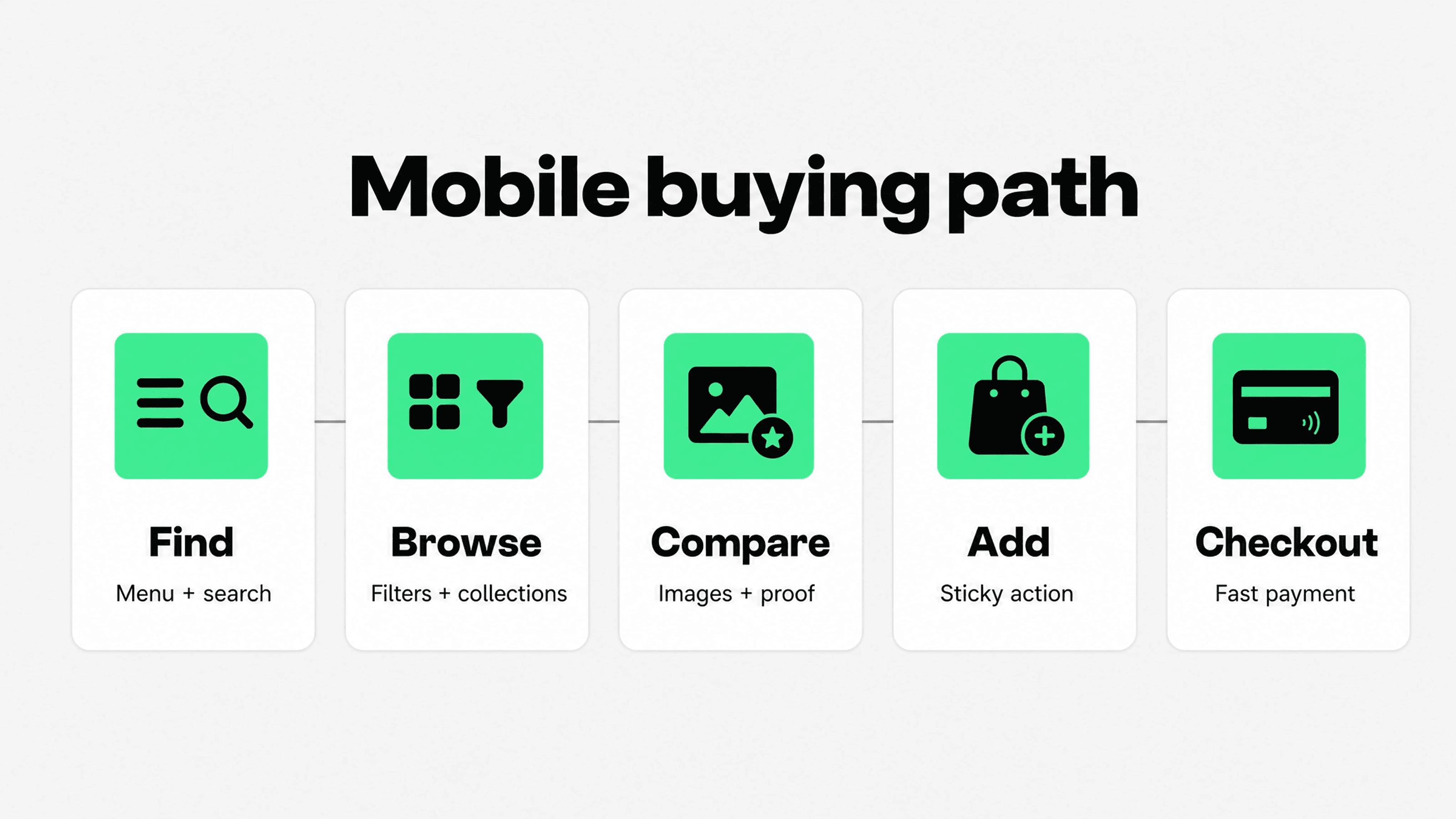
Mobile Shopify UX exposes every usability weakness. A desktop layout can hide clutter with space. A phone screen makes every extra banner, oversized image, vague label, slow script, cramped tap target, and long product block more expensive.
Start with the common mobile path: land on a page, understand the offer, open navigation or search, browse a collection, apply a filter, open a product, choose a variant, add to cart, review the cart, and checkout. Test that path on a real phone, not only in a desktop preview.
Mobile collection pages need short intros, visible sort controls, easy-to-open filters, compact product cards, and clear active filter states. Mobile product pages need readable product information, accessible variant selectors, obvious CTAs, clean trust cues, and product details that do not require endless scrolling.
Shopify's CRO guidance reinforces that optimization should cover the full funnel, including product discovery and checkout, not just button changes. Source: Shopify conversion rate optimization guide. That is especially true on mobile, where one extra interruption can be enough to break momentum.
Be careful with app embeds on mobile. Reviews, bundles, countdowns, chat, popups, sticky bars, upsells, loyalty widgets, and badge rows may each seem small, but together they can make the store slower and harder to operate. Keep what helps the task and remove what only fills space.
Audit Shopify UX with real shopper tasks
The best way to improve Shopify UX is to stop debating pages in isolation and watch the buying path as a sequence of tasks. Pick a few high-value products or collections, then test whether a shopper can complete realistic jobs without confusion.
Task 1: Find the right category. Can a shopper reach a relevant collection from the homepage or menu without guessing?
Task 2: Narrow a product set. Can they use search, sorting, and filters to reduce a collection to useful options?
Task 3: Compare two products. Can they understand the practical difference without opening five tabs or relying on memory?
Task 4: Decide on one product. Can they answer fit, specs, delivery, returns, reviews, payment, and support questions near the product decision?
Task 5: Reach checkout confidently. Can they review the cart, understand costs, apply a discount, see payment options, and continue without surprise?
Pair task testing with analytics. Look at search terms with low conversion, collections with high exits, filters that cause no-result states, product pages with low add-to-cart rate, cart pages with high checkout drop-off, and mobile segments that underperform desktop. The best Shopify UX improvements usually come from the overlap between user confusion and business impact.
Make changes in small batches. Rewrite navigation labels, simplify a collection, improve product card details, add a comparison block, move a return summary closer to the buy button, or remove a distracting popup. Then measure the result before rolling the same pattern across the store.
How Snapp can help
Snapp does not replace ecommerce UX work. A store still needs clear navigation, useful collections, clean product data, strong product information, fast pages, and a checkout path that does not surprise shoppers.
Where Snapp fits is the confidence layer around product decisions. Shopify apps to increase sales can help merchants add trust badges, payment icons, product benefit icon blocks, and concise reassurance cues without rebuilding the theme or hard-coding image strips into product descriptions.
That matters for usability because shoppers often need quick answers, not more decoration. A compact "30-day returns" cue, an honest payment icon row, a shipping promise, or a product benefit icon can make the buying decision easier when it appears near the doubt it answers.
For implementation detail, pair this broader UX article with Snapp's guides to Shopify trust badges, Shopify product page icons, and secure checkout badges. Those articles handle the trust-signal layer so this article can stay focused on usability across the full store.
Final recommendation
The best Shopify UX improvements make the store feel easier, not busier. Start with the shopper's path: understand the store, navigate to the right area, browse a relevant product set, compare options, choose a product, and complete checkout with confidence.
If a page element does not help one of those jobs, question it. If a shopper needs an answer to keep moving, make that answer easier to find. Strong ecommerce UX is usually the result of many small reductions in effort: clearer words, better grouping, more useful product information, cleaner comparison, fewer interruptions, and reassurance placed where hesitation actually happens.