TL;DR
Shopify navigation should start with shopper intent. Use categories and labels that match how customers browse, not how your team organizes products internally.
Keep the main menu focused. A small store may need only a simple Shopify menu, while a larger catalog may need a structured Shopify mega menu.
Use nested menus carefully. Shopify supports nested drop-down menus, but depth only helps when each level makes the next choice easier.
Connect navigation to product discovery. Menus, collections, search, filters, sort, and product cards should work as one path, not separate features.
Mobile navigation deserves its own pass. Make product categories easy to reach, include a clear View all path, and test every menu level on a real phone.
Why Shopify navigation matters for product discovery
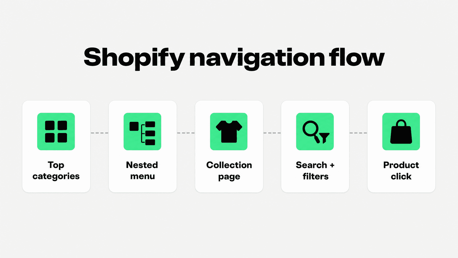
Shopify navigation is the store’s product-finding system. It tells shoppers what you sell, how products are grouped, where the main buying paths live, and what to do when they do not know the exact product name.
Shopify’s Help Center says menus help customers browse an online store and organize links to products, collections, webpages, blog posts, and more. Merchants manage menus from Content > Menus and choose where menus appear through theme settings. Source: Shopify menus and links documentation.
That makes navigation both a UX decision and a merchandising decision. A store can have great products and still feel difficult to shop if the top menu hides important categories, uses vague labels, buries popular collections, or sends shoppers into product grids that do not match what they expected.
Good ecommerce navigation best practices are simple in principle: help people recognize where they are, see the most useful paths, move from broad to specific choices, recover when a path is wrong, and reach products with less scanning effort. The execution is where stores often slip.
Baymard’s 2025 homepage and category navigation benchmark reports that 58% of desktop sites and 67% of mobile sites perform at a mediocre-to-poor level for homepage and category navigation UX, which leaves a large opportunity for stores that make product finding clearer. Source: Baymard homepage and category navigation UX research.
Start with categories before menu design
Before editing a Shopify menu, define the category system. A menu is only as useful as the product architecture behind it. If collections overlap, category names are unclear, or the catalog depends on internal naming, the navigation will inherit that confusion.
Shopify’s collections documentation explains that merchants can group products into collections to make products easier to discover by category, theme, or customer intent. Shopify lists examples such as products by customer group, product type, sale status, size, color, season, variant collection, and nested collections. Source: Shopify collections documentation.
That “customer intent” phrase is the key. Do not start with every possible product type. Start with the ways shoppers decide. Some shoppers browse by category: Dresses, Shoes, Lighting, Coffee, Skincare. Others browse by problem or use case: Gifts under $50, Workwear, Sensitive skin, Outdoor dining, Beginner kits. Strong navigation usually supports both, but not all at the same level.
A practical category pass should answer four questions: What do shoppers expect to see first? Which categories drive the most revenue or search demand? Which collections need guidance because products are hard to compare? Which paths can move into filters, collection tiles, footer links, or content instead of the main menu?
Keep the main Shopify menu focused
The main Shopify menu should not be a full sitemap. Its job is to expose the highest-value shopping paths quickly. Overcrowding the header makes every item compete for attention and forces shoppers to parse the store before they can browse it.
Shopify’s drop-down menu documentation recommends seven or fewer top-level menu items to avoid overcrowding, using clear descriptive link titles, and testing menus on mobile devices. Source: Shopify drop-down menu best practices.
For many stores, the top menu should include a small set of product categories plus a few high-intent commercial paths such as New Arrivals, Best Sellers, Sale, Bundles, or Gifts. Support pages such as About, Contact, Shipping, Returns, and Track Order usually belong in the footer, utility nav, announcement bar, or account/help area unless they are unusually important to the purchase decision.
Avoid labels that sound tidy internally but vague to customers. “Products,” “Catalog,” “Solutions,” and “Explore” can work in some contexts, but they often add one more click before the shopper sees actual category choices. When possible, make the product categories visible immediately.
Use Shopify nested menus without burying products
A Shopify nested menu is useful when the shopper needs a second level of choice. It is not useful when it hides the thing the shopper came to find. A good nested structure moves from broad to specific in a predictable way: Women > Dresses > Summer dresses, or Coffee > Brewing gear > Pour-over.
Shopify says merchants can build drop-down menus by nesting menu items below a top-level item, and that the top-level item can have up to two levels of nested drop-down menus. Shopify also notes that most themes support up to two levels of nested drop-down menus, but merchants should test theme compatibility on desktop and mobile. Source: Shopify nested drop-down menu documentation.
Use those two nested levels as a design constraint. If the store needs more depth than that, the menu is probably trying to solve too much. Move some decisions into landing pages, collection pages, filters, buying guides, or search. Deep navigation can look organized in the admin and still feel slow for shoppers.
Top-level drop-down headers also need care. Shopify’s docs explain that most themes implement drop-down headers as buttons rather than clickable links for accessibility. If shoppers need access to an “All” category page, add it as the first item inside the drop-down instead of depending on the header itself.
When a Shopify mega menu is worth using
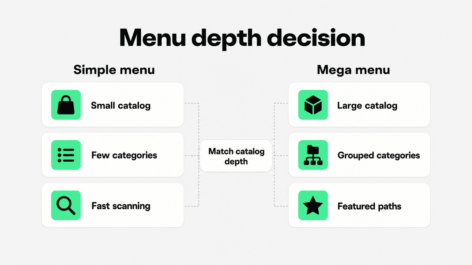
A Shopify mega menu can help a store with a broad catalog, many collections, or categories that need visual grouping. It is most useful when a simple drop-down would become a long vertical list.
Nielsen Norman Group describes mega menus as large, two-dimensional panels that can group navigation choices, reduce scrolling, and use typography or icons to explain options when they are implemented well. Source: Nielsen Norman Group mega menu guidance.
Mega menus work best when they clarify the catalog. Use columns for meaningful groups, not arbitrary symmetry. A fashion store might group by Women, Men, Accessories, New, Sale, and Featured edits. A home store might group by Room, Product type, Material, Style, and Best sellers. A beauty store might group by Skin concern, Product type, Ingredient, Routine step, and Brand.
Do not make a mega menu just because it looks more advanced. A mega menu with too many links, inconsistent labels, tiny text, weak spacing, or poor mobile fallback becomes a product-finding problem. The test is whether shoppers can choose faster, not whether the header looks fuller.
Use this Shopify navigation audit table
Use this one-table audit to decide what belongs in the main menu, what should move deeper, and what should be handled by collections, filters, or search.
Navigation decision | Use when | Best practice | Avoid |
|---|---|---|---|
Top-level category | The path represents a major shopping intent or revenue-driving product family. | Use plain shopper language and keep the total set tight enough to scan. | Listing every department, support page, and campaign in the header. |
Nested menu | A category needs one or two obvious subcategory choices. | Move from broad to specific and include an “All” link when useful. | Burying key collections three decisions deep. |
Shopify mega menu | The catalog is broad enough that a simple drop-down becomes hard to scan. | Group links into meaningful columns and use featured collections sparingly. | Mega menus that are just long link dumps. |
Collection page | The shopper needs to compare a set of products after choosing a path. | Send menu clicks to well-merchandised collections with clear sorting and product cards. | Sending vague menu links to all products pages. |
Search | Shoppers may know a product name, SKU, brand, material, or problem. | Make search visible and tune results/synonyms for real queries. | Treating search as a fallback nobody maintains. |
Filters and sort | The collection is too broad to scan comfortably. | Use filters for real buying criteria such as size, color, price, material, availability, compatibility, or use case. | Exposing messy internal tags or too many low-value facets. |
Footer or utility nav | The link supports trust, service, account, policy, or company information. | Keep support paths easy to find without crowding product navigation. | Hiding shipping, returns, or contact information entirely. |
Connect menus to collections, filters, and search
Menus start product discovery, but they do not finish it. After a shopper clicks a menu item, the collection page has to continue the path with relevant products, useful sorting, clean product cards, and filtering where the catalog needs it.
Shopify says collection pages can display products as a webpage with a gallery, customers can click product images to visit product pages, merchants can add collection links to menus, and different sorting options can control the default product order on individual collection pages. Source: Shopify collections documentation.
This is where many Shopify stores lose momentum. The header label might say “Summer dresses,” but the collection might include unrelated items, weak product images, sold-out products at the top, no useful sort order, and product cards that do not show size or color availability. The menu did its job, then the collection page broke the promise.
Shopify’s Search & Discovery app is Shopify’s native app for customizing storefront search, filters, and product recommendations. It can help merchants tune discovery after the shopper reaches a collection or uses search. Source: Shopify Search & Discovery app listing.
For stores with many SKUs, treat navigation, search, filters, sorting, product cards, and merchandising as one system. A shopper who clicks a category should be able to narrow the result, compare products, and recover if the first path was wrong.
For more depth on the collection-page side, connect this article to Snapp’s guides on Shopify collection page best practices, Shopify product filters, and Shopify merchandising.
Design mobile navigation separately
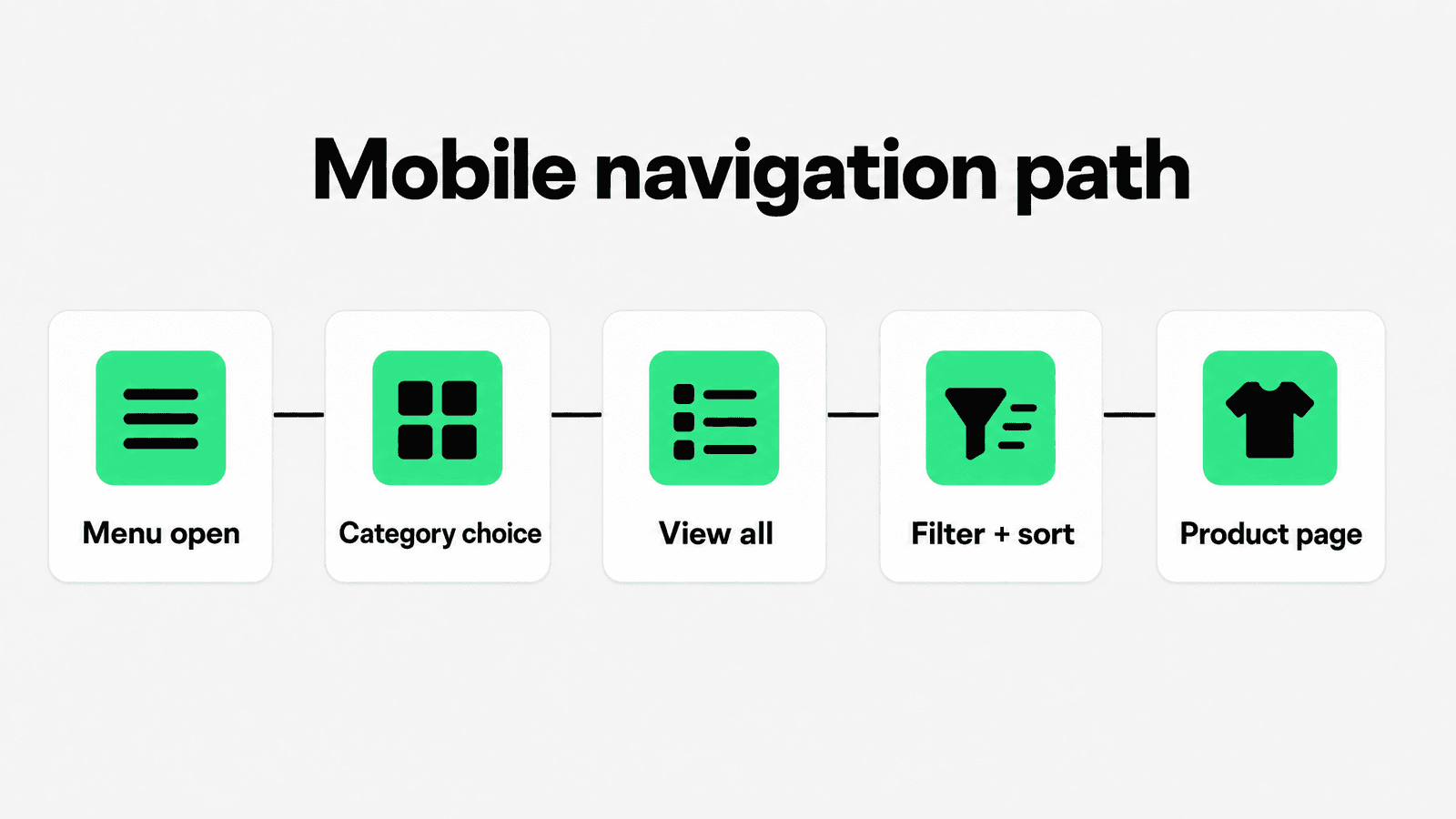
Mobile navigation is not a compressed desktop header. Shoppers have less screen space, less patience for deep menus, and fewer visible products after each click. A mobile menu needs a clear first level, obvious category labels, generous tap targets, and a way to view the full category without forcing deeper choices.
Baymard’s 2024 product-finding update notes that making product categories the first level of main navigation remains especially important on mobile, even though desktop can sometimes tolerate a broader “Shop” or “Products” layer. Source: Baymard product finding research update.
That does not mean every store must remove “Shop” everywhere. It means the mobile menu should expose category choices quickly. If the first tap opens only another generic label, shoppers have to work harder before they see what the store sells.
Baymard also recommends having a “View all” option in mobile main navigation at each level so shoppers can browse the full category instead of being forced into a narrower subcategory. Source: Baymard mobile main navigation View all guidance.
Test the full mobile path: open menu, choose category, go back, use View all, open a nested menu, apply a filter, sort, click a product, and return to the collection. Navigation problems often appear only when the complete path is tested on a real phone.
For the broader mobile buying path, Snapp’s Shopify mobile optimization article is the natural internal next read.
Make menu labels specific and stable
Navigation labels should be specific, short, and durable. If a shopper has to decode the label, the menu is already slower than it needs to be. “Dresses” is clearer than “Edit.” “Coffee grinders” is clearer than “Gear” when grinders are the actual category. “Gifts under $50” is clearer than “Holiday favorites” if price is the decision.
Use campaign labels carefully. Seasonal edits, gift guides, launches, and sale categories can earn top-level space when they are commercially important. But if the campaign ends, the menu should be cleaned up. A stale navigation item teaches shoppers that the store is not being maintained.
Also keep naming consistent across menus, collection pages, filters, breadcrumbs, and product cards. If the menu says “Sofas,” the collection H1 says “Couches,” and the filter says “Seating type,” shoppers can still figure it out, but the store feels less deliberate.
Use navigation for trust and conversion, not just browsing
Navigation also affects trust. Shoppers look for signs that the store is organized, current, easy to buy from, and easy to recover from if something goes wrong. Product categories matter most, but service paths matter too.
Keep shipping, returns, contact, size guides, warranty, store location, and FAQ links findable. They usually do not belong in the main product menu, but they should not be buried so deeply that shoppers question whether the store is legitimate.
For confidence cues near product decisions, Snapp’s Shopify product page icons and Shopify product page optimization guides are useful next steps. Navigation gets shoppers to the right product area; product pages still need to earn the purchase.
For merchants comparing Shopify apps to increase sales, start with the discovery path first: menu clarity, category structure, collection pages, search, filters, product cards, and then trust/support tools that reinforce the buying decision.
Measure whether Shopify navigation is working
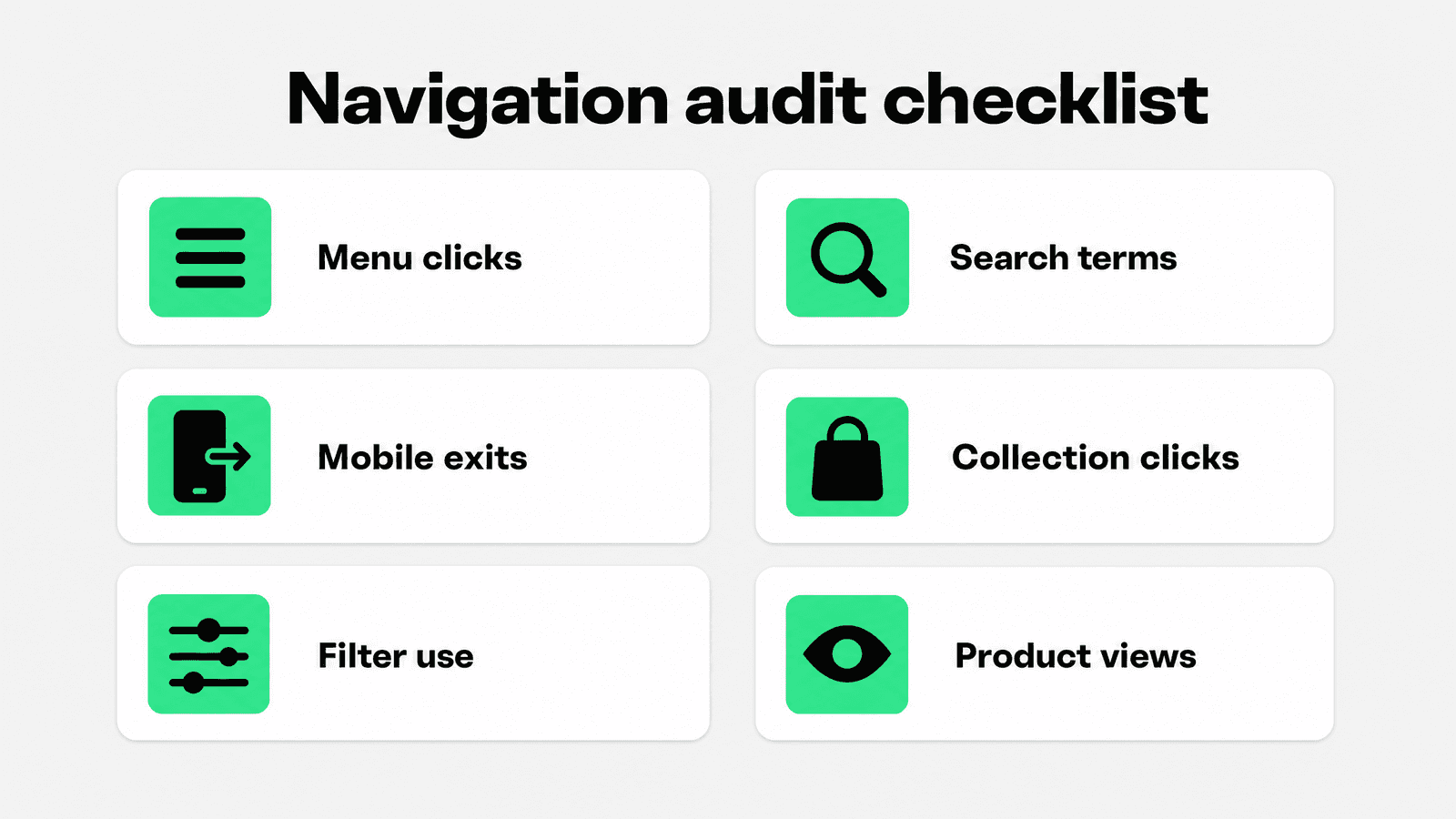
A navigation redesign is not finished when the menu looks cleaner. It is finished when shoppers can find products more easily and the store can see that improvement in behavior.
Menu click-through: which top-level and nested links actually get used.
Collection landing quality: whether menu clicks lead to product views, filter use, add-to-cart actions, or exits.
Search behavior: common queries, zero-result searches, refinements, and searches that should become menu or collection links.
Mobile path completion: whether shoppers can open, browse, go back, and recover without dropping off.
First-screen product performance: whether the products reached from navigation earn clicks and add-to-cart actions.
Support path visibility: whether shipping, returns, contact, and FAQ pages are findable before checkout anxiety appears.
Baymard’s expanded product-finding research found 1,000+ medium-to-severe product-finding usability issues across 219 moderated test sessions, which is a useful reminder that navigation, search, lists, filters, and category pages should be audited together. Source: Baymard 2024 product-finding research update.
Use analytics and session review to simplify the menu over time. Remove ignored links, rename confusing categories, promote search terms that reveal missing paths, and improve collection pages that receive traffic but do not send shoppers forward.
Final recommendation
Better Shopify navigation starts before the menu editor. First, build categories around shopper intent. Then keep the main menu focused, use nested menus only when they make decisions easier, add a Shopify mega menu only when the catalog needs visual grouping, and make mobile navigation its own design pass.
The best navigation system helps shoppers move from “what does this store sell?” to “this is the product I want to open” without confusion. When menus, collections, search, filters, sorting, and product cards work together, product discovery feels natural instead of forced.