TL;DR
Trust elements help customers buy when they answer real doubts: delivery, returns, payment safety, product proof, support, and offer clarity.
The most useful product page trust cues usually sit near the price, variants, add-to-cart button, shipping details, reviews, or mobile buy section.
For Shopify product page conversion, fewer specific trust signals usually beat a long strip of generic badges.
Use one trust cue per doubt. Shipping clarity answers delivery anxiety; payment icons answer payment uncertainty; reviews answer product-risk hesitation.
Snapp can help merchants add clean trust badges, payment icons, and product benefit icon blocks without rebuilding the product page.
What Shopify product page optimization really means
Shopify product page optimization is the process of improving the content, layout, and trust signals on a product detail page so shoppers can understand the product, feel confident in the store, and complete the next step. Shopify’s own product page optimization guide highlights essentials such as CTA visibility, product imagery, descriptions, reviews, mobile usability, buying options, and trust signals. Source: Shopify product page optimization guide.
For a Shopify merchant, that does not mean adding every possible widget above the fold. A high-converting product page helps the shopper answer a few practical questions quickly: Is this the right product? Is the price and offer clear? Can I trust the store? What happens after I click Add to cart?
Trust elements are the part of product page optimization that reduces perceived risk. They include product reviews, star ratings, secure checkout cues, payment icons, shipping details, return policy summaries, guarantee badges, support links, product benefit icons, warranty details, and clear delivery expectations.
The goal is not to make the product page look busier. The goal is to make the buying decision feel safer and simpler.
Put trust elements near the buying decision
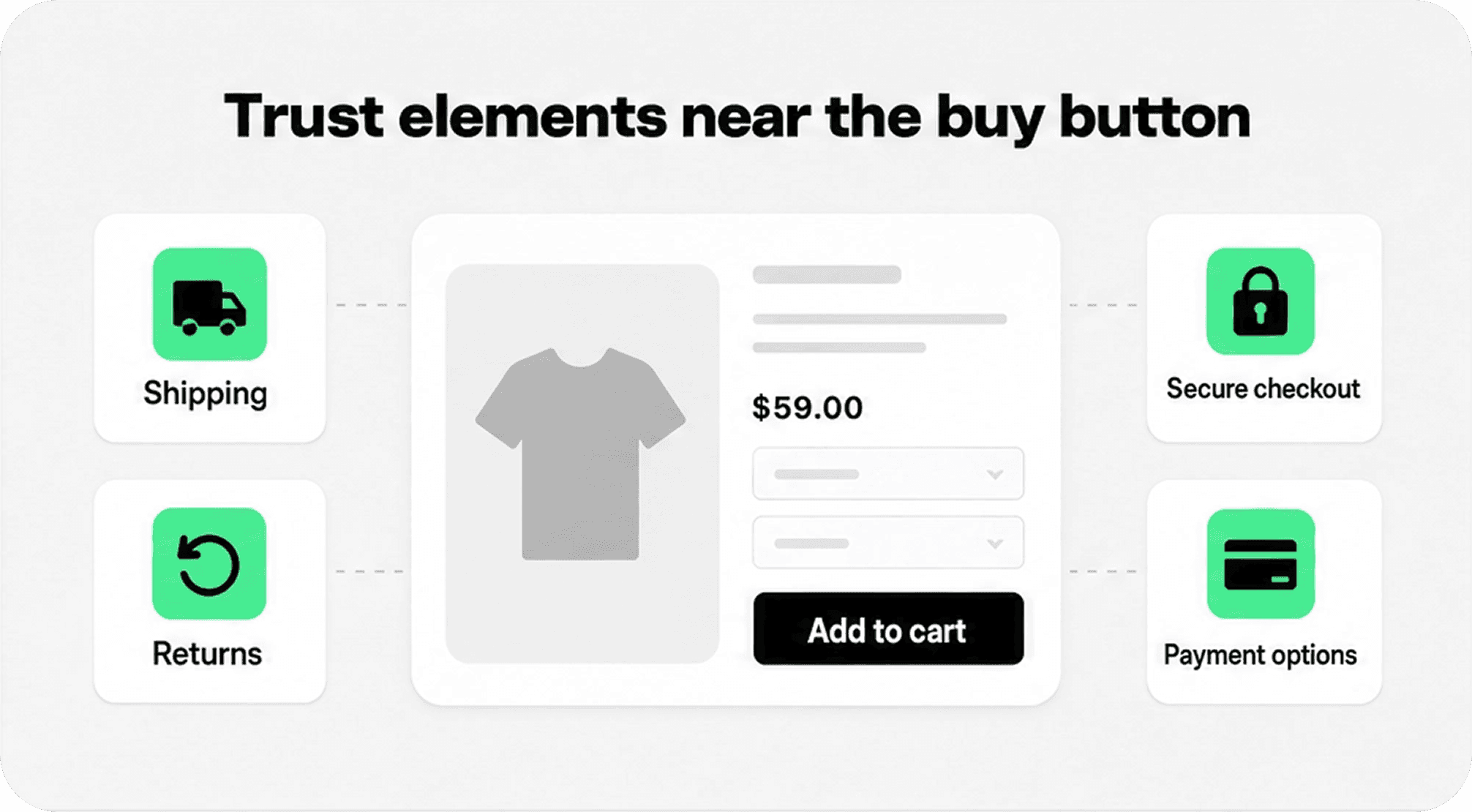
The highest-value placement for many trust elements is the product buy section: the area around the product title, price, variant selector, quantity selector, add-to-cart button, delivery note, and checkout option. This is where shoppers are actively weighing whether to continue.
A trust cue works harder when it appears close to the doubt it answers. If the shopper worries about delivery, a short shipping promise near the product form helps more than a policy link hidden in the footer. If the shopper worries about paying safely, accepted payment icons or secure checkout microcopy near the add-to-cart or cart checkout path feel more relevant than a generic seal buried below reviews.
Shopify’s trust badge guidance describes trust badges as credibility signals and notes that merchants can use official Shopify badges as well as third-party apps for payment icons, security badges, review endorsements, and policy-specific badges. Source: Shopify trust badges guide.
For Shopify product page optimization, start with three to five trust elements near the buy section. That is usually enough to reassure without crowding the CTA.
Match each trust cue to the buyer doubt
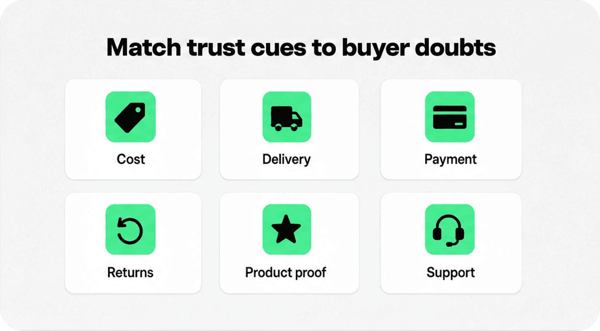
A strong product page does not use trust elements randomly. It pairs each cue with a specific hesitation. The shopper may like the product but still wonder about shipping cost, delivery speed, return risk, payment safety, size, materials, support, or whether the store is legitimate.
Baymard’s 2026 cart and checkout abandonment data shows why these concerns matter. After excluding people who were just browsing, shoppers cited extra costs, slow delivery, lack of credit-card trust, unsatisfactory returns, inability to calculate total cost up front, and insufficient payment methods among the reasons they abandoned purchases. Source: Baymard cart abandonment research.
Although that research focuses on cart and checkout, many of those doubts begin earlier on the product page. If the product page makes delivery, returns, payment options, and product proof clear before the shopper reaches checkout, the page can reduce friction before it becomes abandonment.
Use this simple filter: if a trust element does not answer a real buyer doubt, it should not sit near the buy button. Move it lower, rewrite it, or remove it.
Use this trust element priority table
The table below gives a practical Shopify product page optimization framework. Use it to decide what belongs near the product form, what belongs lower on the page, and what needs supporting detail elsewhere.
Buyer doubt | Trust element to show | Best product page placement | Avoid |
|---|---|---|---|
Will delivery be expensive or slow? | Shipping cost, threshold, speed, tracking, delivery date | Near price, add-to-cart, cart drawer, or shipping details | Hiding shipping until checkout or using vague “fast delivery” copy |
What if the product does not work for me? | Returns, exchanges, guarantee, warranty | Near variants, sizing info, product form, or accordion rows | Saying “risk free” without a clear policy |
Can I pay safely and conveniently? | Secure checkout note, payment icons, wallet options | Near add-to-cart, cart checkout button, or footer baseline | Showing unavailable payment methods or fake security seals |
Is the product actually good? | Reviews, rating count, testimonials, UGC, quality proof | Near title, below product media, around product description | Using unsupported claims or pushing reviews too far down |
Can I get help if I need it? | Support hours, FAQ, contact options, chat availability | Product FAQ, support block, footer, cart reassurance | Making support invisible until after purchase |
Is this product right for my situation? | Product benefit icons, specs, fit guide, compatibility, materials | Near product description, variant selector, or comparison block | Generic badges that do not match the product |
Prioritize clarity before adding more trust badges
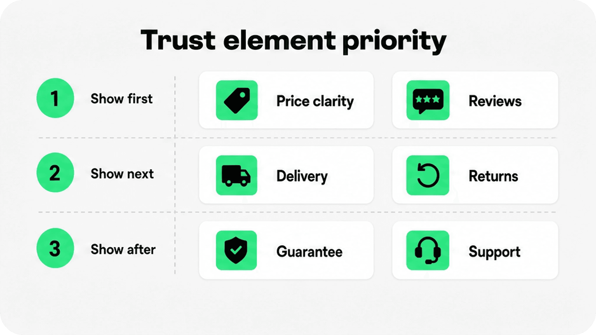
The easiest way to optimize a Shopify product page is often to remove uncertainty, not add decoration. If the price, discounts, shipping threshold, returns, and product benefits are unclear, a badge strip will not fix the problem.
Start with the trust elements that affect the highest number of shoppers. For most stores, that means price clarity, delivery clarity, returns, reviews, secure checkout, payment options, and product-specific proof. Then adjust by product type.
Apparel pages may need sizing, exchanges, fabric, and fit guidance. Electronics pages may need compatibility, warranty, setup, and support. Beauty pages may need ingredients, skin type, certifications, returns, and reviews. Furniture pages may need delivery windows, assembly, dimensions, materials, and warranty.
Shopify’s broader trust badge article groups common trust badges into security, payment, endorsement, policy-specific, and media mention badges, and notes that policy badges such as free shipping, free returns, and money-back guarantees can be useful on checkout or product pages. Source: Shopify trust badge types.
Optimize the mobile product page trust check
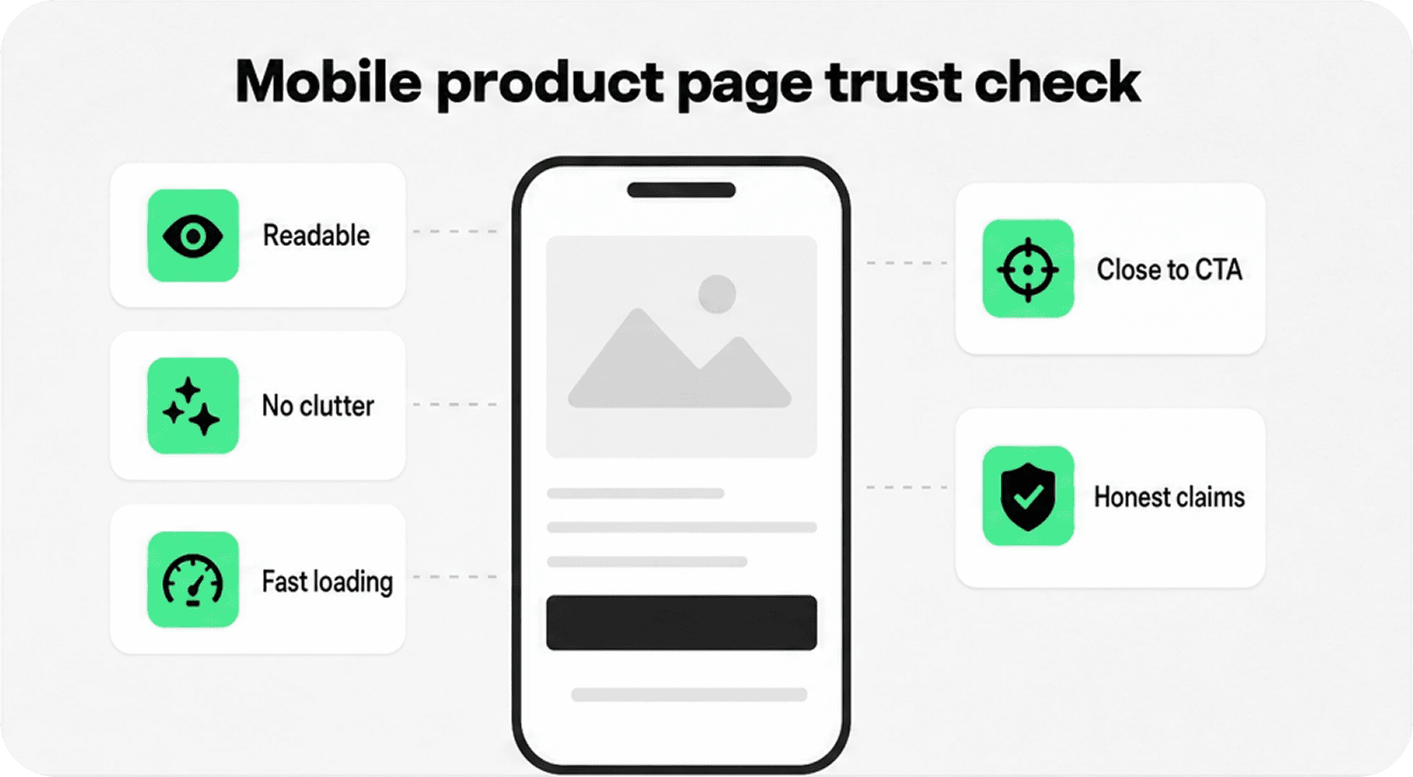
Mobile is where trust elements become either helpful or messy. A desktop row of five badges may become a cramped two-line block under the buy button. A long label may wrap awkwardly. A heavy icon strip may push reviews, delivery details, or the CTA too far down the screen.
To optimize Shopify product page trust elements for mobile, use short labels, consistent icon sizes, enough tap spacing, and no more than the strongest few cues near the CTA. If a claim needs explanation, use a short label near the buy section and link or expand into details lower on the page.
A mobile trust block should pass five checks: it is readable, close to the CTA, not cluttered, honest, and fast loading. If it fails any of those checks, simplify it before testing.
How to optimize Shopify product page trust elements step by step
Use this workflow before installing another app or redesigning the template.
Audit the top product pages by traffic and revenue. Do not optimize only the homepage.
List the main buyer doubts for each product type: cost, delivery, returns, payment, sizing, materials, support, warranty, or proof.
Choose one trust element for each major doubt. Keep the buy-section set to three to five cues.
Rewrite vague labels into specific claims: “30-day returns” instead of “Easy returns,” “Free shipping over $50” instead of “Fast shipping.”
Place product-specific cues near the product form and policy details where shoppers naturally look for them.
Check mobile before desktop polish. If trust elements crowd the CTA on mobile, reduce the set.
Measure changes with a simple KPI such as add-to-cart rate, product page conversion rate, checkout starts, or revenue per visitor.
For many merchants, the fastest improvement is not a full redesign. It is a tighter product page trust layer: clearer delivery expectations, visible returns, stronger review placement, better product benefit icons, and cleaner payment or secure checkout cues.
How Snapp can help
Snapp Trust Badges & Icons helps Shopify merchants add trust badges, payment icons, banners, and product benefit icon blocks without rebuilding the store or hard-coding image strips into product descriptions.
That matters because product page trust elements should look native to the store. A badge row that clashes with the theme can make the page feel less trustworthy, even when the underlying claim is useful. Snapp is a good fit when the merchant wants confidence cues that are simple, consistent, and easy to place across product pages.
Want to add trust badges, payment icons, and product benefit icons without editing code? Snapp Trust Badges & Icons helps Shopify merchants add clean confidence cues across key store pages.
Final recommendation
Shopify product page optimization should make the product decision feel easier. Do not start by adding every trust badge you can find. Start by identifying what the shopper might doubt, then place the smallest useful trust element near that decision.
If your product page already has strong media, clear pricing, useful descriptions, and a visible CTA, trust elements can be the layer that helps hesitant shoppers continue. Use them carefully: specific claims, close placement, clean design, honest proof, and mobile-first restraint.