TL;DR
Shopify CRO is storewide work. Do not limit conversion rate optimization to product pages or button colors; improve the path from first landing page through checkout.
Start with measurement. Compare sessions, add-to-cart rate, reached-checkout rate, checkout completion, revenue per visitor, source, device, and landing page before choosing fixes.
Match every page to shopper intent. Landing pages should keep the promise of the ad or search result, navigation should make the next path obvious, and collections should make comparison easy.
Reduce hesitation near decisions. Product pages, carts, and checkout-adjacent areas need clear product information, price context, delivery details, return reassurance, payment confidence, and proof.
Prioritize tests by impact. The best way to improve Shopify conversion rate is to fix the biggest measurable leak first, then test smaller refinements once the journey is already clear.
What Shopify conversion rate optimization really means
Shopify conversion rate optimization is not one tactic. It is a repeatable process for helping more qualified shoppers complete the next useful action: clicking from an ad to the right page, finding a product, adding it to cart, starting checkout, completing payment, or returning later to buy.
Shopify defines CRO as a data-driven, iterative process for increasing the percentage of visitors who complete a specific action, and its 2026 CRO guide is explicit that CRO is not just changing button colors or testing the last click. Source: Shopify CRO guide.
For Shopify merchants, that matters because a storewide conversion problem rarely lives in one place. A homepage can attract the right shopper but send them into confusing navigation. A collection page can show the right products but make comparison difficult. A product page can earn interest but fail to answer delivery or sizing questions. A cart can create uncertainty about shipping costs. Checkout can introduce account, payment, or address friction.
A practical CRO framework follows the shopper rather than chasing isolated hacks. The question is simple at each step: what does the shopper need to understand, trust, or do next?
Build a Shopify CRO journey map
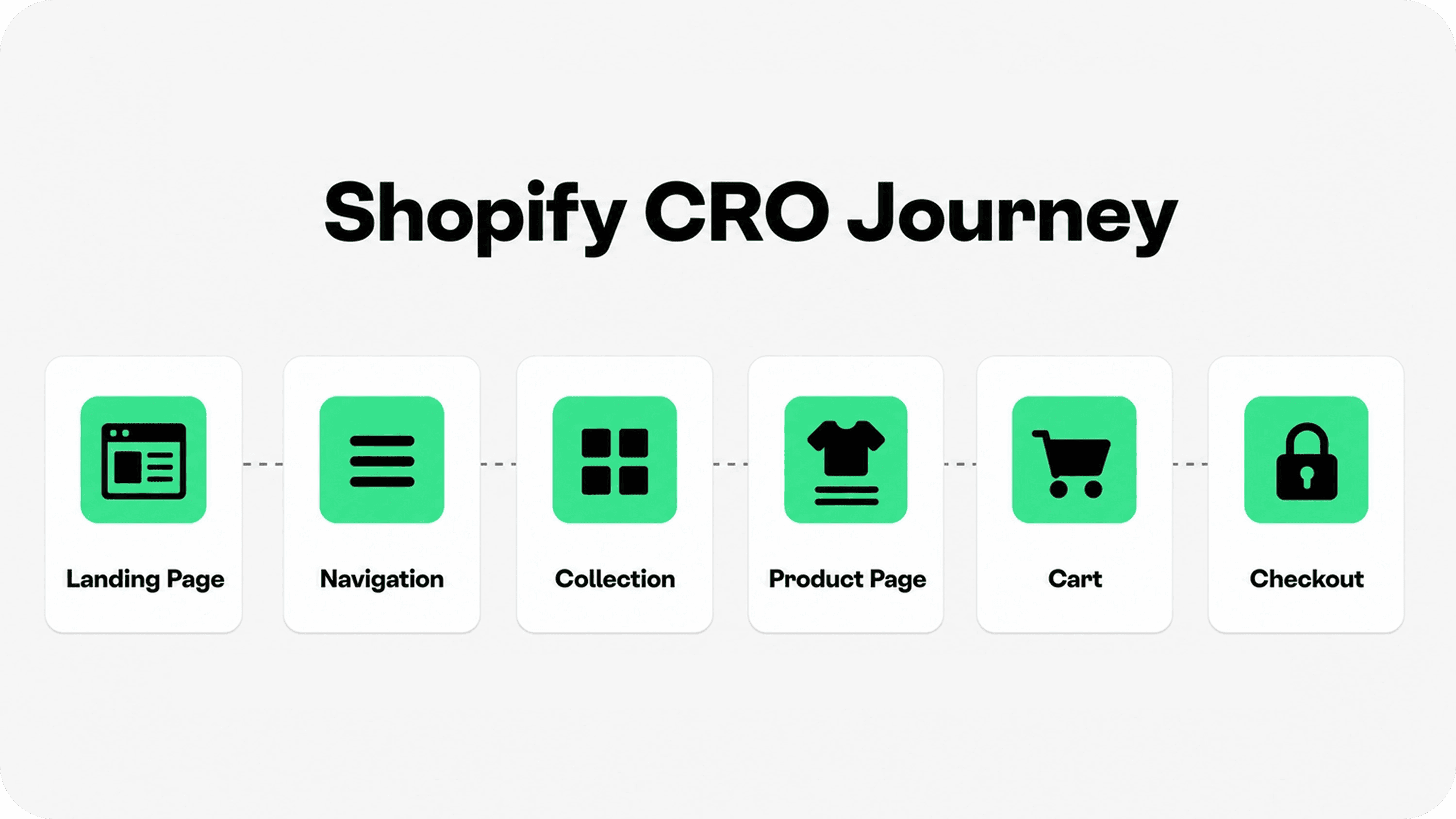
Start by mapping the full path from acquisition to order. For most stores, the journey includes six conversion zones: landing page, navigation, collection, product page, cart, and checkout. Each zone has a different job, so each zone needs a different diagnostic lens.
In Shopify, the standard store conversion rate is session based: sessions that completed checkout divided by total sessions. Source: Shopify CRO guide That number is useful, but it becomes much more actionable when you also review funnel-stage metrics.
Look at conversion by source, device, landing page, product, collection, and customer type. If mobile conversion is weak, the issue may be speed, layout, tap targets, image weight, cart drawer behavior, or checkout friction. If paid social traffic has a high bounce rate, the issue may be audience quality or message mismatch. If product pages get views but few add-to-carts, the issue is closer to offer clarity, page content, trust, or price perception.
This is where many Shopify CRO projects go wrong. Merchants jump to redesigning the product template before checking whether the right visitors are landing on the right pages. A journey map protects you from polishing the wrong page.
Measure the leak before changing the store
Before installing another app or rewriting every page, gather a baseline. Track online store conversion rate, add-to-cart rate, reached-checkout rate, checkout completion, average order value, revenue per visitor, returning customer rate, bounce or engagement patterns, and support questions tied to buying doubts.
Shopify's web performance reports also help merchants understand loading speed, interactivity, and visual stability against Core Web Vitals, and Shopify notes that optimizing performance can improve customer experience, discoverability, and conversion rates. Source: Shopify web performance reports.
Do not treat one storewide conversion rate as the whole truth. A luxury jewelry store, a low-AOV consumables store, a repeat-purchase subscription brand, and a seasonal gift store will not behave the same way. Segment the data before judging performance.
Use the table below to connect the symptom to the part of the journey that most likely needs attention.
Conversion symptom | Likely journey issue | What to inspect first | First Shopify CRO test |
|---|---|---|---|
High bounce from landing pages | Message mismatch or slow first impression | Ad/search promise, hero copy, mobile load, first CTA | Rewrite the first screen around one offer and one next step |
Shoppers browse but do not click products | Navigation or collection friction | Menu labels, collection hierarchy, sort, filters, product card information | Create clearer collection paths and improve product card comparison cues |
Product views but low add-to-cart | Weak offer clarity or product confidence | Images, benefits, specs, variants, sizing, price context, reviews, policies | Clarify the buy area with stronger value, proof, and product-specific reassurance |
Add-to-cart is healthy but checkout starts are low | Cart hesitation | Shipping threshold, discount field, payment icons, returns, support access, cart layout | Add concise shipping, return, payment, and support cues near the cart CTA |
Checkout starts but orders are low | Checkout friction or surprise costs | Payment methods, delivery options, address flow, taxes, account requirements, error states | Test checkout on mobile and remove unnecessary steps or surprises |
Conversion varies sharply by device or source | Channel or UX mismatch | Mobile path, traffic quality, geography, offer, campaign landing page | Create source-specific landing paths and fix the weakest device experience first |
Improve landing pages, navigation, and collections
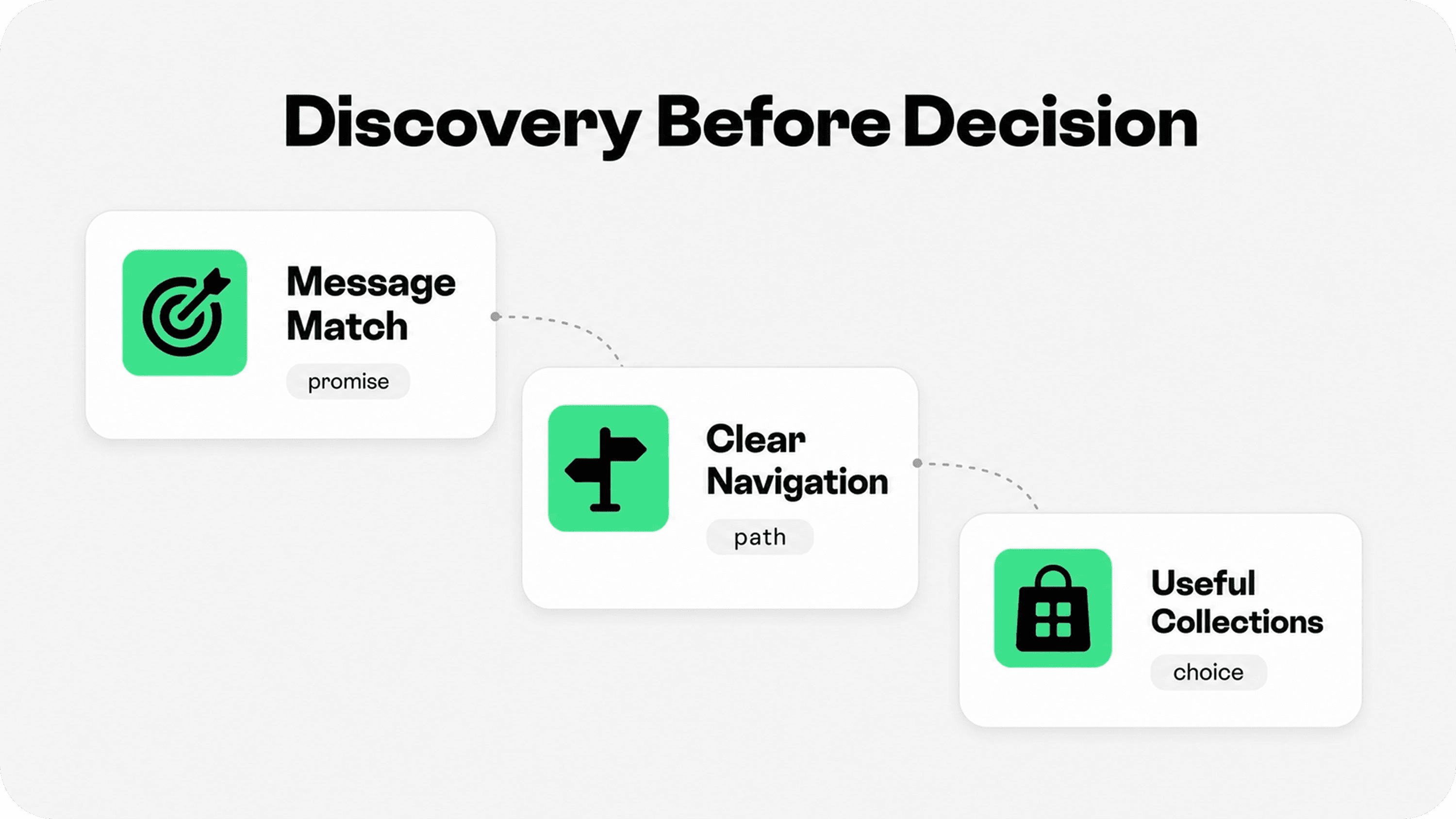
The first half of Shopify CRO is discovery. A shopper has to understand where they are, why the store is relevant, and where to go next. If discovery is weak, product page optimization cannot rescue the journey because too few qualified shoppers reach the right product.
Landing pages should keep the promise that created the click. If an ad promotes a bundle, the landing page should show that bundle quickly. If a search result promises a category guide, the page should explain the category and route shoppers into the right products. If an influencer sends traffic for a specific use case, the landing page should not drop visitors into a generic homepage.
Navigation should use shopper language rather than internal catalog language. Use menu labels that match how customers think about the product: product type, use case, recipient, material, problem, price range, or season. Avoid hiding important buying paths behind vague labels like Explore, Lifestyle, or Essentials unless the brand has already trained shoppers to understand them.
For collection-page depth, link internally to Shopify Collection Page Best Practices, which covers collection hierarchy, product grids, sorting, mobile browsing, and merchandising in more detail.
Collections should help shoppers compare. Strong collection pages use clear titles, short context, useful sort options, focused filters, consistent product images, visible prices, ratings or proof where available, and product badges only when they communicate something real. The goal is not to show everything. The goal is to help shoppers narrow the list with confidence.
Optimize product pages, cart, and checkout together
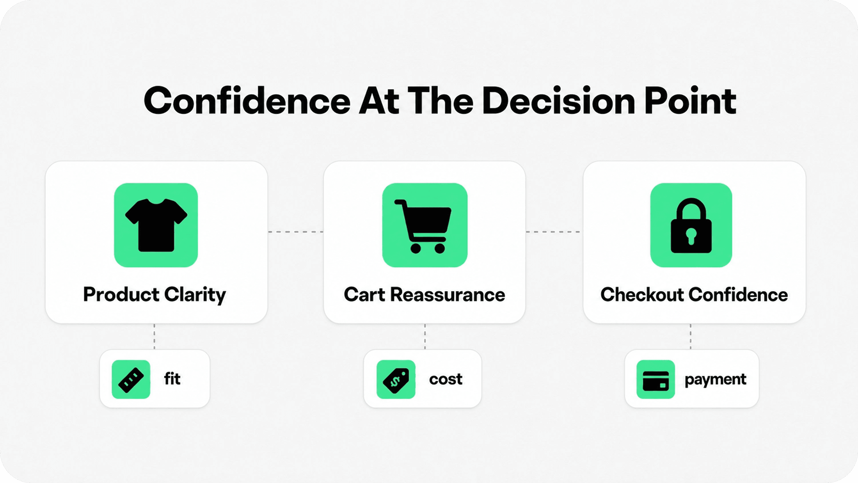
The second half of Shopify CRO is decision support. Product pages, cart, and checkout work as one buying sequence. A shopper who feels confident on the product page can still hesitate in cart if shipping is unclear. A shopper who likes the cart can still abandon checkout if payment, delivery, or account options feel wrong.
On product pages, focus first on clarity. The buy area should explain what the product is, who it is for, what makes it valuable, what options are available, what is included, when it ships, how returns work, and why the store is trustworthy. Use product images, short benefit copy, specifications, reviews, sizing or compatibility details, FAQs, and trust cues around real objections.
A deeper product-page companion is Shopify Product Page Optimization: Trust Elements That Help Customers Buy. This article stays broader, but product-page trust still matters most when it answers specific doubts near the buying decision.
In cart, reduce uncertainty before the shopper commits to checkout. Show subtotal clarity, shipping thresholds, discount behavior, accepted payment methods, return reassurance, delivery expectations, support access, and a clear checkout CTA. Keep the cart calm. Badge walls, aggressive urgency, and competing upsells can make a ready shopper pause.
Baymard has tracked cart and checkout abandonment for many years and reports a global average cart abandonment rate of about 70%, which is a reminder that late-stage friction is structural in ecommerce. Source: Baymard cart and checkout research.
Checkout is where the sale becomes real. Shopify Checkout gives merchants a strong base, but store owners should still test the live mobile checkout path, payment methods, shipping options, discounts, taxes, account prompts, address validation, and market-specific details. Do not assume checkout works because it technically loads.
Make mobile speed and usability part of every CRO pass
Many Shopify CRO problems are really mobile problems. A theme that feels polished on desktop can become slow, crowded, or hard to tap on a phone. Product images can push the buy button too far down. Sticky bars can cover key content. App blocks can stack awkwardly. Long badge labels can wrap and make the first screen feel noisy.
Google describes Core Web Vitals as real-world user experience metrics for loading performance, interactivity, and visual stability. Source: Google Search Central Core Web Vitals For Shopify merchants, that translates into practical CRO work: lighter media, fewer blocking scripts, stable layouts, and faster taps.
Review each page type on a real phone: homepage, campaign landing page, collection, search results, product page, cart drawer or cart page, and checkout. Ask whether the next action is visible, whether the page responds quickly, whether text is readable, whether important reassurance sits near the decision, and whether any app block pushes core buying content too far down.
For a mobile-specific companion, use Shopify Mobile Optimization: How to Improve UX.
Build a storewide trust layer without clutter
Trust is not a single badge. It is the overall evidence that the store is real, clear, reliable, and safe enough to buy from. A strong trust layer includes contact information, policies, shipping clarity, return reassurance, reviews, secure payment confidence, product proof, realistic claims, and consistent details across the journey.
The key is matching the trust signal to the doubt. A payment icon belongs near payment decisions. A return promise belongs near product and cart decisions. A delivery estimate belongs near price and checkout decisions. Reviews belong where shoppers are judging product fit. A guarantee should be specific enough to mean something.
Snapp Trust Badges & Icons is useful when a merchant wants to add lightweight, on-brand trust cues across product pages, cart areas, and other decision points without hard-coding visual strips into the theme. For a broader starting point, see Shopify apps to increase sales.
Use Snapp as part of the trust layer, not as a substitute for the truth behind it. If a badge says 30-day returns, the return policy should say the same thing. If a payment row shows a wallet, the customer should actually be able to use it. If a shipping icon says fast delivery, the shipping settings and fulfillment workflow need to support the claim.
Prioritize Shopify CRO tests without guessing
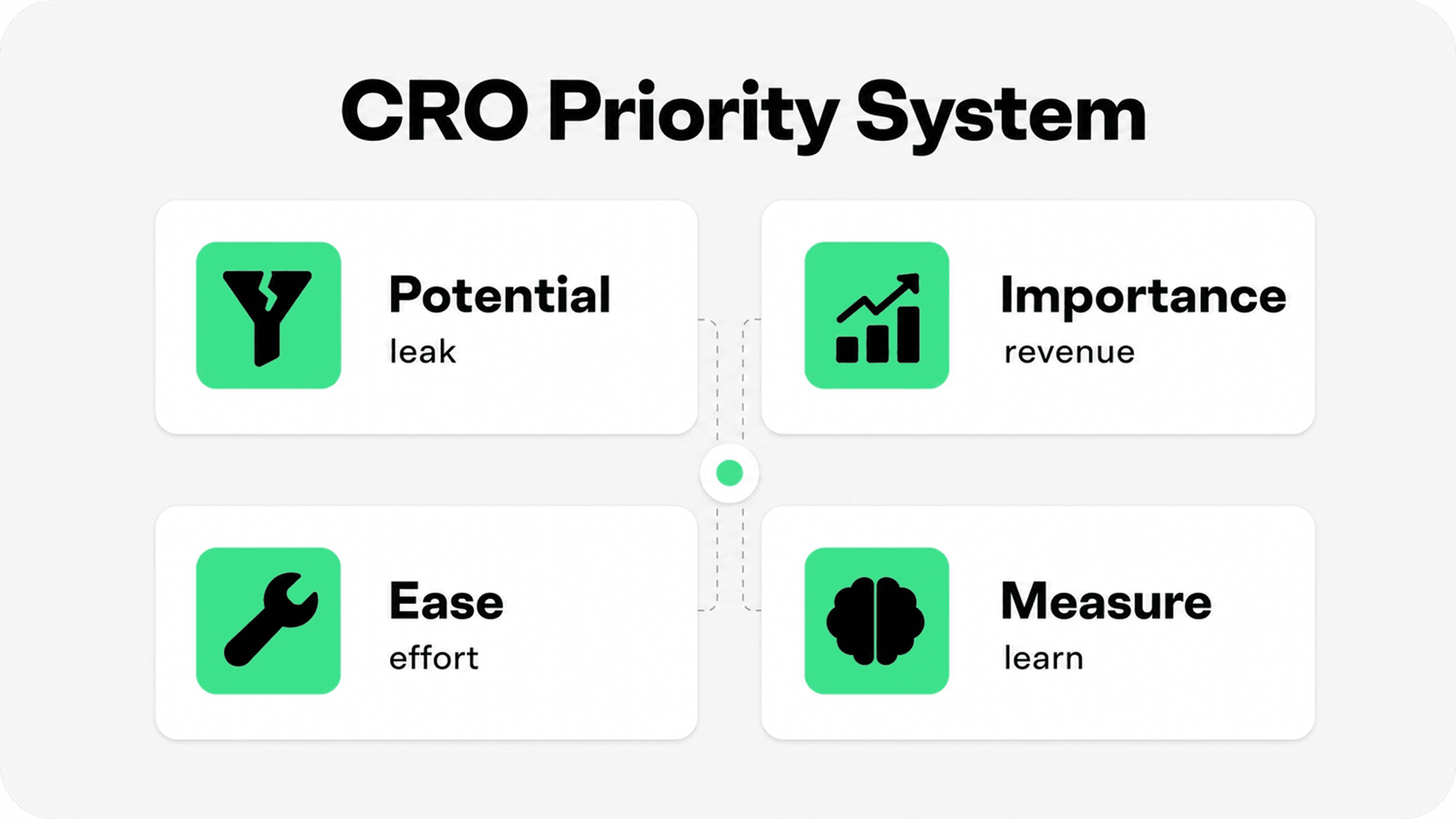
Once the journey is mapped, prioritize tests by potential, importance, and ease. High-potential pages have obvious friction or weak performance. Important pages influence revenue: top landing pages, top collections, top products, cart, and checkout. Easy tests can be implemented cleanly without weeks of development or a messy theme overhaul.
Shopify's CRO guide describes the PIE framework as one way to rank ideas by potential, importance, and ease. Source: Shopify CRO guide.
For smaller Shopify stores, not every change needs a formal A/B test. If traffic is limited, use a before-and-after measurement window, compare similar periods, annotate changes, and avoid making five major edits at once. The goal is to learn which friction point mattered, not just to make the store different.
A practical 30-day CRO sprint might look like this: week one, baseline analytics and shopper journey audit; week two, landing page and collection fixes; week three, product page and cart clarity; week four, mobile speed, checkout testing, and measurement review. Repeat the cycle with the next highest-leverage leak.
Common Shopify CRO mistakes to avoid
Testing tiny changes before fixing obvious friction. Button colors matter less than unclear offers, slow mobile pages, hidden shipping costs, or confusing product options.
Copying another store's layout without understanding intent. A CRO pattern that works for a subscription skincare brand may not work for furniture, electronics, apparel, or gifts.
Adding too many apps at once. Apps can help, but they can also slow the storefront or create overlapping widgets that distract from buying.
Using fake urgency or vague trust claims. Countdowns, exaggerated scarcity, and unsupported badges can damage confidence even if they create short-term clicks.
Judging conversion rate without segmentation. Always compare source, device, page type, country, product, and customer type before deciding what the number means.
Final recommendation
The best Shopify conversion rate optimization work starts with the shopper journey, not a tactic list. Map how people arrive, browse, compare, decide, cart, and check out. Then fix the clearest leak with the highest revenue impact.
If the store is hard to understand, improve message match and navigation. If shoppers cannot compare products, improve collections and product cards. If product pages create hesitation, improve clarity, proof, policies, and trust cues. If cart or checkout drops are high, remove uncertainty around cost, delivery, payment, support, and returns.
CRO works best as a calm operating rhythm: measure, prioritize, change one meaningful thing, validate, and repeat. That is how Shopify merchants increase conversion rate without turning the store into a pile of popups, badges, and guesses.