TL;DR
The best Shopify cart page optimization work reduces doubt before the shopper enters checkout.
Add trust signals close to the cart checkout button, order summary, shipping message, payment row, and policy links.
Prioritize specific trust cues: secure checkout, payment options, shipping clarity, easy returns, reviews or proof, and support access.
A clean cart page usually converts better than a crowded badge wall. Use fewer cues that answer real buyer concerns.
Snapp can help Shopify merchants add trust badges, payment icons, and simple reassurance blocks without editing theme code.
What Shopify cart page optimization really means
Shopify cart page optimization is the process of improving the cart page or cart drawer so shoppers can review their order, understand the total value, feel safe continuing, and click checkout with fewer doubts. It sits between product-page persuasion and checkout completion.
That makes the cart different from a product page. A product page has to explain why the item is worth buying. A cart page has to confirm that the decision is safe, clear, and worth finishing right now.
Cart trust matters because many abandonment reasons are practical and fixable. Baymard’s cart abandonment research lists extra costs, slow delivery, credit-card trust concerns, unsatisfactory returns, lack of upfront total cost, and too few payment methods among the reasons shoppers abandon purchases after excluding people who were just browsing. Source: Baymard cart abandonment research.
Those issues do not begin only after checkout loads. They often appear while the shopper is scanning the cart. If the cart page hides shipping details, lacks payment reassurance, or makes returns hard to find, the checkout button starts to feel risky.
Cart trust signals to add before checkout
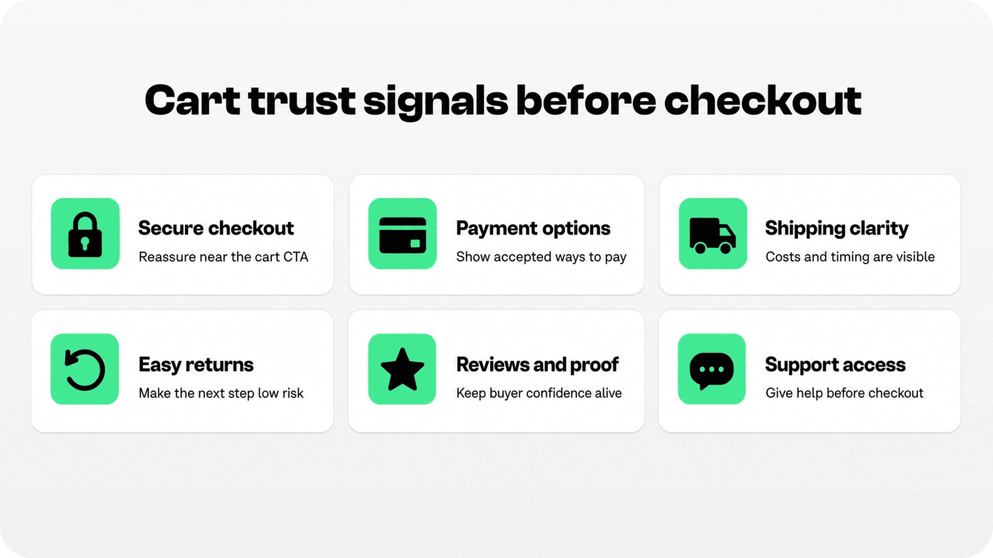
A Shopify cart page should not try to prove everything. It should answer the last few questions that stop a shopper from continuing. For most stores, the strongest trust signals are the ones that make the next click feel lower risk.
Start with secure checkout reassurance. This can be a small lock icon, a short line such as “Secure checkout,” or a compact badge row near the cart checkout CTA. Keep the claim defensible. The badge communicates confidence; it does not create security by itself.
Then show accepted payment options. Payment icons are useful on the cart page because they confirm whether the shopper can pay in the way they expected. Avoid fake or decorative payment logos. Only show payment methods the store actually accepts.
Shipping clarity is just as important as payment trust. If the cart can show free shipping progress, estimated delivery timing, pickup availability, shipping thresholds, or a link to shipping details, it helps shoppers understand what happens after payment.
Returns and guarantees also belong near the cart decision when they are short and specific. A line like “30-day returns” or “Easy exchanges” is often more useful than a generic “Satisfaction guaranteed” badge, because it tells shoppers what protection they actually have.
Shopify’s trust badge guide groups common badge types around payment security, accepted payment methods, returns, guarantees, reviews, and third-party credibility. For a cart page, the practical move is to choose the few that match the shopper’s final hesitation. Source: Shopify trust badges guide.
Prioritize signals by the doubt they answer
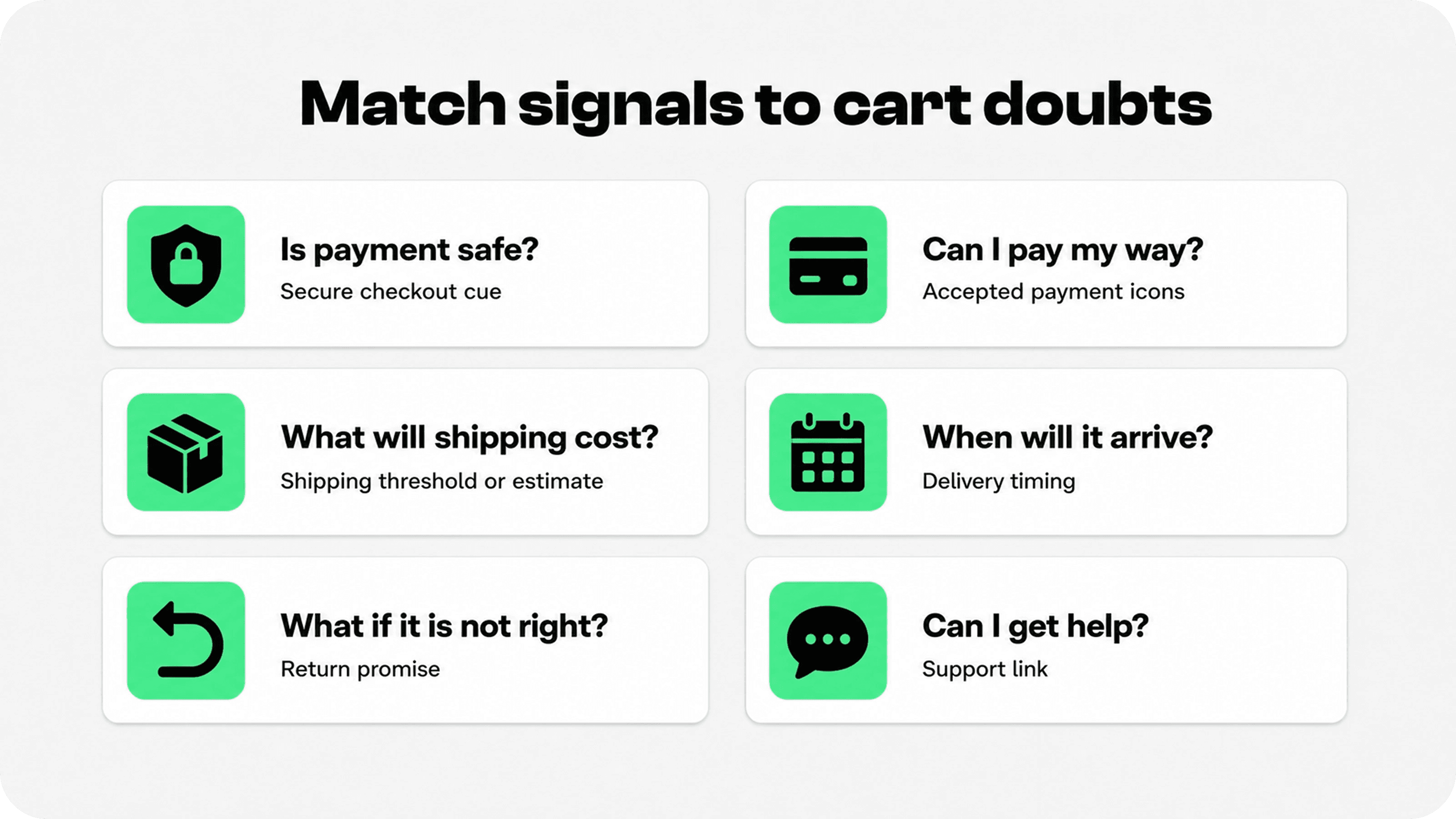
The most common mistake in Shopify cart conversion work is adding trust badges as decoration. A badge row only helps when it solves a specific problem in the shopper’s mind.
Use this table as a practical cart audit. It is intentionally focused on what to add before checkout, not every possible store-wide trust cue.
Buyer doubt | Cart trust signal to add | Best cart placement | Keep it clean by |
|---|---|---|---|
Is payment safe? | Secure checkout badge or short lock-icon line | Directly near the checkout button | Using one clear security cue, not five competing seals |
Can I pay my way? | Accepted payment icons or wallet labels | Below or near checkout CTA and express checkout area | Showing only real accepted methods |
What will shipping cost? | Free shipping threshold, shipping estimate, or shipping policy link | Order summary, subtotal area, or cart progress bar | Keeping the message short and specific |
When will it arrive? | Delivery estimate, pickup note, or dispatch timing | Near shipping message or below cart items | Avoiding vague promises like “fast delivery” |
What if it is not right? | Returns, exchange, or guarantee badge | Near checkout CTA or policy links | Stating the real window or condition |
Can I get help? | Support link, chat, email, or FAQ link | Near the bottom of cart or close to policy links | Offering one obvious help path |
This is the only table the article needs because the reader wants a usable decision guide: which doubt, which signal, and where to place it on the cart page.
Where to place trust signals on the Shopify cart page
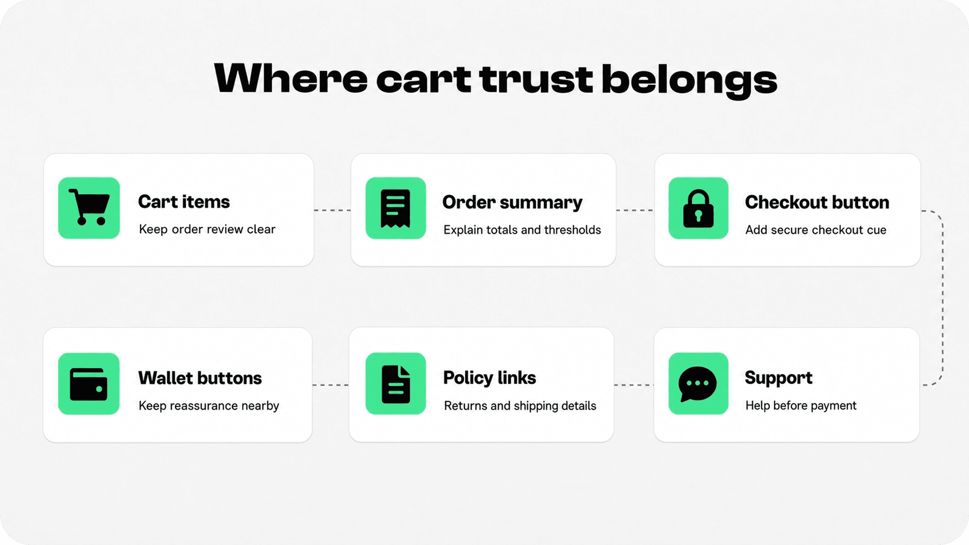
Placement should follow attention. On a cart page or cart drawer, shoppers usually scan the cart items, subtotal, discount field, shipping message, checkout button, express checkout options, and policy links. Trust cues should sit near those decision points.
The highest-impact area is usually around the checkout CTA. Place a secure checkout line, payment icon row, return promise, or short shipping reassurance close enough to support the button without competing with it.
If the store uses accelerated checkout buttons, Shopify explains that express checkout methods can save customer payment and shipping information so returning customers can complete payment faster. Shopify also notes that accelerated checkout buttons can appear at the beginning of checkout and that hiding them might negatively affect conversion rates. Source: Shopify accelerated checkouts.
For cart pages that show wallet buttons or express checkout options, do not crowd them with large custom graphics. Keep trust cues nearby and supportive: a short line, a small badge row, or a clear policy link is usually enough.
On mobile, spacing matters even more. A long badge strip can push checkout below the fold or wrap into a messy stack. Mobile cart trust signals should be short, tappable, and easy to scan with one thumb.
Shopify cart page examples: useful patterns to copy
Good Shopify cart page examples usually have the same structure: a clear item review area, a simple order summary, one obvious checkout CTA, and a compact trust layer near the decision.
For a low-AOV store, the cart trust layer might focus on free shipping progress, accepted payment icons, and a secure checkout line. The shopper wants to know the deal is still good and the payment step is simple.
For a higher-AOV store, the cart may need more risk reduction: returns, warranty, delivery timing, support, and real review proof. The higher the perceived risk, the more important it is to make policies visible before checkout.
For a replenishment or subscription product, the cart should clarify frequency, cancellation, support, and payment safety. Shoppers are not only buying a product; they are committing to a recurring experience.
If the cart page already links to trust content, connect it naturally to stronger Snapp resources. For example, merchants can link readers to Snapp’s guides on secure checkout badges, Shopify payment icons, and where to place Shopify trust badges when building out a broader trust layer.
Trust builders vs trust killers on the cart page
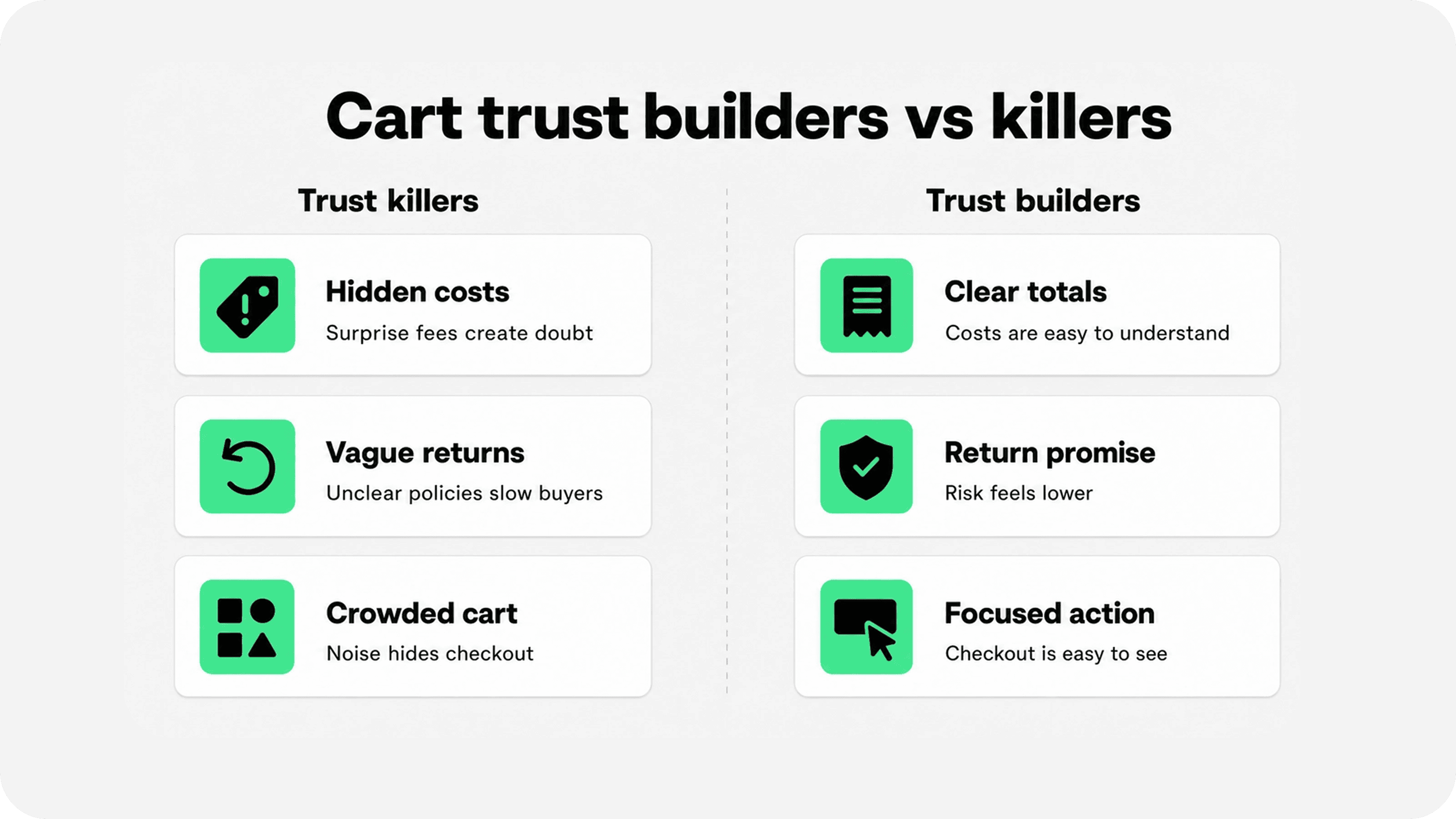
Cart trust builders are specific. They tell shoppers what will happen next. Cart trust killers are vague, late, or noisy.
A specific shipping line builds trust. A hidden shipping cost kills it. A real return window builds trust. A vague “easy returns” claim with no link can create more questions. Accurate payment icons build trust. A row of logos for methods the store does not support does the opposite.
The same rule applies to checkout trust badges. Do not add seals, certifications, payment logos, or guarantee claims unless the store is allowed to use them and the claim is true. Trust signals work because they reduce risk. Unsupported claims add risk.
The safest approach is to write cart trust copy like a promise you can prove: “Secure checkout,” “30-day returns,” “Free shipping over $50,” “Pay with Shop Pay, PayPal, Apple Pay, or card,” or “Need help? Contact support before ordering.”
How to optimize Shopify cart page trust without clutter
To optimize Shopify cart page trust, start with an audit before adding anything new. Open the cart page and ask what a first-time shopper can learn in ten seconds.
Can they see the checkout button without searching?
Can they understand the subtotal and any shipping threshold?
Can they tell which payment methods are accepted?
Can they find the return policy without leaving the buying flow?
Can they get help if something feels uncertain?
Does the cart feel calm on mobile, or does it look like a wall of badges?
After the audit, add only the missing trust cues. A cart page with one clean checkout button, one payment row, one shipping message, one return cue, and one support link can feel more trustworthy than a page filled with repeated icons.
Track changes over time. Watch cart-to-checkout click rate, checkout completion, mobile cart behavior, payment-method usage, and support questions. Trust signals should make the cart easier to finish, not just nicer to look at.
Where Snapp fits
Snapp Trust Badges & Icons is a practical fit when a Shopify merchant wants to add clean cart trust signals without hard-coding image strips into a theme. It can help with trust badges, payment icons, icon blocks, and simple reassurance banners that match the store design. See Snapp Trust Badges & Icons.
For a broader Snapp starting point, merchants comparing Shopify apps to increase sales can also use the Snapp homepage before choosing the right trust and conversion tools.
For cart page optimization, the best Snapp setup is usually a compact trust row near checkout plus supporting cues for shipping, returns, and payment confidence. Keep it useful, not loud.
Final recommendation
The best Shopify cart page optimization starts with one question: what could make a ready shopper hesitate before checkout? Add trust signals that answer that question directly.
Use secure checkout badges, payment icons, shipping clarity, return reassurance, review proof, and support access where they support the decision. Keep the cart page calm, mobile-friendly, and honest. A cart page does not need more decoration. It needs fewer unanswered questions.