TL;DR
A secure checkout badge is a promise, not security by itself. It should communicate a real protected checkout experience backed by HTTPS, reliable payment processing, clear policies, and accurate payment-method support.
Use the badge near payment hesitation. The strongest placements are product-page trust rows, cart drawers, cart pages, checkout-adjacent areas where editable, payment-method sections, and footer trust zones.
Avoid fake authority. Do not use security seals, card-network marks, or “verified” claims unless the store is actually authorized to use them and the claim is true.
Keep the row small. A few specific checkout trust badges are better than a crowded strip of generic secure checkout icons.
One image slot is intentionally empty. The Snapp implementation section includes a clear placeholder where a real Snapp secure-checkout badge example can be added later.
What is a secure checkout badge?
A secure checkout badge is a visual cue that tells shoppers the store takes the payment step seriously. It might say “Secure checkout,” “Safe checkout,” “Encrypted checkout,” “Secure payment,” or “100% secure checkout.” It may sit beside secure payment icons such as Visa, Mastercard, PayPal, Shop Pay, Apple Pay, or Google Pay, or appear as a lock, shield, card, or protection icon near a checkout button.
The important distinction: the badge does not create security. It communicates security. The real trust comes from the store using a protected checkout flow, legitimate payment providers, accurate policies, and a checkout experience that does not surprise the customer. A secure checkout badge is helpful only when the back-end experience supports the front-end claim.
For Shopify merchants, this matters because Shopify provides the checkout and payment infrastructure, while the merchant controls much of the messaging around product pages, cart drawers, cart pages, theme sections, app blocks, footer badges, and policy links. Shopify’s security badge guidance frames trust badges as signals that can reassure shoppers about payment security, shipping, returns, guarantees, and other risk points. See Shopify’s trust badge guide for context.
What secure checkout badges actually signal
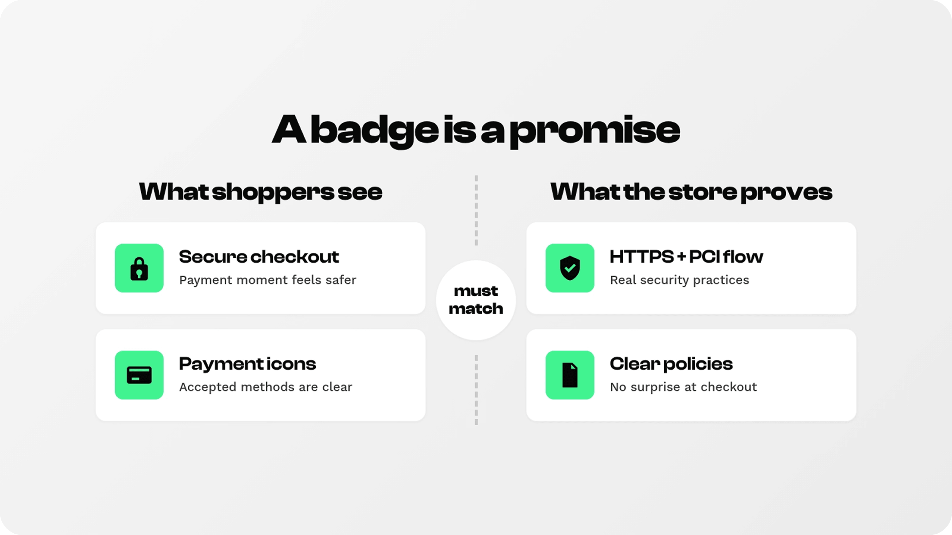
A secure checkout badge usually signals one or more of four things: the checkout page uses an encrypted connection, payments are processed by a reliable provider, common payment methods are accepted, and the merchant has policies that protect the shopper if something goes wrong. These signals are related, but they are not identical.
Encryption is the technical layer shoppers most associate with the lock icon. Shopify’s SSL documentation explains that SSL certificates encrypt store content and publish it securely using HTTPS. That is an important baseline, but “secure checkout” should not be reduced to a decorative lock alone. See Shopify’s SSL certificate documentation.
Payment security is also tied to compliance and processing. The PCI Security Standards Council explains that PCI DSS applies to entities that store, process, or transmit account data, and Shopify’s PCI page states that Shopify is certified Level 1 PCI DSS compliant by default. In plain English: the store should not invent payment-security claims; it should use accurate language that reflects the actual checkout/payment setup. See the PCI SSC PCI DSS overview and Shopify’s PCI compliance page.
Payment icons signal accepted payment options. They help shoppers recognize a method they trust, especially on mobile, but they do not prove a store is safer by themselves. A row of secure payment icons should therefore be accurate: only show methods the store actually accepts, and avoid implying third-party certification that does not exist.
Types of secure checkout badges and where each belongs
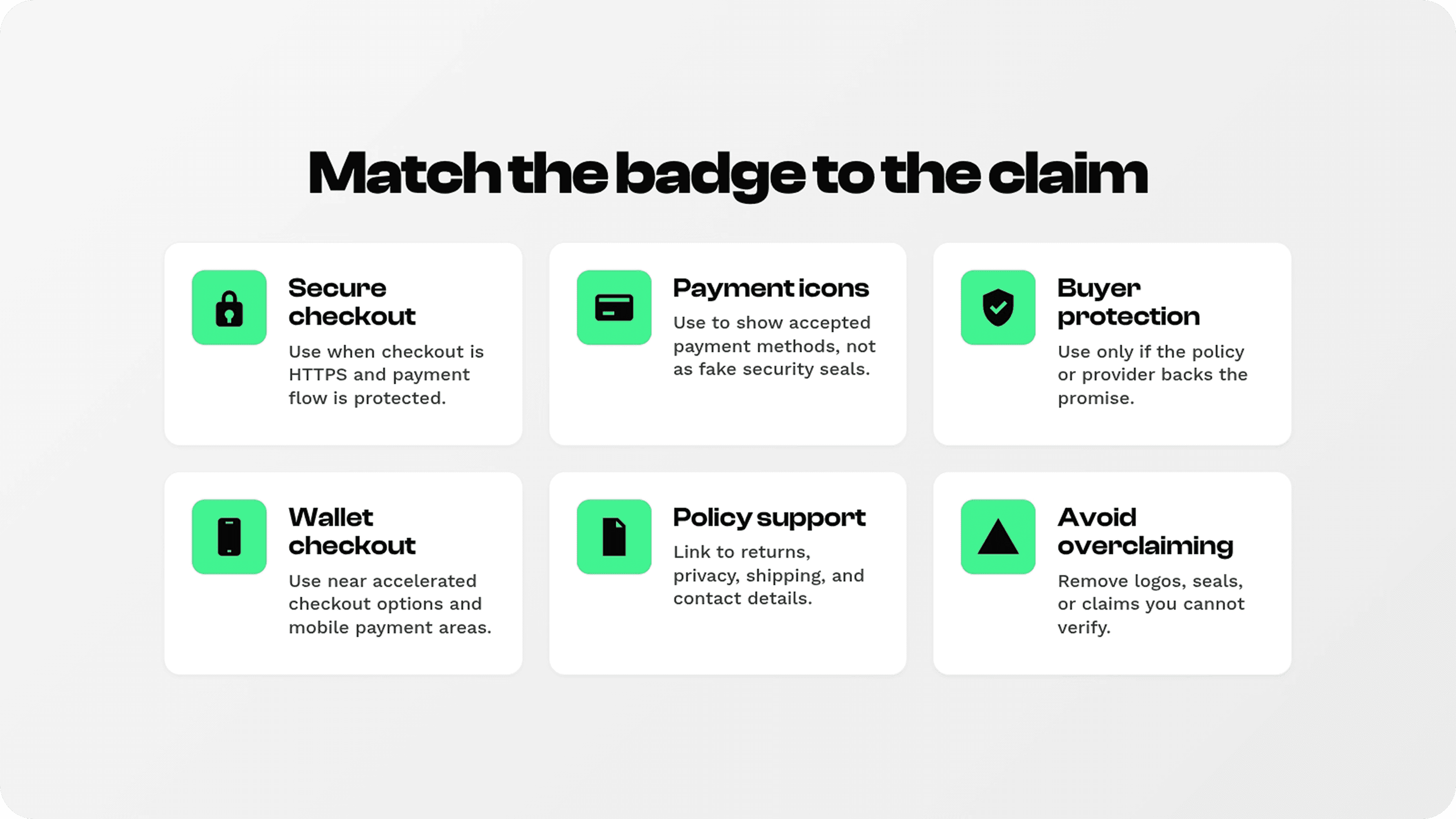
Most stores do not need every badge type. The goal is to match the badge to the shopper’s concern at that moment. A product page may need a small trust row; a cart drawer may need payment-method reassurance; a checkout-adjacent area may need only a compact “secure checkout” cue; a policy page needs explanation rather than icons.
Badge or icon type | What it means | Best placement | Use it only when |
|---|---|---|---|
Secure checkout badge | The payment step is protected and safe to continue | Near add-to-cart, cart checkout CTA, checkout-adjacent areas, footer trust row | Checkout is genuinely served over HTTPS and processed through legitimate payment infrastructure |
Safe checkout badge | A softer reassurance that the order/payment process is trustworthy | Product page trust row, cart drawer, cart page | The store also shows clear contact, returns, shipping, privacy, and support details |
Secure payment icons | Accepted payment methods shoppers recognize | Footer, cart, payment-method area, near checkout button | The store actually accepts those methods and the logos are used according to provider rules |
SSL/encryption lock icon | The store uses an encrypted connection | Cart and checkout reassurance copy, policy/FAQ sections | The store is actually using HTTPS/SSL correctly |
Buyer protection or guarantee badge | The shopper has recourse if something goes wrong | Product page, cart, guarantee section, returns policy | A real policy, provider, warranty, or guarantee backs the claim |
This is the only table the article needs: the reader wants to know what each badge means and where to use it, not sort through a long badge taxonomy. Keep the live article focused and practical.
Where to use secure checkout badges on Shopify
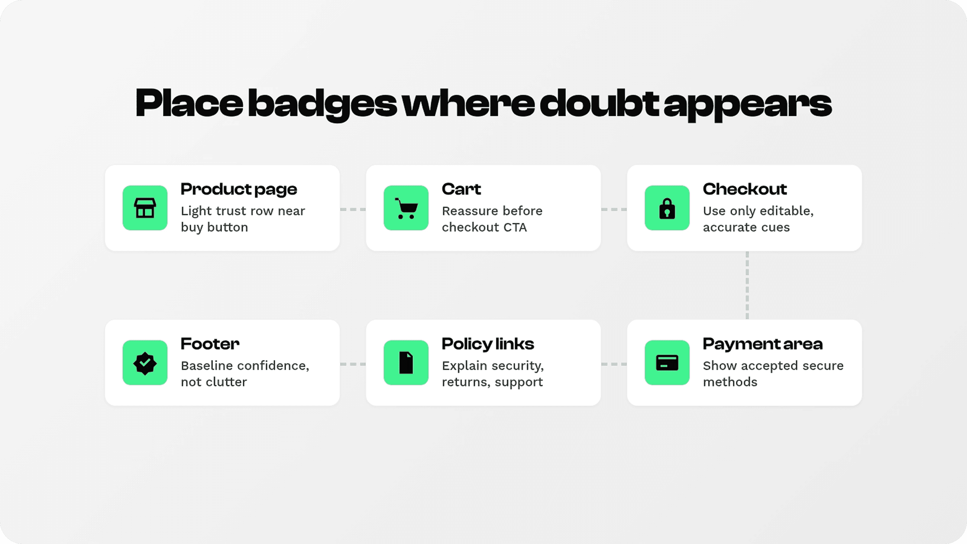
Placement should follow the shopper’s anxiety. A secure checkout badge belongs where the shopper is thinking, “Can I trust this store with my money and details?” That can happen before checkout, during the cart step, or while scanning payment options. It usually does not happen in the middle of a product description.
Product pages
Use a small trust row near the price, add-to-cart button, buy button, or product form. The best product-page row is not only “Secure checkout.” It can pair secure checkout with returns, shipping, support, or warranty badges so the shopper sees a complete risk-reduction system before taking action.
Cart drawer and cart page
The cart is often the best place for checkout trust badges because the shopper is close to payment but not yet locked into the checkout flow. Place a compact row near the checkout CTA, order summary, payment icons, or cart benefits. Copy like “Secure checkout,” “Encrypted payment,” or “Pay safely with Shop Pay, PayPal, Apple Pay, and cards” can work when the methods are accurate.
Checkout and payment area
Use checkout badges carefully. Shopify checkout customization depends on the merchant’s plan, theme, app capabilities, and checkout extensibility options, so a merchant may not be able to place arbitrary icons inside checkout. Shopify’s theme documentation notes that checkout-page security badge placement is restricted unless a merchant is working on a Shopify Plus store with checkout.liquid access. When checkout placement is limited, use the cart page, cart drawer, footer, payment icons, and policy links to set expectations before the customer enters checkout. See Shopify’s security badges theme documentation.
Footer and policy pages
Footer badges provide baseline reassurance, especially for new visitors scanning the store. They should not be the only trust signal because they are far from the buying decision. Pair footer secure checkout icons with privacy, returns, shipping, and contact links so the badge has a proof path.
Mobile layouts
On mobile, badge rows must stay short. A long strip of icons can push the add-to-cart button down, wrap awkwardly, or become unreadable. Use one clear secure checkout badge plus a short set of payment icons, then put longer explanations behind links or policy sections.
How to write badge copy without overclaiming
Secure checkout copy needs to be calm, specific, and defensible. Shoppers do not need a dramatic security promise. They need a quick reason to feel safe continuing.
Good: “Secure checkout.”
Good: “Encrypted checkout.”
Good: “Pay securely with Shop Pay, PayPal, Apple Pay, Google Pay, or card.”
Good: “Safe checkout backed by clear returns and support.”
Risky: “100% guaranteed secure” if the store cannot support exactly what that means.
Risky: “Verified by [provider]” without authorization or an active verification program.
Risky: Showing payment logos for methods the store does not actually accept.
The badge should also match the brand tone. A premium brand may prefer “Secure checkout” with a simple lock icon. A discount-heavy store may use payment icons and “Pay safely.” A store selling high-consideration products may need secure checkout plus returns, warranty, and support badges in the same row.
How to use Snapp for secure checkout badges
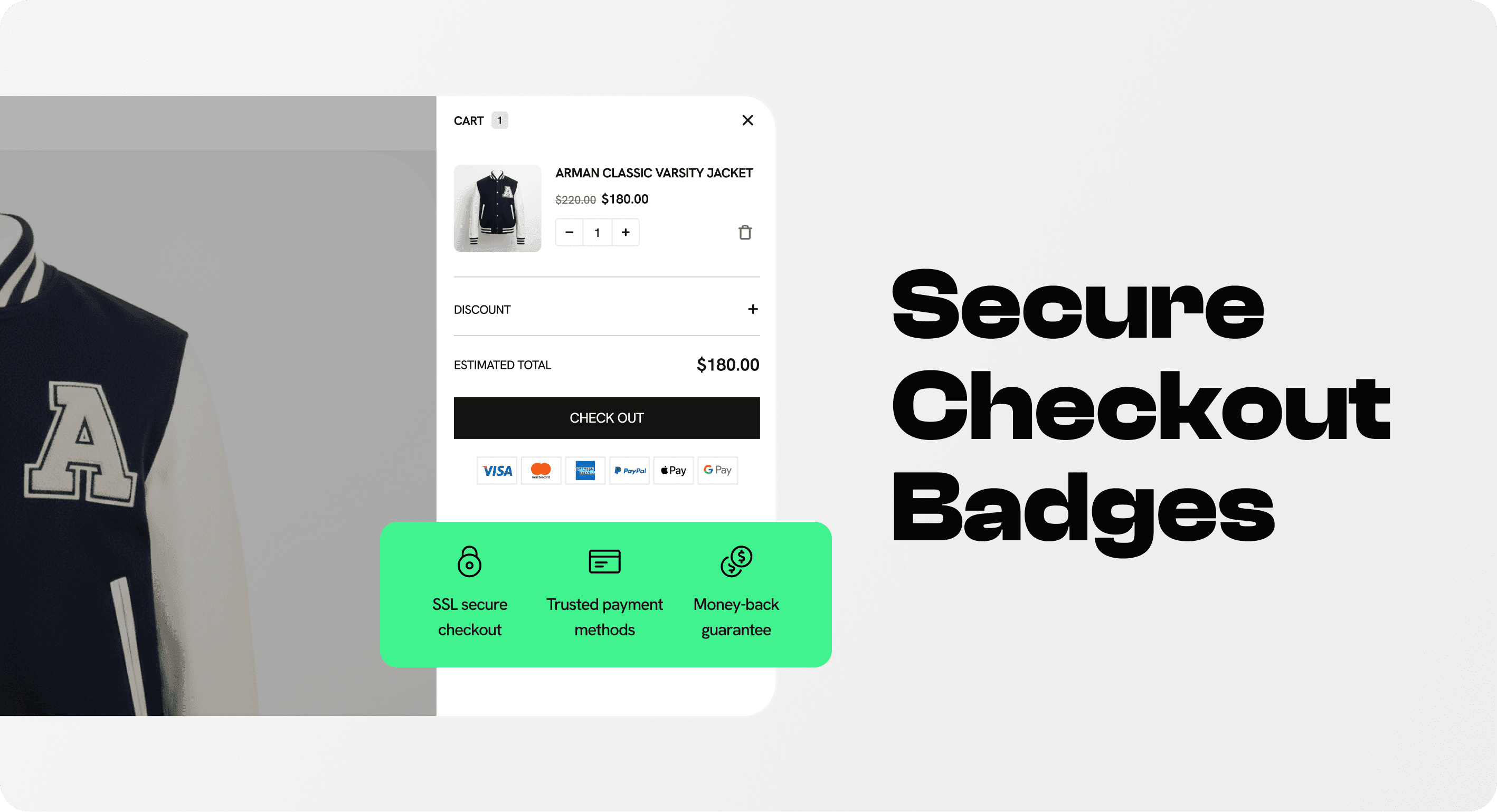
This is the intentional empty image slot requested in the brief. It should eventually show a real Snapp example: a clean badge row on a Shopify product page or cart drawer with a secure checkout badge, secure payment icons, and perhaps one supporting badge such as easy returns or fast support. Leaving this slot ungenerated avoids creating a fake app screenshot.
Snapp is a good fit when a Shopify merchant wants trust badges and secure checkout icons without editing theme code. Snapp’s product pages and Shopify App Store listing describe trust badges, banners, payment icons, custom icons, and placement through a theme app extension. See Snapp Trust Badges & Icons and the Snapp Shopify App Store listing.
Among Shopify apps to increase sales, Snapp focuses on the trust layer of the customer journey, helping stores make product and cart decisions feel clearer without adding unnecessary conversion widgets.
1. Choose the claim first
Start by choosing what the badge needs to say: secure checkout, safe checkout, accepted payments, returns, shipping, support, guarantee, or buyer protection. Do not start with the icon. Start with the shopper doubt and the proof behind the claim.
2. Build a small trust row
For most Shopify stores, the best Snapp setup is a compact row of three to five badges: secure checkout, payment options, returns, shipping, and support. This feels more trustworthy than a wall of ten unrelated icons because each badge answers a specific concern.
3. Place it near action
Place the row near the add-to-cart button, buy button, cart checkout CTA, or cart drawer summary. Use footer placement as a secondary trust layer, not the main conversion point.
4. Match styling to the store
The badge should look intentional, not pasted on. Snapp’s help center explains badge styling options such as spacing, typography, icon size, and colors, and it notes that app embeds must be enabled for badges to show. See Snapp’s badge styling guide and app embed troubleshooting guide.
Secure checkout badge mistakes to avoid
Using too many badges at once. A crowded row can look desperate or generic. Choose the few that answer the biggest doubts.
Making badges louder than the button. Trust badges should support the CTA, not compete with it.
Using unauthorised logos or seals. Payment brands and security providers have usage rules. If you cannot verify the right to use a logo or claim, do not use it.
Showing unsupported payment icons. If the store does not accept a method, the icon should not appear.
Hiding the policy proof. A safe checkout badge works better when privacy, returns, shipping, and contact links are easy to find.
Forgetting mobile. Badge rows must remain readable and compact on small screens.
Treating badges as a replacement for UX. Badges help, but they cannot fix surprise fees, unclear shipping, weak support, broken payment methods, or a confusing checkout flow.
Testing checklist before publishing
Before publishing checkout trust badges, test the full path from product page to cart to checkout. The goal is not only to make the icon visible; the goal is to make the claim true and useful.
Check HTTPS. Confirm the storefront and checkout load securely and do not show browser warnings.
Check payment icons. Only show payment methods that are actually available to the shopper’s market/device.
Check placement. The badge should appear near the relevant decision without pushing the CTA too far down.
Check policies. Privacy, returns, shipping, and contact details should be easy to reach.
Check mobile. Badge rows should not wrap awkwardly or become unreadable.
Check analytics. Monitor add-to-cart rate, cart-to-checkout rate, checkout completion, payment errors, and support questions about payment safety.
Check claims quarterly. Remove outdated logos, unsupported methods, retired seals, or old security claims.
Final recommendation
A secure checkout badge works best when it is specific, truthful, and close to the moment of payment hesitation. Use it as a reassurance cue, not a decoration. A small row near the add-to-cart button or cart checkout CTA can do more than a large badge buried in the footer because it appears when the shopper is deciding whether to continue.
For Shopify merchants using Snapp, the strongest approach is a compact trust row: secure checkout, recognized payment options, returns, shipping, and support. Keep the visual design clean, keep the copy defensible, and make sure every badge points back to a real store practice.
The best secure checkout badge is not the most dramatic one. It is the one that quietly answers “Is it safe to pay here?” at the exact moment the shopper needs the answer.