
TL;DR
Testimonials provide human proof. They show that real customers bought, used, and trusted the product.
Trust badges provide safety proof. They reassure shoppers about checkout security, payment options, shipping, returns, guarantees, and support.
The best conversion lift comes from matching proof to hesitation. A delivery testimonial belongs near shipping details; a security badge belongs near payment or checkout confidence moments.
Use fewer, stronger signals. Specific testimonials and relevant badges beat a crowded wall of generic logos.
Why testimonials and trust badges work together
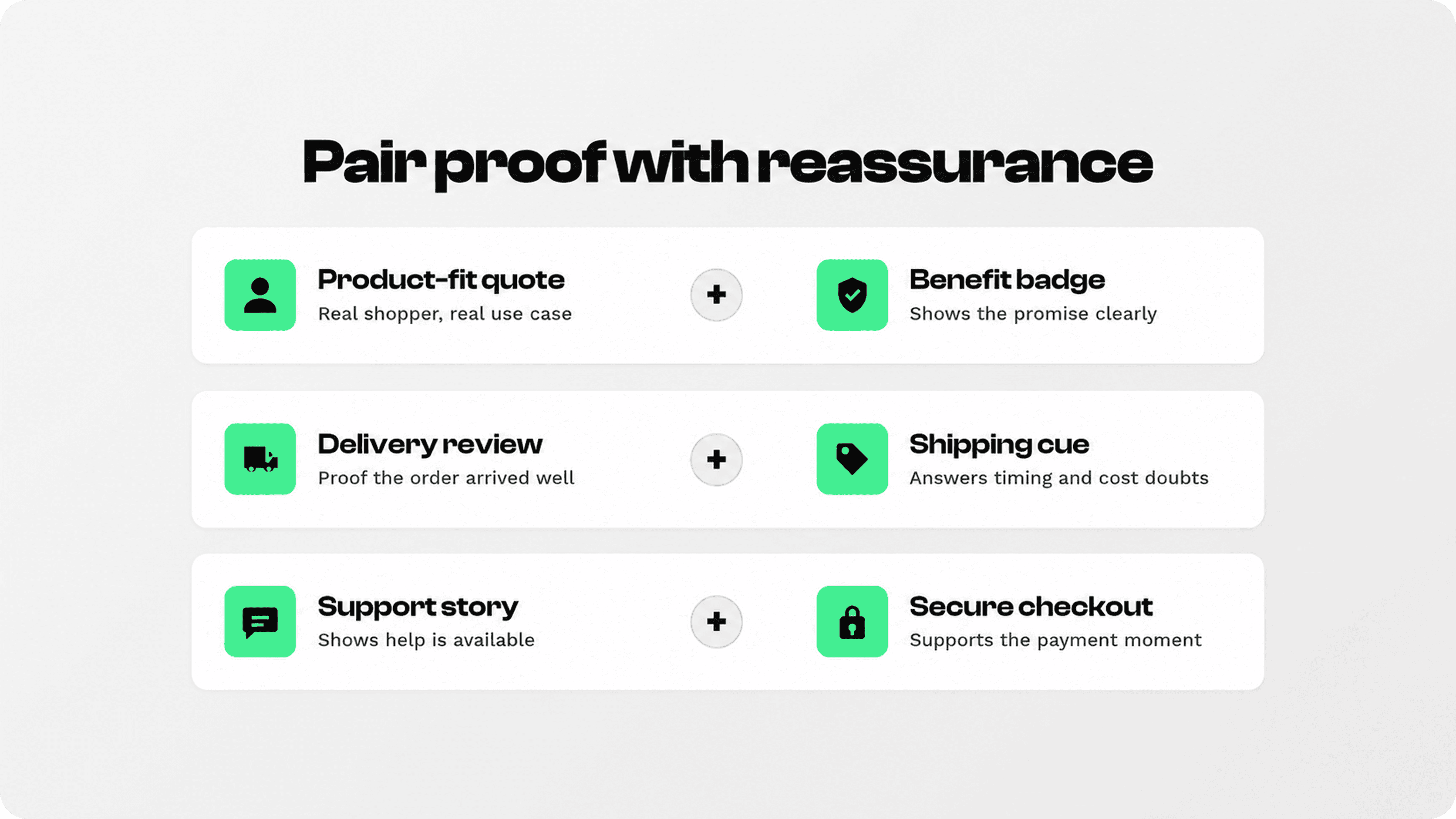
Trust is not one thing. A shopper may believe the product looks useful but still wonder whether the store is safe, whether shipping is clear, whether returns are easy, or whether people like them had a good experience. Testimonials and trust badges answer different parts of that doubt.
Testimonials are social proof. They make the buying decision feel less lonely because shoppers can see that other customers already made the choice and were satisfied. Trust badges are reassurance signals. They make the store feel safer, more credible, and easier to buy from.
The original Snapp article had the right idea, but the rewrite should avoid unsupported blanket claims and focus on practical placement. Baymard’s checkout research shows that checkout trust still matters: its cart and checkout research reports a 70.19% average cart abandonment rate and significant room for improvement through better checkout UX. See Baymard’s checkout usability research for context.
Start with the shopper’s hesitation
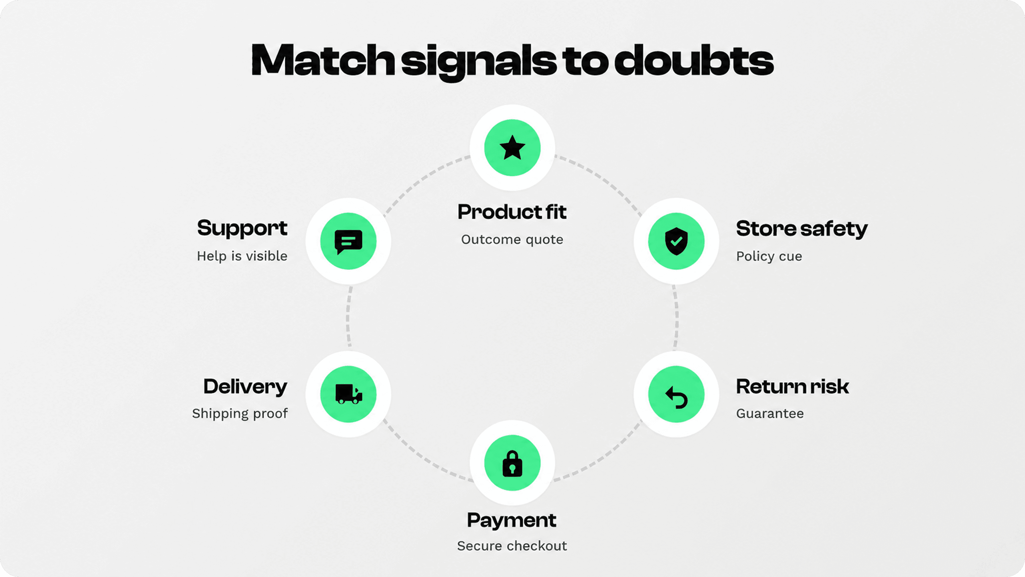
Before adding proof blocks, list the questions a shopper might ask right before buying. Most ecommerce doubts fall into a few buckets: Is this product right for me? Is this brand real? Is checkout safe? Will delivery be clear? What happens if the product does not work for me? Can I get help?
That list should decide which testimonial or badge appears where. A generic review carousel at the bottom of the page may look nice, but it is less useful than a specific proof point near a specific decision.
Product-fit doubt: show a testimonial that mentions the use case, result, size, quality, or customer type.
Security doubt: show secure checkout, payment, or privacy reassurance near payment-related areas.
Delivery doubt: pair shipping details with reviews that mention fast delivery, careful packaging, or clear tracking.
Risk doubt: place guarantee, return, warranty, or support cues near price and add-to-cart moments.
Where to place testimonials and trust badges
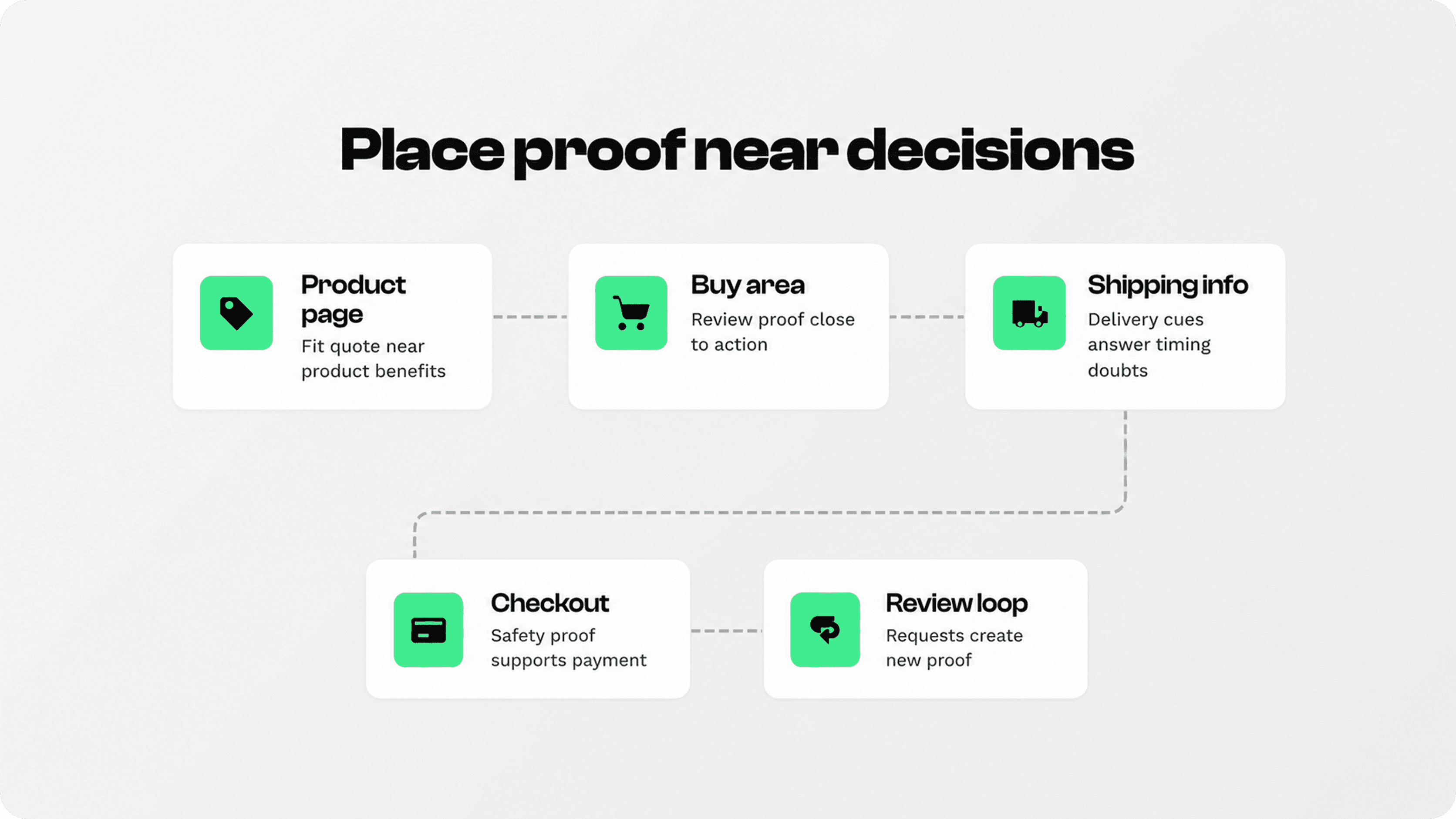
Placement matters because trust signals are most useful at the moment of hesitation. Do not treat testimonials and badges as decorations. Use them as answers beside the decision they support.
Store area | Best testimonial to show | Best trust badge or cue | Why it helps |
|---|---|---|---|
Product page near add to cart | A short quote about product quality, fit, result, or use case | Shipping, returns, guarantee, secure checkout, payment icons | Answers doubts before the shopper leaves the product page |
Cart drawer or cart page | A quote about delivery, packaging, or buying experience | Free shipping threshold, delivery timing, return policy, payment methods | Reduces last-minute hesitation before checkout |
Checkout-adjacent areas | A brief reassurance quote about smooth checkout or support | Secure checkout, accepted payment methods, privacy, guarantee | Supports the moment where payment anxiety is highest |
Landing page or homepage | A credibility quote from a representative customer segment | Review count, press mention, guarantee, support promise | Helps first-time visitors decide whether the brand feels credible |
Post-purchase flow | A quote that invites reviews or repeat purchase confidence | Support, tracking, returns, loyalty or referral cue | Turns the trust loop into new social proof |
Avoid putting every badge everywhere. A secure checkout cue is useful near payment, but less meaningful in a blog hero. A shipping promise is useful near delivery expectations, but can feel random if it appears without context.
How to pair proof with buyer doubts
The strongest trust sections combine a human signal and a practical reassurance signal. A testimonial says, “someone like me had a good experience.” A badge or policy cue says, “the store has the systems to make this purchase safe.” Together, they reduce emotional and practical doubt.
Pair a product-result testimonial with benefit icons. If a customer says the product saved time, improved fit, or solved a problem, place that near the matching product benefit icon.
Pair delivery testimonials with shipping badges. If shoppers worry about timing, show a short delivery-related quote beside shipping timing, tracking, or free-shipping cues.
Pair return concerns with guarantees. A return-policy badge becomes stronger when the page also shows customers had a low-friction support or return experience.
Pair payment concerns with secure checkout cues. Payment logos, secure checkout language, and privacy reassurance belong near payment decisions, not hidden in a footer.
What makes a testimonial worth using
A good testimonial is specific enough to answer a real objection. “Great product” is nice, but it rarely changes a decision. “The size guide was accurate, shipping took two days, and returns were clearly explained” answers concerns that can block a purchase.
Use specific details. Prioritize testimonials that mention use case, outcome, quality, delivery, support, size, setup, or repeat purchase.
Keep the quote short. One or two strong sentences usually work better than a long paragraph.
Get permission and avoid fake polish. Use real customer language. Over-edited testimonials can feel less believable.
Segment testimonials by page. A homepage quote can be broader; a product-page quote should relate to that product or category.
Trustpilot’s social proof guidance is useful here: reviews, testimonials, mentions, and other feedback work because the message comes from other consumers rather than only from the brand. See Trustpilot’s guide on how social proof influences consumers.
What makes a trust badge worth showing
A trust badge should represent a real promise, policy, payment method, guarantee, security cue, or customer benefit. If the badge does not answer a real concern, remove it. Decorative badges can make a page feel busier without making it feel safer.
Use relevant badges. Shipping, returns, secure checkout, payment methods, warranty, support, and product-benefit icons are usually more useful than generic “trusted store” graphics.
Keep badges honest and current. Do not use certification marks, seals, payment logos, or claims that the store cannot verify or support.
Keep the set small. A focused row of three to five relevant cues usually feels cleaner than a wall of badges.
Use consistent design. Badges should feel like part of the store, not random stickers from different design systems.
A quick checklist for better trust sections
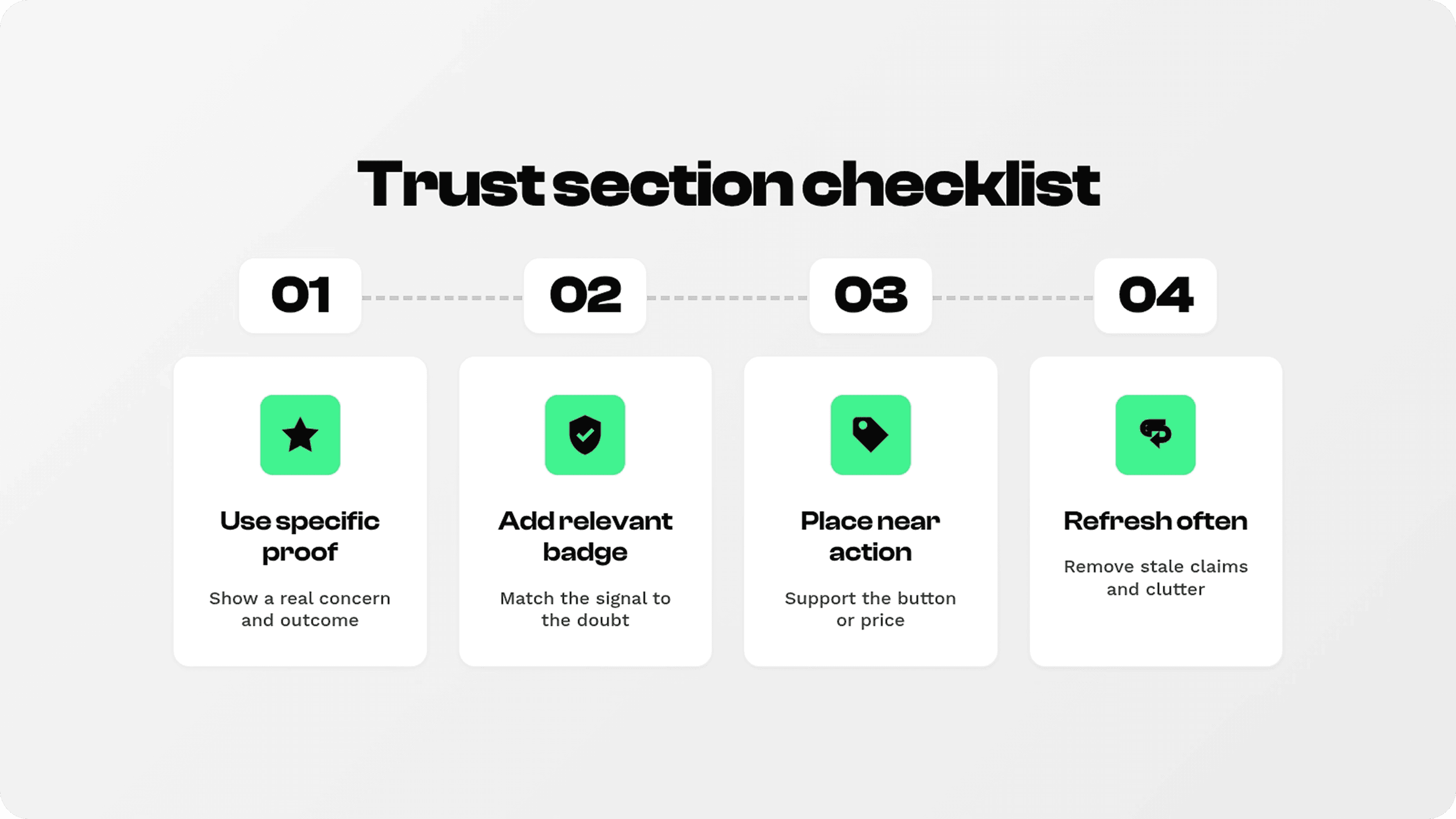
Before publishing a trust section, review it like a shopper. The goal is not to prove everything at once. The goal is to answer the next reasonable concern without slowing the page down.
Choose one main doubt per section. Product fit, payment safety, delivery, returns, or support.
Use one human proof point. A quote, review, rating, or customer photo if you have permission and it fits the page.
Use one practical reassurance cue. A badge, icon row, guarantee, policy summary, or payment cue that directly supports that doubt.
Place it near action. Trust signals should support add-to-cart, pricing, cart, checkout, or form completion moments.
Measure the result. Watch conversion rate, add-to-cart rate, checkout starts, cart abandonment, product-page scroll, and support questions.
Where Snapp fits
For stores looking for Shopify apps to increase sales, Snapp is useful for the trust side of the buying journey. With Snapp Trust Badges & Icons, merchants can add clean trust badge rows, payment icons, product benefit icons, delivery cues, and reassurance blocks without rebuilding the store.
The best use is not “add every badge.” The best use is to support the testimonial or page section already doing trust-building work. If a customer quote talks about fast delivery, add a clear shipping or tracking cue. If the section explains low-risk buying, add a returns or guarantee cue. If the shopper is near checkout, use payment and security reassurance.
For related internal context, see Snapp’s guide on what trust badges are and the article on B2C sales.
Common mistakes to avoid
Using fake or vague proof. Generic quotes and unverified badges can hurt credibility instead of helping it.
Showing too many signals at once. Crowded trust sections feel noisy and can make the store look less polished.
Putting proof too far from the decision. If the shopper has to scroll away from the button to feel reassured, the proof is in the wrong place.
Letting proof go stale. Old testimonials, outdated guarantees, and expired-looking badges weaken trust.
Treating trust badges as a conversion hack. Badges help only when the offer, policy, checkout, and customer experience support the promise.
Final recommendation
Use testimonials and trust badges as a paired system. Testimonials make the store feel human and proven. Trust badges make the buying process feel safe, clear, and low-risk. The best-performing version is usually simple: one specific customer proof point, one relevant reassurance cue, and placement near the action you want the shopper to take.
Start with the pages where hesitation is highest: product pages, cart, checkout-adjacent sections, pricing blocks, and landing pages. Add proof where it answers a real concern, remove anything decorative, and keep improving based on what shoppers do next.