TL;DR
Use product feature icons Shopify shoppers can understand in seconds: shipping, returns, payment options, secure checkout, warranties, support, materials, sizing, compatibility, or product-specific benefits.
Three to five Shopify icon blocks near the buy button are usually clearer than a long strip of generic badges.
Choose icons by buyer hesitation. A furniture page may need delivery, assembly, and warranty cues; a skincare page may need ingredient, cruelty-free, and refill cues.
Keep every claim truthful and supported by a real policy, product detail, or help page.
Use theme blocks, app blocks, or Snapp Trust Badges & Icons instead of hard-coded badge images when you want reusable, editable Shopify product page icons.
Why product feature icons matter on Shopify product pages

A shopper who reaches a Shopify product page is usually asking a few quiet questions: Will this arrive in time? Can I return it? Is checkout safe? Does this product fit my need? What happens if something goes wrong? Product page icons Shopify merchants place near the buy button can answer those questions before the shopper has to search the page.
The goal is not to add more visual noise. The goal is to summarize the specific reasons a shopper can continue with confidence. A useful icon block says something practical, such as “Free shipping over $50,” “30-day returns,” “Secure Shopify checkout,” “2-year warranty,” “Organic cotton,” or “Setup support included.”
For stores choosing Shopify apps to increase sales, product-page icon tools are valuable when they make important information easier to notice without making the buying experience feel crowded.
Shopify themes are built from templates, sections, and blocks, which gives merchants a natural way to add small decision-support content to product pages. Shopify’s own documentation explains how templates and sections and blocks shape page layouts, so product feature icons should usually live in an editable product section rather than inside a static product-description image.
What to highlight with Shopify feature icons
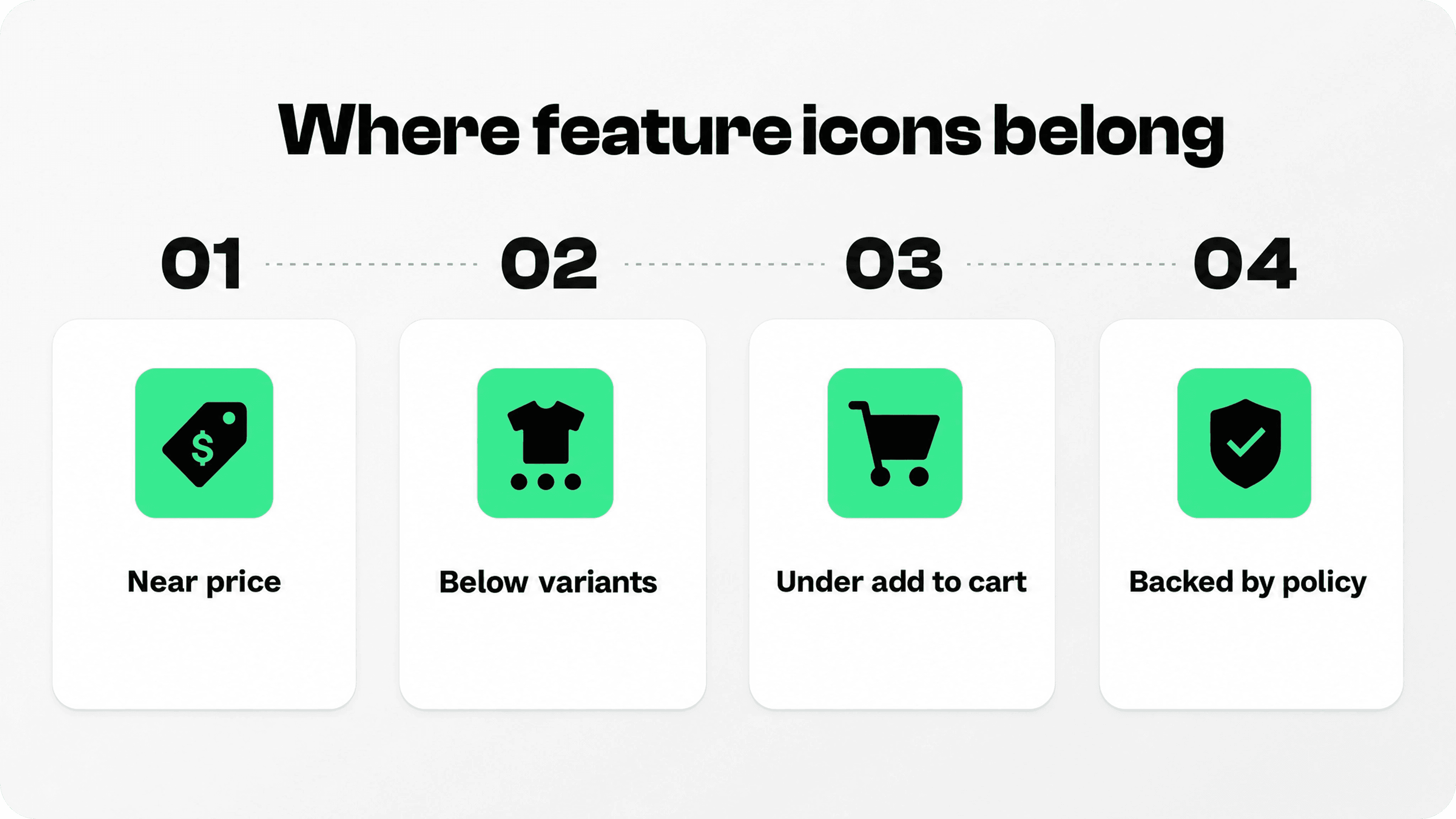
Most stores do not need dozens of Shopify feature icons. They need a focused set that matches the product, the offer, and the customer’s likely hesitation. Start with the promises that influence the buying decision most directly.
Shipping icons work when delivery is a real reason to continue: free shipping, express shipping, tracked delivery, local delivery, or a clear free-shipping threshold. Return icons are useful when shoppers worry about fit, color, gifting, quality, or first-time purchases. Payment icons help when payment method choice matters, especially if the store supports common wallets or express checkout options.
Secure checkout icons can help, but they should stay modest. Use them to reassure, not to invent a fake certification. Product feature icons are often more persuasive because they connect directly to the item: waterproof material, handmade production, vegan ingredients, refill availability, battery life, warranty length, compatibility, spare parts, or care instructions.
Image slot: Snapp-generated feature icon set
This article intentionally leaves one image slot open for a Snapp-generated feature icon set. The best version would show product-specific icons rather than generic trust badges: material, warranty, sizing, compatibility, support, delivery, returns, and sustainability cues arranged in the approved Snapp visual language.
A practical decision table for Shopify icon blocks
Use this table to decide what belongs near the buy button and what should move lower on the product page. Icon blocks should summarize important proof; they should not replace the policy pages, product details, or help content that support the claim.
Icon type | Use near the buy button when… | Good microcopy | Avoid |
|---|---|---|---|
Shipping | Delivery speed, cost, or tracking affects the decision. | Free shipping over $50; Ships in 24h; Tracked delivery | Vague “fast shipping” when delivery times vary. |
Returns / guarantee | Fit, quality, gifting, or first-time purchase risk is high. | 30-day returns; Free exchanges; 1-year warranty | Guarantee claims that are not backed by a real policy. |
Payment icons | Payment trust or method choice matters. | Visa, PayPal, Shop Pay, Apple Pay accepted | Oversized logo strips that compete with the CTA. |
Secure checkout | The shopper may worry about payment safety. | Secure Shopify checkout | Fake certifications or exaggerated security language. |
Product features | A concrete product benefit helps the choice. | Waterproof; Organic cotton; USB-C compatible | Generic “premium quality” claims with no detail. |
Support | Setup, sizing, or post-purchase help reduces risk. | Fit help available; Setup support; Reply within 24h | 24/7 support unless it is truly available all day. |
How to choose product feature icons by shopper risk

The strongest product feature icons Shopify stores can show are not identical across every catalog. A sofa, phone case, supplement, skincare product, and subscription box create different doubts. If the risk is fit, show sizing, exchanges, or fit help. If the risk is delivery, show shipping speed or tracking. If the risk is quality, show warranty, material, certification, or care information. If the risk is effort after purchase, show setup help, support, or easy returns.
This is where many Shopify product page icons go wrong. Stores repeat the same generic row across every product even when those claims are not the strongest reason to buy that specific item. Generic trust icons can still help, but product-specific icons often feel more credible because they connect to the product on the page.
For stores with varied catalogs, use product templates, metafields, or dynamic content rather than one universal icon row. Apparel pages might show “Easy exchanges,” “Fit help,” and “Soft organic cotton.” Electronics accessories might show “2-year warranty,” “Fast USB-C charging,” and “Setup support.” Home goods might show “Easy assembly,” “Tracked delivery,” and “Replacement parts available.”
Where Shopify product page icons should sit
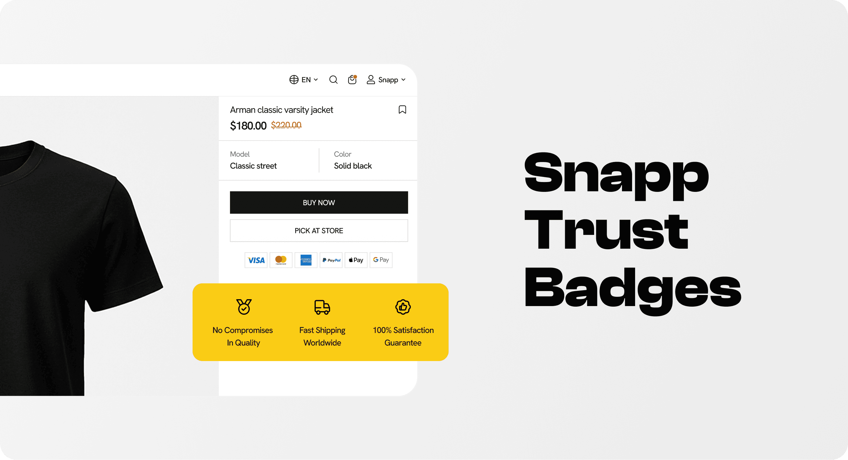
The safest placement is close to the buy button, but not inside the button itself and not above the product title. Put the icon row under the price, under the variant selector, under the quantity selector, or directly below the Add to cart button depending on the theme layout. The row should support the CTA, not compete with it.
Baymard Institute’s product-page UX research treats product-page decision information such as shipping, returns, the buy section, mobile layout, and auxiliary product information as important parts of the shopper’s evaluation flow. That does not mean every detail needs to sit in the first screen, but shoppers should not have to hunt for basic reassurance before adding to cart.
On mobile, be stricter. Four desktop icons may become two rows of two, or a compact vertical list with small icons and short labels. Avoid tiny badges, long labels, or icons that wrap awkwardly under the CTA. If the label cannot stay readable on mobile, rewrite it before publishing.
How to add Shopify icon blocks without clutter
Shopify merchants usually have three practical options. The first is a native theme block if the theme includes icon-with-text, collapsible rows, multicolumn content, or product information blocks. The second is a custom section or Liquid edit, which gives more control but adds maintenance work. The third is an app block or badge app that lets the team create icon blocks, payment icons, and banners without touching code.
Snapp Trust Badges & Icons is built for this trust layer: Shopify trust badges, payment icons, single banners, and icon blocks that can be placed across key store pages without code. That makes it useful when a merchant wants product page icons near the buy button but does not want a developer to hard-code badge strips into product descriptions.
Whichever route you choose, keep the block visually quiet. Match the store’s fonts, colors, spacing, and border radius. Use the same icon style throughout the block. Avoid mixing outline icons with filled icons, payment logos with product benefits, and policy promises with random “premium quality” badges in one crowded row.
Common mistakes with product page icons Shopify stores should avoid
The biggest mistake is using too many icons. If the buy-button area looks like a certification wall, shoppers may read it as overcompensation. Use fewer, better signals. Three strong promises often beat eight weak ones.
The second mistake is making unsupported claims. Do not show “Free worldwide shipping” if shipping is only free above a threshold. Do not show “24/7 support” if support replies only during business hours. Do not show “100% secure” as if it is a special guarantee. Product page icons should summarize real store policies, not invent them.
The third mistake is hiding the real details. An icon row can say “30-day returns,” but the return policy still needs to be accessible. It can say “Ships in 24 hours,” but shipping details should still be clear in the delivery or FAQ section. Icons create confidence fastest when they are backed by consistent information elsewhere on the store.
Copy examples for Shopify feature icons
Short labels perform best. Use concrete copy instead of vague promises. “Free shipping over $50” is clearer than “Fast delivery.” “30-day returns” is clearer than “Easy returns.” “Made with recycled nylon” is clearer than “Eco friendly.” “2-year warranty” is clearer than “Premium quality.”
For product feature icons Shopify merchants can rotate by collection, build a small internal library. Apparel: “Soft cotton,” “Easy exchanges,” “Fit guide.” Beauty: “Cruelty-free,” “Dermatologist tested,” “Refill available.” Home goods: “Easy assembly,” “Tracked delivery,” “2-year warranty.” Food and supplements: “Vegan,” “No added sugar,” “Ships cold.” Electronics: “USB-C,” “1-year warranty,” “Setup support.”
The point is not to make every product page look identical. The point is to make each product page easier to trust.
A simple checklist before publishing Shopify icon blocks
Does each icon answer a real shopper question?
Is every claim true and supported by a policy, product detail, or help page?
Is the text readable on mobile?
Does the block sit close enough to the buy button to help the buying decision?
Does the icon style match the store design?
Are payment icons separated from product benefits if mixing them would feel cluttered?
If the answer is yes, the icon block is doing its job. If not, remove the weakest icon, shorten the copy, or move the detail lower on the page.
Final recommendation
Treat product feature icons for Shopify as decision support, not decoration. Start with the buyer’s hesitation, choose the smallest useful set of icons, write specific labels, place the block close to the buy button, and keep the design calm. If the icons make the next step feel safer and clearer, they belong. If they only fill space, remove them.