TL;DR
If your Shopify store gets traffic but no sales, do not start by redesigning everything. Find where shoppers drop: landing page, product page, add to cart, cart, checkout, or payment.
Traffic quality matters as much as traffic volume. Visitors from broad ads, giveaways, viral posts, or untargeted SEO pages often browse without purchase intent.
Most conversion problems come from a weak offer, unclear pricing, poor product discovery, thin product pages, mobile friction, credibility gaps, checkout surprises, or bad analytics assumptions.
Trust cues help, but only as one layer. They cannot rescue a product shoppers do not understand, a price they do not accept, or a checkout that adds unexpected costs.
Work from evidence: segment by source, device, landing page, product, and funnel step before deciding which Shopify conversion fix matters most.
Why a Shopify store gets traffic but no sales
A Shopify store with visitors and no orders is not automatically broken. It might be too early, the traffic might be unqualified, or the analytics window might be too small. But if the pattern continues, the issue is usually not “more traffic.” It is that the store is failing to move the right people from interest to decision.
Shopify explains ecommerce conversion rate as orders divided by sessions for a selected period, which means one person can create multiple sessions and conversion should be read against traffic source, device, and journey stage. Source: Shopify ecommerce conversion rate guide.
That matters because “shopify no sales” can describe several different problems. A store with high bounce rates has a different issue from a store with many add-to-carts and no purchases. A store with search traffic landing on educational blog posts has a different issue from a store paying for product-specific ads.
The fastest path is diagnosis before tactics. If you fix the wrong layer, you can make the store prettier without making it easier to buy.
Start with the sales leak, not random fixes

Before changing prices, themes, apps, or ad budgets, open your analytics and identify the largest leak. Look at sessions, landing pages, add-to-cart behavior, reached-checkout behavior, checkout completion, device type, source, and product-level performance.
Shopify’s Conversion rate breakdown report shows how visitors move through store and checkout steps, including sessions with cart additions, sessions that reached checkout, and sessions converted. Source: Shopify behavior reports.
Read the funnel like a doctor, not a critic. If many visitors leave from the first page, check message match, page speed, mobile layout, and whether the page answers the promise that brought them there. If product views are healthy but add-to-cart is weak, inspect price, offer clarity, product images, variants, sizing, benefits, reviews, and objections. If add-to-cart is healthy but checkout is weak, inspect shipping costs, discounts, payment methods, account settings, delivery options, returns, and errors.
Also separate new visitors from returning visitors. New shoppers need orientation and reassurance. Returning shoppers may need a clearer reason to act now, an easier cart path, or an abandoned-cart recovery flow.
Check traffic quality before blaming the store

Not all traffic is equal. A store can receive hundreds of visits from people who were curious, misled, too early in the buying journey, outside the shipping region, outside the price range, or attracted by content that does not lead naturally to a product.
Start with source quality. Paid social traffic from broad interests often behaves differently from search traffic for product-specific terms. Influencer traffic can spike sessions without purchase intent if the audience likes the creator but not the product. Giveaway traffic can look exciting while attracting people who mainly want something free.
Then check landing-page intent. If visitors land on a blog post, quiz, collection, homepage, or product page, each page needs a different next step. Educational content should guide readers toward relevant collections or products. Product pages should help shoppers evaluate and buy. Collection pages should make comparison easy.
If your Shopify store is not converting from one channel, do not assume the whole store is failing. Compare channels side by side. A low-converting ad set might be a targeting or creative problem, while organic product traffic might convert fine.
Fix the offer, pricing, and product clarity
When people ask “why is my Shopify store not converting,” the uncomfortable answer is sometimes that the offer is not obvious enough or strong enough. Shoppers do not buy a product because it exists. They buy when the value, risk, price, and fit make sense quickly.
Review the first screen of every key product page. A shopper should understand what the product is, who it is for, why it is better or different, what is included, what it costs, when it arrives, and what happens if it is not right. If they need to scroll through vague lifestyle copy to find basics, the page is making them work too hard.
Pricing needs the same clarity. A price can fail because it is too high for the perceived value, because competitors frame the value better, because shipping makes the final total feel unfair, or because the store hides bundles, subscriptions, discounts, and thresholds until too late.
Use this diagnostic table to match the symptom to the most likely blocker and the first fix to test.
Symptom in Shopify | Likely issue | What to check | First fix to test |
|---|---|---|---|
Traffic but high bounce | Poor message match or low-quality traffic | Landing page by source, mobile speed, first-screen copy | Rewrite the first screen around the ad/search promise |
Product views but few add-to-carts | Offer, price, or product clarity gap | Images, benefits, variants, sizing, reviews, delivery, FAQs | Clarify value near price and add-to-cart |
Many add-to-carts but few checkouts | Cart friction or cost surprise | Shipping threshold, discounts, cart drawer layout, policy visibility | Show shipping and return basics before checkout |
Many checkouts but few orders | Checkout friction or payment hesitation | Payment methods, address errors, delivery options, account requirement, taxes | Test checkout on mobile and add clear payment/delivery cues |
Sales from one channel only | Traffic quality mismatch | Conversion by source, campaign, keyword, audience, country | Pause weak sources and rebuild targeting around buyers |
Repeat visits but no purchase | Weak reason to decide | Email flows, retargeting, offer timing, comparison objections | Add stronger product proof and a focused follow-up offer |
Make products easier to find and compare

A Shopify store can lose orders before shoppers ever reach the right product. Product discovery problems are common when collections are too broad, filters are missing, search results are weak, product names are unclear, or the store assumes visitors already know what they want.
Shopify’s Search & Discovery app is built to customize search, filters, and product recommendations, and Shopify notes that merchants can use analytics to understand how customers navigate the store. Source: Shopify Search & Discovery.
For stores with several products, start with collection usability. Can shoppers filter by size, color, use case, price, compatibility, scent, material, style, or problem solved? Do product cards show the decision-making information people need before clicking, such as price, variant, key benefit, rating, or availability?
Search is another hidden conversion lever. Check what people search for, what returns zero results, and whether common synonyms work. If someone searches “gift,” “black dress,” “waterproof,” or “replacement,” the store should either return relevant products or guide them to a useful collection.
Recommendations should also be helpful rather than random. Related products, bundles, and complementary items can increase confidence when they make the choice easier. They hurt conversion when they distract from the main product or make shoppers question whether they are looking at the right item.
Remove UX and mobile friction
Many Shopify stores get mobile-heavy traffic but are reviewed mostly on desktop by the owner. That creates blind spots: sticky bars cover content, popups appear too early, variant selectors are hard to tap, image galleries are slow, announcement bars stack awkwardly, and the checkout button moves below distractions.
Shopify’s web performance documentation notes that apps, images, videos, carousels, social feeds, analytics, theme code, and other features can affect loading speed, interactivity, and visual stability. Source: Shopify online store web performance.
Test the full buying path on a phone with normal cellular speed. Land from the ad or search result, open a collection, filter, view a product, choose a variant, add to cart, apply a discount, estimate shipping if possible, and reach checkout. Write down every moment where you hesitate.
Common friction points include oversized image files, slow-loading app widgets, discount popups that interrupt product evaluation, weak product-card information, unclear variant availability, hidden shipping details, crowded cart drawers, and buttons that do not look tappable.
Keep the buying path visually calm. Conversion does not require every possible app block, timer, popup, announcement, review carousel, and badge row to appear at once. The best Shopify conversion fixes often remove noise rather than add more.
Build enough credibility without making trust the whole article
Trust is one factor, but it is not the only reason a Shopify store gets no sales. Treat credibility as a support layer for the offer, not a substitute for the offer.
Start with basic legitimacy: clear contact details, a real about page, consistent branding, accurate product photos, visible shipping and return policies, professional copy, no broken links, and no fake urgency. These basics matter more than a wall of generic badges.
Then add proof where shoppers hesitate. Product reviews belong near product evaluation. Payment icons and secure checkout cues belong near buying actions. Shipping and return promises belong near price, cart, and product details. Support cues belong near policy links or higher-risk products.
For stores looking for Shopify apps to increase sales, Snapp can support this credibility layer with clean trust badges, payment icons, product benefit icons, and reassurance blocks that match the store design.
The rule is simple: every credibility cue should answer a real doubt. If it does not make the buying decision clearer, remove it.
Once you identify the main bottleneck, use the guides to increasing Shopify sales and Shopify conversion rate optimization to plan the next small improvement.
Reduce cart and checkout friction
If shoppers add products to cart or reach checkout but do not buy, the store has purchase intent. Now the job is to remove surprises and make completion feel easy.
Baymard’s cart abandonment research reports a high documented average cart abandonment rate and points to fixable reasons such as extra costs, forced account creation, slow delivery, checkout complexity, credit-card trust concerns, return dissatisfaction, website errors, and limited payment methods. Source: Baymard cart abandonment research.
On Shopify, check the cart first. Does the cart show product title, variant, quantity, subtotal, discounts, shipping threshold, delivery expectations, return basics, and one clear checkout action? If a shopper has to guess the final cost, the checkout can feel like a trap.
Then test checkout. Try it on mobile, desktop, and at least one real payment method in test mode. Look for address-field issues, tax surprises, discount-code problems, shipping-rate errors, missing payment methods, unclear delivery options, and account requirements that block first-time buyers.
Shopify’s one-page checkout documentation explains that customers can enter and review order details, shipping information, and payment details on one page. Source: Shopify one-page checkout.
Do not hide important costs until the last moment. Showing shipping thresholds, return basics, and payment options earlier can reduce the number of shoppers who reach checkout only to abandon when the final decision feels different from what they expected.
Use analytics to decide what to fix first
A practical Shopify no-sales audit should end with priorities, not a 40-item wishlist. Rank fixes by impact, evidence, and effort.
Day 1: Confirm tracking. Compare Shopify Analytics, ad platform data, and payment/order records so you know whether “no sales” is a real conversion issue or a tracking/reporting issue.
Day 2: Segment by source and device. Find whether the problem is all traffic, one campaign, one country, one device, or one landing page.
Day 3: Audit product pages. Improve first-screen value, images, variant clarity, price context, shipping, returns, reviews, and FAQs.
Day 4: Audit discovery. Fix collection filters, search terms, product cards, recommendations, navigation, and dead-end pages.
Day 5: Audit mobile UX. Remove blockers, compress heavy assets, reduce app clutter, and test the path with real thumbs.
Day 6: Audit cart and checkout. Look for cost surprises, discount errors, missing payment options, checkout errors, and unclear delivery or return details.
Day 7: Make one measured change per major leak. Give each change enough traffic to evaluate before adding more changes on top.
This sequence keeps the work grounded. You are not guessing whether the answer is better ads, lower prices, new badges, faster pages, or checkout changes. You are letting the funnel tell you.
Where Snapp fits
Snapp is useful when your diagnosis shows that shoppers need clearer confidence cues around product, cart, and checkout-adjacent decisions. It can help add payment icons, trust badges, product benefit icons, delivery cues, return promises, and reassurance blocks without editing theme code.
That makes Snapp a good fit after you have clarified the offer and identified where reassurance belongs. For deeper placement guidance, see Shopify Trust Badges: Where to Place Them and How to Reduce Cart Abandonment With Better Trust Signals.
The goal is not to cover every page with icons. The goal is to make the buying path feel clearer at the exact points where shoppers hesitate.
Final recommendation
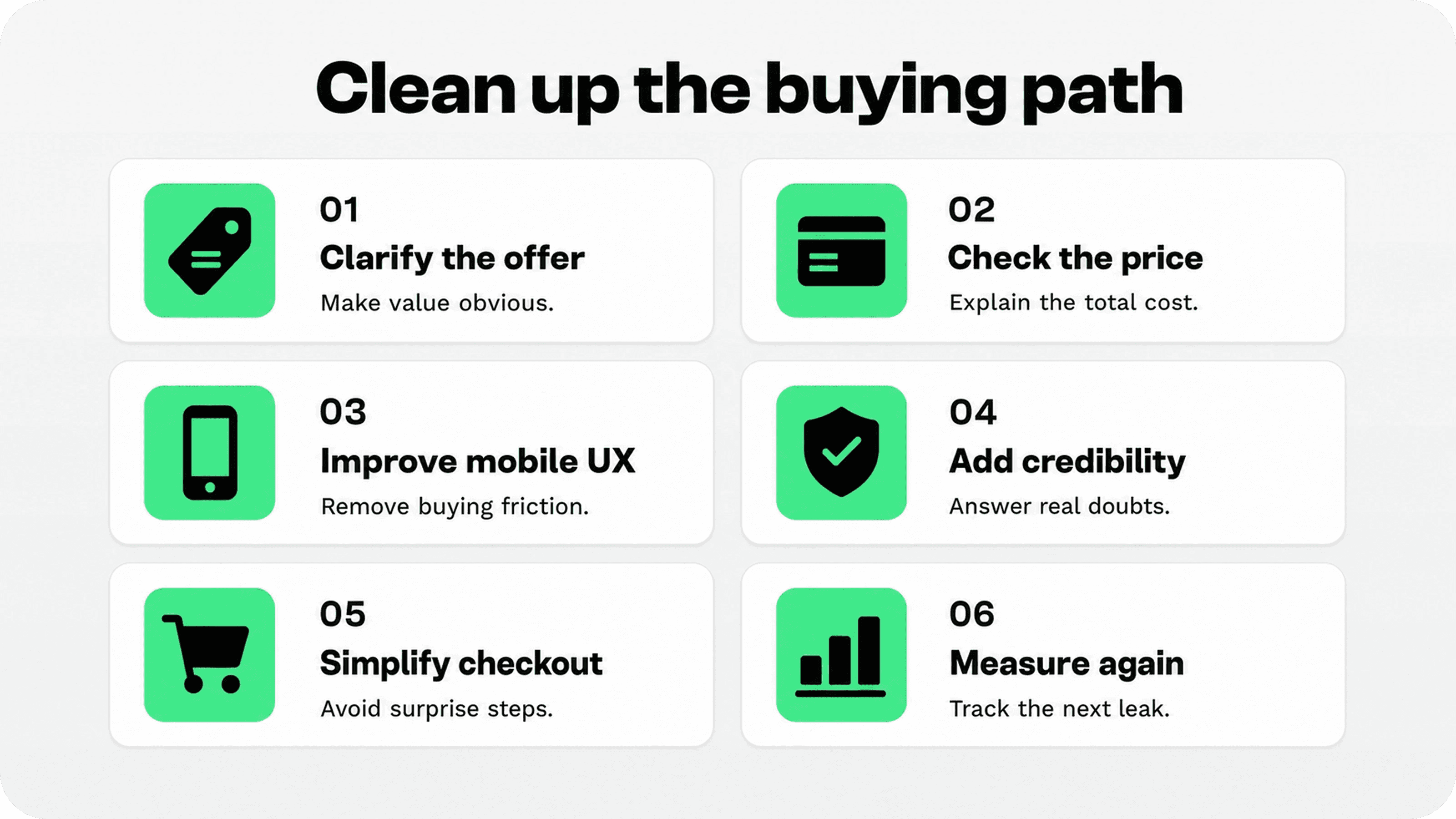
If your Shopify store is getting traffic but no orders, do not treat it as one mystery. Treat it as a funnel diagnosis. First confirm that the traffic is qualified. Then check whether the offer is clear, the price feels justified, products are easy to find, product pages answer buying questions, mobile UX is smooth, credibility is visible, checkout is predictable, and analytics are telling the truth.
Fix the biggest leak first. A store with poor traffic does not need checkout tweaks yet. A store with add-to-carts but no orders does not need more blog traffic yet. A store with confused product-page visitors does not need more trust badges yet. The best conversion work is specific to the point of hesitation.