TL;DR
Use Shopify product badges to clarify a real buying signal: sale, new arrival, best seller, low stock, free shipping, product feature, preorder, bundle, or limited edition.
Place badges where the shopper is comparing products or deciding whether to buy: collection cards, product images, buy-button areas, cart drawers, and mobile product pages.
Keep the hierarchy tight. One primary badge per product card is usually clearer than three competing labels stacked over the image.
Shopify sale badges usually depend on compare-at pricing and theme settings, while custom badges may need theme blocks, metafields, tags, or a Shopify badge app.
Leave one image slot open for the future Snapp product badge visual. This file includes three generated Snapp-style article images plus one intentional placeholder.
What are Shopify product badges?
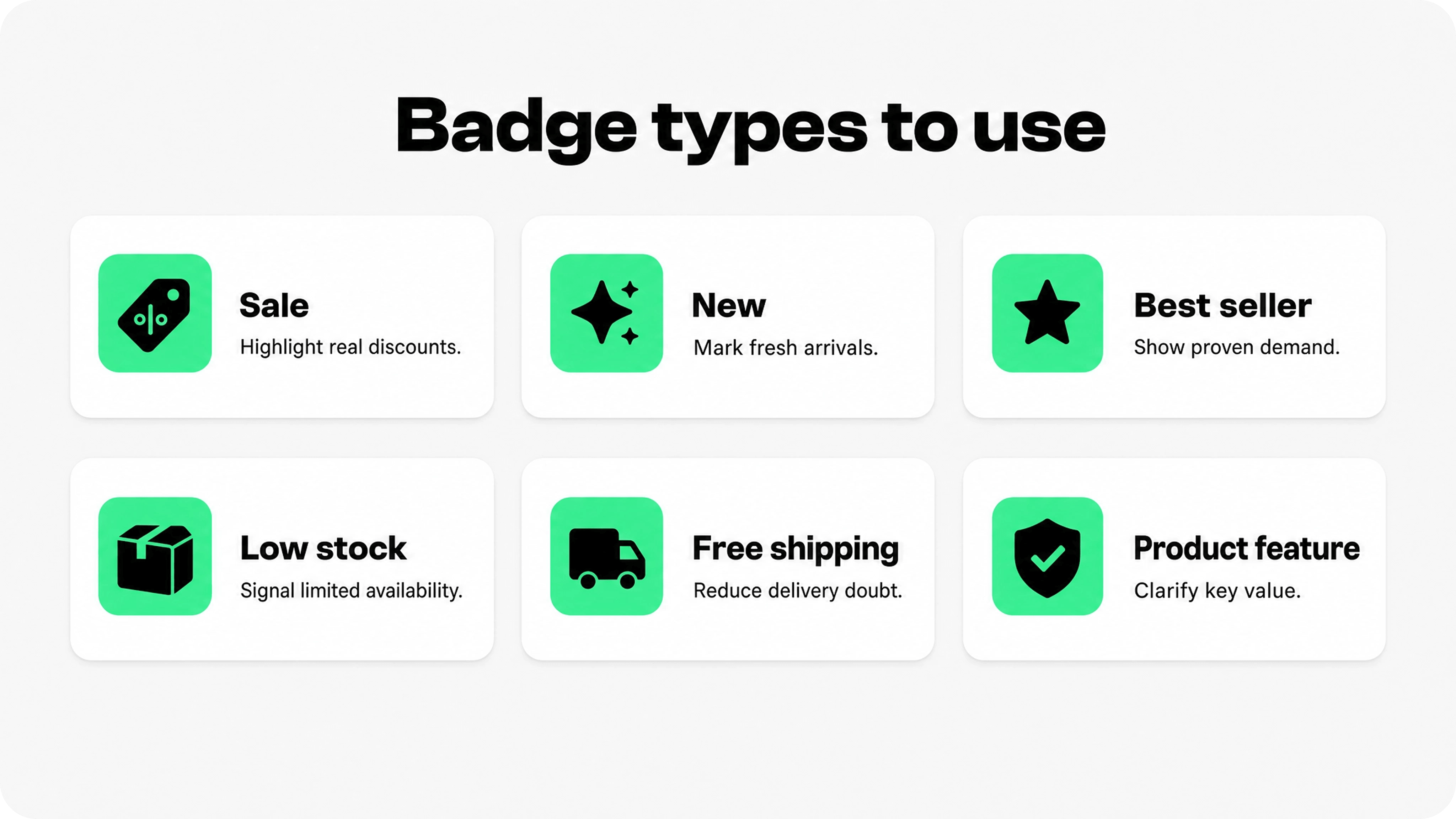
Shopify product badges are small visual labels that appear on product cards, product images, product pages, collection grids, or cart experiences. They help shoppers understand something important before they click, compare, or buy. Common examples include Sale, New, Best seller, Low stock, Free shipping, Limited edition, Preorder, Bundle deal, Vegan, Organic, Handmade, or Back in stock.
The useful version of a badge is not just decorative. It summarizes a real product condition, offer, or proof point. A sale badge should point to a real price reduction. A best seller badge should reflect actual sales or demand. A low-stock badge should not manufacture urgency if inventory is healthy. A product benefit badge should say something the product details can support.
Shopify already supports some badge behavior inside themes. Shopify Help Center documentation explains that Sale and Sold out badges can be automatically added to product images when the price is reduced or inventory reaches 0, with badge position, shape, and color controlled in theme settings for compatible themes. See Shopify theme settings documentation. Shopify also explains that sale pricing is created by setting a Compare-at price higher than the current Price, which lets themes display sale pricing and, in many themes, a sale badge. See Shopify sale pricing documentation.
Custom product badges go beyond built-in sale and sold-out states. They might depend on product tags, product metafields, collection rules, inventory thresholds, discount campaigns, or app settings. That is where merchants need a more deliberate badge system instead of adding labels one by one.
What product badges Shopify stores should use
The best product badges Shopify stores can use fall into a few practical groups. Each group answers a different shopper question, so the badge should be chosen by intent rather than by what looks most eye-catching.
Promotional badges: Sale, 20% off, Bundle deal, Free gift, Buy one get one, Clearance. Use these when the price or offer is the reason to act.
Availability badges: Low stock, Back in stock, Preorder, Sold out, Limited edition. Use these when availability changes the decision.
Freshness badges: New, Just dropped, New color, Seasonal. Use these on collection cards where shoppers are browsing recent additions.
Popularity badges: Best seller, Trending, Customer favorite, Top rated. Use only when backed by real sales, review, or engagement data.
Shipping and policy badges: Free shipping, Ships today, Easy returns, Warranty included. Use these when fulfillment or risk is part of the buying decision.
Product feature badges: Organic, Vegan, Handmade, Recycled, Waterproof, Wide fit, Compatible, Refillable. Use these when one concrete feature helps the shopper compare similar products.
For most stores, the best badge system mixes one merchandising badge with one reassurance cue. For example, a collection product card might show Sale over the image, while the product page shows Free shipping or Easy returns near the buy button. The card earns attention; the product page earns confidence.
Where to place Shopify badges on products
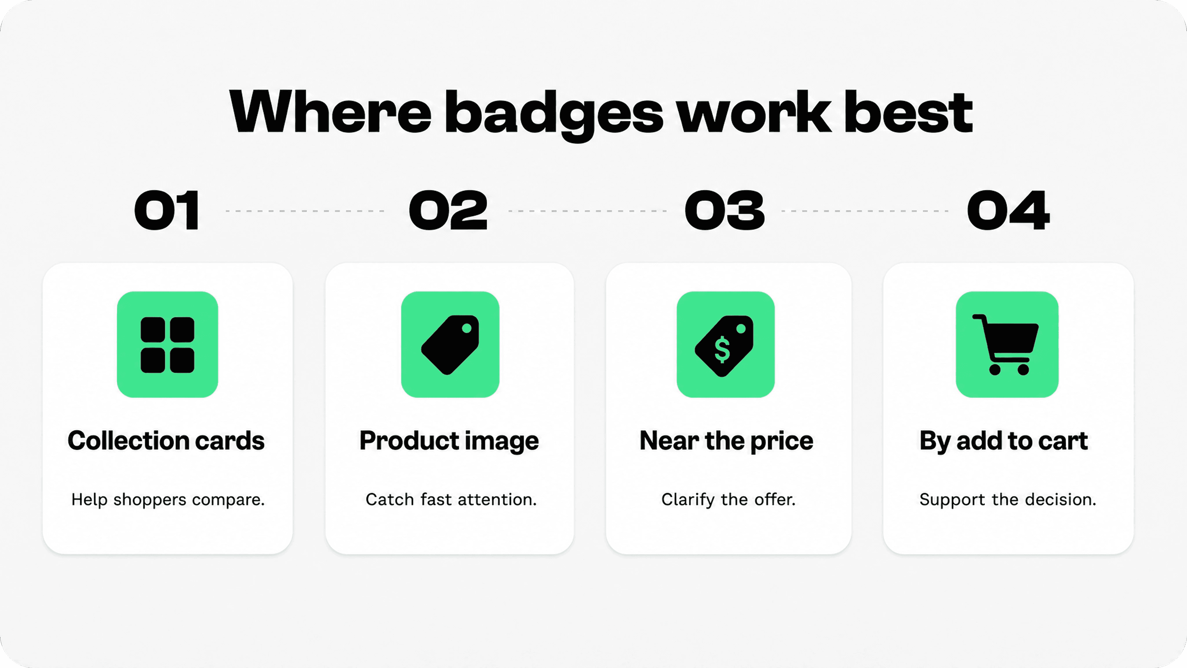
Placement matters because product badges are directional cues. Put them where the shopper is doing the job that the badge supports. If the badge helps shoppers compare products, place it on the product card or image. If it helps shoppers trust the purchase, place it near the price, variant selector, add-to-cart button, or cart drawer. If it explains a policy, support it with a nearby link or short line of copy.
The right Shopify apps to increase sales help merchants communicate a real reason to buy at the right moment, whether that is a product benefit, a time-sensitive offer, free shipping, or a clearer return promise.
On collection pages, product badges should be easy to scan without covering the product. The safest default is the upper-left or upper-right corner of the product image, with enough padding and contrast to stay readable on mobile. Use collection badges for quick sorting signals: Sale, New, Best seller, Low stock, Limited edition, or Back in stock.
On product pages, badges should move closer to the decision area. A sale badge can sit near the price or product title. A free shipping badge can sit below the add-to-cart button or in a trust row. A product feature badge can sit near product bullets, image thumbnails, or a compact benefit row. A preorder or low-stock badge should be close enough to variant selection that shoppers understand the condition before buying.
In the cart or cart drawer, badges should shift from product discovery to reassurance. Use badges sparingly here: Free shipping applied, Easy returns, Secure checkout, Warranty included, or Gift eligible. This is not the place for a busy product-card label system.
On mobile, use fewer badges and shorter copy. Mobile product cards have less room, and a badge that looks neat on desktop can cover the product image, price, swatch, rating, or quick-add button on a phone. If the badge cannot stay legible without blocking the product, shorten the label or move it into the product information area.
Shopify sale badges: how to use them without confusing shoppers
Shopify sale badges are usually the first badge type merchants notice because many themes create them automatically from compare-at pricing. The mechanics are simple: the compare-at price shows the original price, the current price shows the sale price, and the theme can display a sale message or badge when the compare-at price is higher than the current price.
The strategy is less simple. A sale badge should make the discount easier to understand. If every item is always on sale, the badge becomes background noise. If the sale badge hides the actual price difference, shoppers may not understand the value. If the badge promises a discount but the cart applies a different discount logic, shoppers may feel misled.
Baymard has separate research on product page price discounts and warns against discount displays that make shoppers work too hard to understand the price reduction. The principle applies to Shopify sale badges as well: show the sale badge, but make the old price, new price, and discount logic easy to verify. See Baymard on product page price discounts.
Use Sale when the product has a real markdown and the compare-at price is accurate.
Use a percentage badge only when the percentage is easy to calculate and not misleading across variants.
Use Clearance when the goal is inventory movement, not just a normal promotion.
Use Limited-time sale only when the end date is real and visible somewhere nearby.
Avoid stacking Sale, 20% off, Clearance, and Low stock on the same product card unless there is a strong merchandising reason.
Image slot: Snapp product badge example
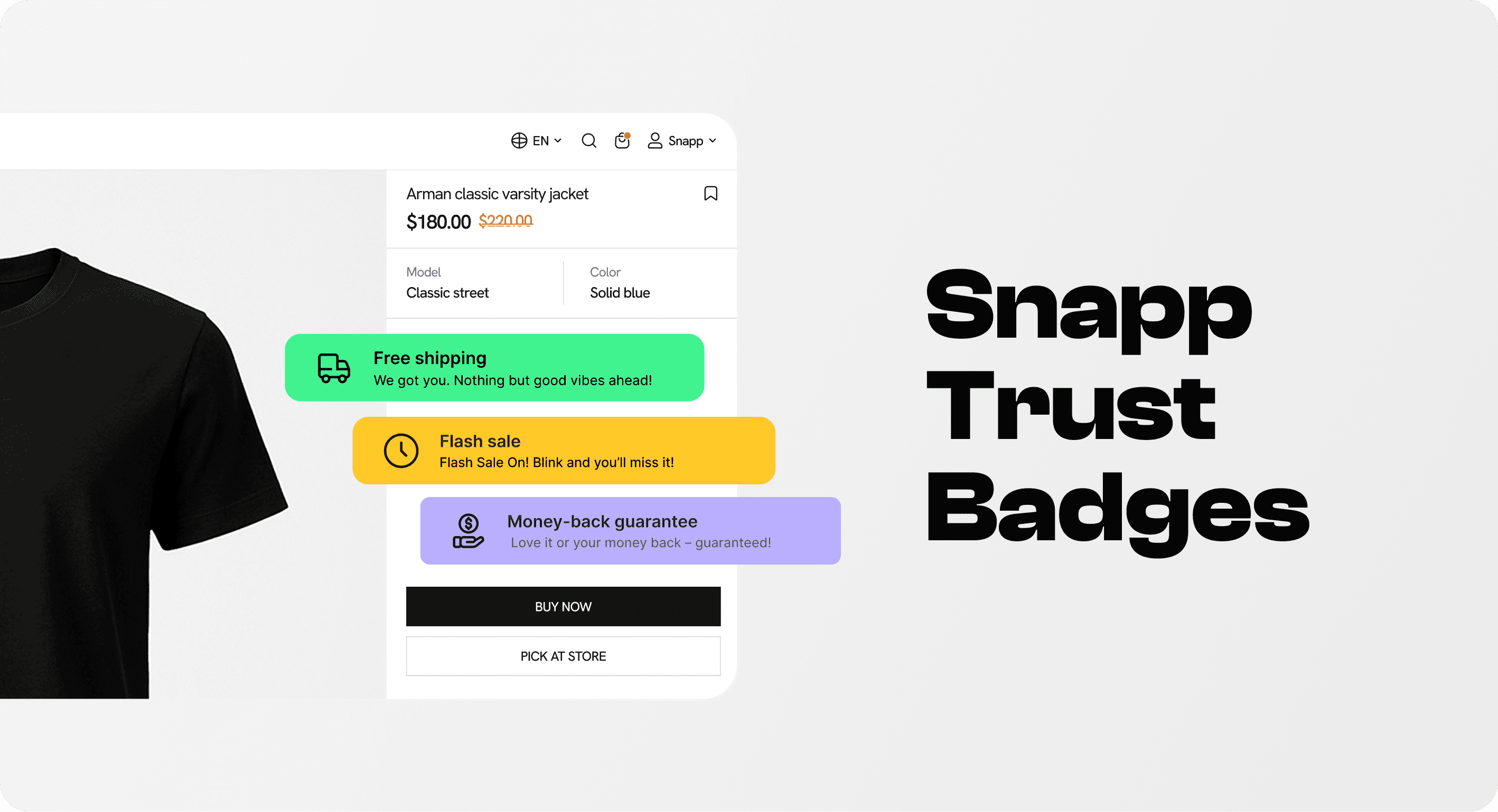
This image slot is intentionally left ungenerated so the final Snapp product badge visual can be added later. The strongest example would show a clean Snapp-made badge on a Shopify product card or product page, with one specific badge such as Best seller, Sale, Low stock, New, or Free shipping. The visual should demonstrate the placement principle from this article: one clear badge near the product decision, not a crowded stack of labels.
A practical product badge placement table
Use this table as the working rule set for product badges Shopify teams can apply across collection pages, product pages, and carts. It is intentionally focused on placement and risk, not on adding as many labels as possible.
Badge type | Best placement | Best for | Good copy | Avoid |
|---|---|---|---|---|
Sale / discount | Product card image, price area, collection grid | Promotions, markdowns, clearance | Sale; 20% off; Clearance | Using sale badges when compare-at prices are inflated or unclear |
New arrival | Product card, collection filters, homepage product row | Fresh drops and seasonal launches | New; Just dropped | Leaving New badges on products for months |
Best seller / trending | Product card, product title area, recommendation blocks | Social proof and product discovery | Best seller; Customer favorite | Claiming popularity without real sales or review data |
Low stock / limited edition | Product page near variants, product card when inventory is truly low | Scarcity and availability clarity | Only 4 left; Limited edition | Fake urgency or badges that do not update with inventory |
Free shipping / easy returns | Product page buy area, cart drawer, cart page, footer support area | Reducing purchase risk | Free shipping over $50; 30-day returns | Hiding thresholds, regions, or exclusions |
Product feature | Product page benefit row, product card for high-value attributes | Comparison and product fit | Organic cotton; Waterproof; Wide fit | Vague claims such as premium, best, or top quality |
How many badges should appear on one product?
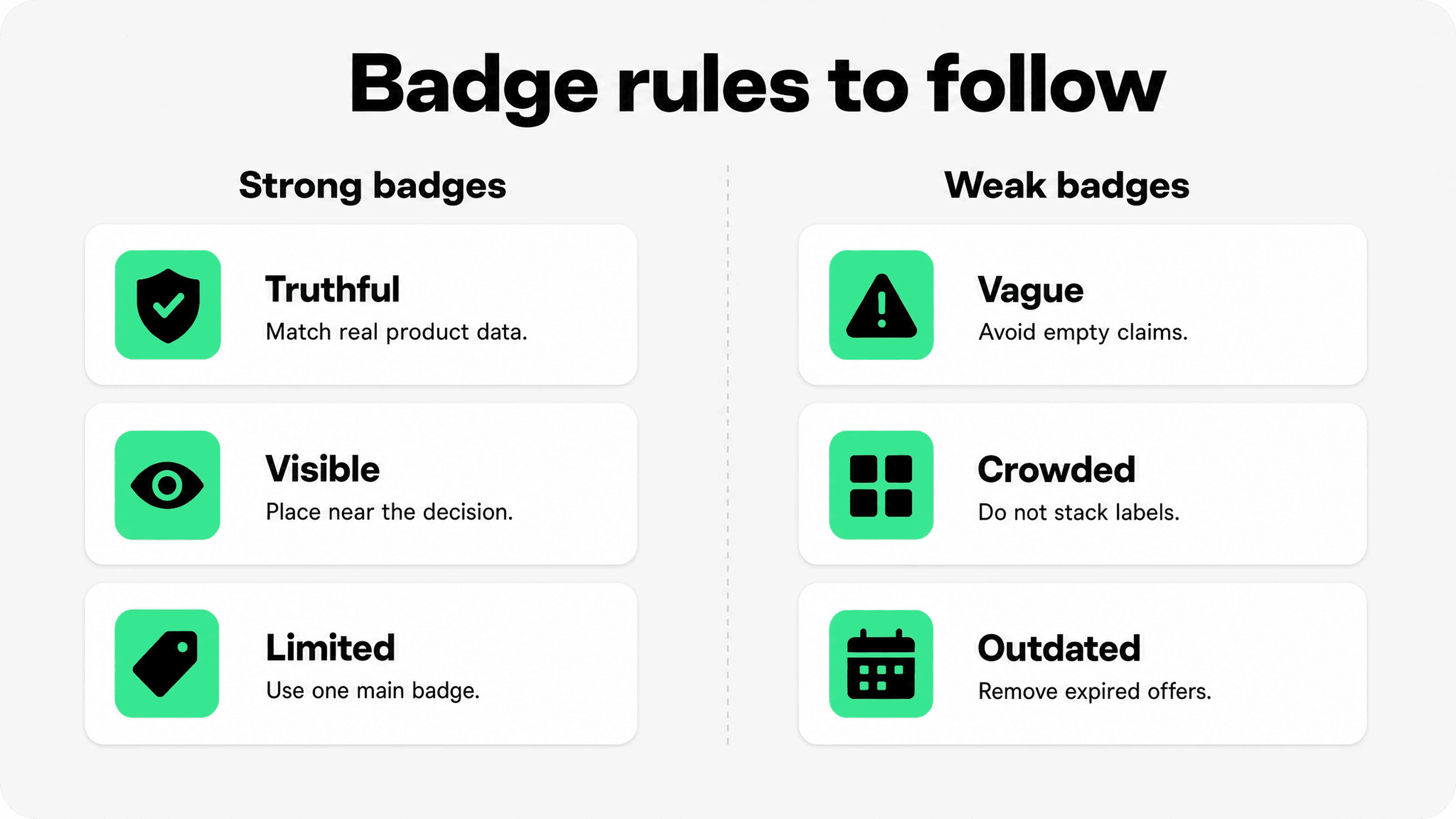
A good default is one primary badge per product card and up to three supporting cues in the product page decision area. Product cards are for quick comparison, so one badge should lead. Product pages have more room, but the badge area should still feel like decision support, not decoration.
If a product qualifies for several badges, rank them by shopper value. Sale usually beats New if the discount is meaningful. Sold out usually beats Sale because the availability state is more important. Low stock can beat Best seller when inventory is the main decision pressure. Free shipping usually belongs near the buy button or cart rather than over the product image, unless shipping is the primary campaign message.
The safest hierarchy is: availability first, promotion second, product fit third, reassurance fourth. This keeps urgent states visible and moves slower trust signals into places where shoppers can read them properly.
Badge fatigue is real. When every product has a label, no product stands out. When every label uses high-contrast colors, shoppers stop reading and start ignoring. Use visual contrast for the badge that matters most, and keep secondary cues quieter.
When to use a Shopify badge app
Theme settings are enough when a store only needs built-in Sale and Sold out badges. Custom code can work when the badge logic is stable and a developer can maintain it. A Shopify badge app is worth considering when the merchant needs flexible placement, reusable badge presets, product-specific badges, icon uploads, styling controls, or no-code management across product pages and carts.
The Shopify App Store has a dedicated Badges and icons category with many apps for product labels, product badges, trust badges, payment icons, and custom badge placement. That category is useful because merchants can compare whether they need a product label app, a trust badge app, or a broader badge-and-icon builder. See the Shopify App Store Badges and icons category.
Snapp fits when the merchant wants clean, on-brand trust badges, feature icons, payment logos, banners, and custom icon blocks without editing theme code. Snapp describes 15,000+ icons, styling controls, theme presets, uploaded icons, and custom placement for Shopify stores. See Snapp Trust Badges & Icons.
For this article topic, Snapp is strongest when the badge is part of the product confidence layer: shipping, return, payment, product feature, guarantee, or reassurance badges around the buy decision. For pure merchandising labels such as Sale, New, Low stock, or Best seller, merchants should decide whether their theme, metafields, inventory logic, or a product label app is the better source of truth.
Implementation checklist before publishing badges
Confirm the badge is true. Sale, low stock, best seller, and limited edition badges should be backed by real product data or store rules.
Choose the highest-value badge first. Product cards should rarely show more than one primary badge.
Check compare-at pricing. Shopify sale badges should match the actual price logic and variant pricing.
Test desktop and mobile. Badges must not cover product images, variant swatches, prices, ratings, quick-add buttons, or sticky buy bars.
Match the brand. Badge color, shape, typography, and icon style should feel native to the theme.
Keep badges editable. Campaign badges should be easy to remove after the campaign ends.
Support the claim. Shipping, returns, warranty, material, and guarantee badges should link back to real product details or policies when needed.
Final recommendation
Shopify product badges work best when they are treated as decision cues, not decorative stickers. Use them to help shoppers compare products faster, understand real promotions, see availability, and feel more confident near the buy button. Start with built-in Shopify sale and sold-out badges if that covers the need. Add custom badges only when they clarify something meaningful, and consider a Shopify badge app when the team needs flexible styling, product-specific control, or no-code placement across the store.
The simplest rule is also the strongest: show one clear badge in the place where it helps most, then make sure the store experience proves the claim.